Live data from Hacker News

So you think you can tell Arial from Helvetica?

ironicsans.com

171–180 of 184 posts

Re: So you think you can tell Arial from Helvetica?

#171
post #119

Earlier quoted context omitted.

The perfectly round Os in toyota are the giveaways. I got them all correctly, except for MATTEL for which the only difference is the stroke width; and which I ended up flipping a coin for (incorrectly). That said, I did get a degree in graphic design, so I may not be typical when it comes to this.

In MATTEL, the crossbar of the E is placed in the exact center.

I picked the one with the longest distance between the T and the E. That was the wrong answer.

This quizz is an excellent training though. I didn't know anything at all about typography prior to taking the test (never bothered to learn the names of the fonts or their shapes), ended up scoring 17/20.
Re: So you think you can tell Arial from Helvetica?

#175
post #119

Earlier quoted context omitted.

The perfectly round Os in toyota are the giveaways. I got them all correctly, except for MATTEL for which the only difference is the stroke width; and which I ended up flipping a coin for (incorrectly). That said, I did get a degree in graphic design, so I may not be typical when it comes to this.

I have a degree in CS and did the exact same thing

I have three degrees in CS, and I (correctly) answered the titular question with "No", and then proceeded to prove it with 10/20 on the button.

I notice the differences (slanted terminals, narrower "A"s, etc.), but had no clue which was which. Weirdly, I'm super-picky about typefaces, but mostly in a "I like what I like" sense rather than a "I know the precise details about why" sense. I dislike both Helvetica and Arial intensely, and so never bothered to learn much about what made them different. They're both just fonts I don't choose for anything.

Re: So you think you can tell Arial from Helvetica?

#176
There are (at least) three "bugs" in this quiz (i.e. artifacts from the alteration). The person who made them must have a crappy monitor if the differences weren't noticeable. That, or they were just sloppy. Still, fun quiz though.

Here are the bugs:

http://imgur.com/a/S2aDO

Re: So you think you can tell Arial from Helvetica?

#178
post #119

Earlier quoted context omitted.

The perfectly round Os in toyota are the giveaways. I got them all correctly, except for MATTEL for which the only difference is the stroke width; and which I ended up flipping a coin for (incorrectly). That said, I did get a degree in graphic design, so I may not be typical when it comes to this.

In MATTEL, the crossbar of the E is placed in the exact center.

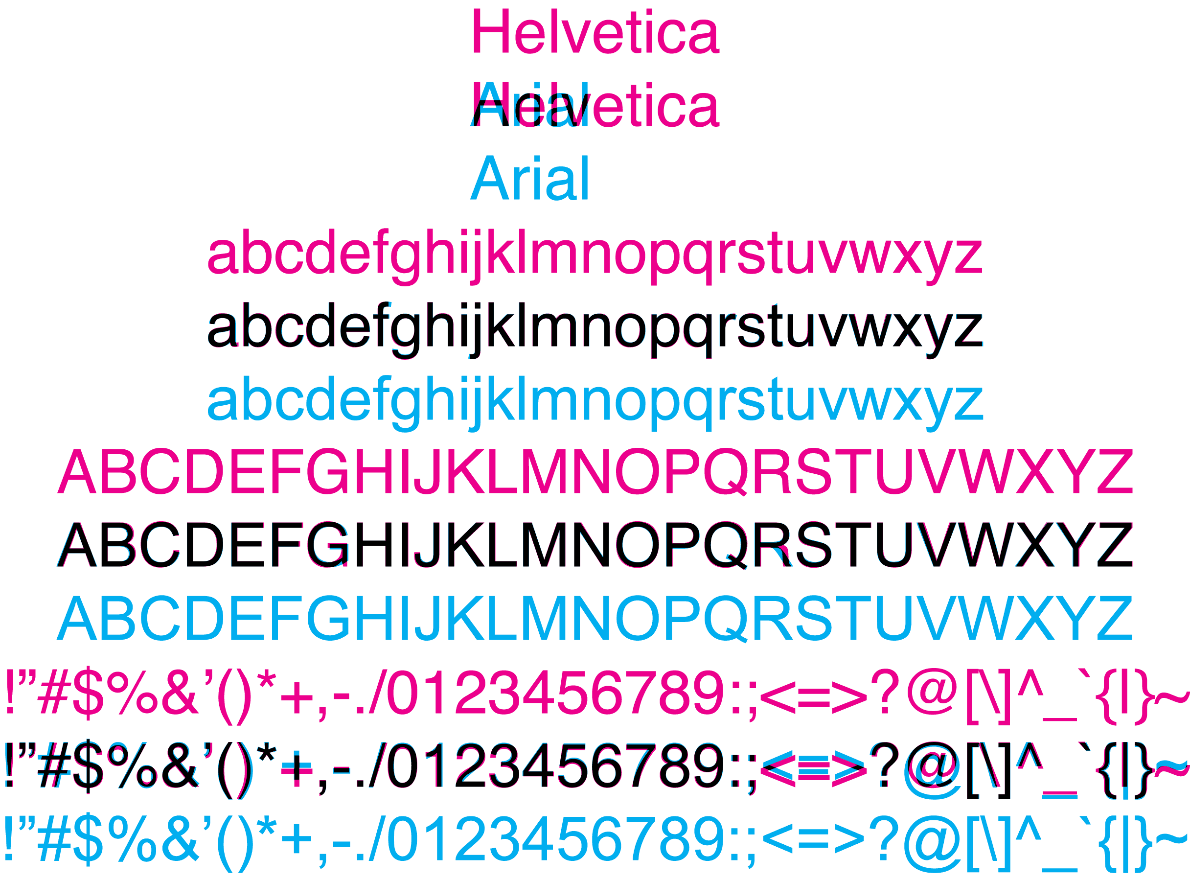
Here's a nice graphic of Helvetica overlaid with Arial with the same font weight and kerning.

http://snth.net/~rlk/image/helvetica-vs-arial-2.png

In this comparison, the capital E's are identical, so perhaps MATTEL used a different weight Helvetica?

Re: So you think you can tell Arial from Helvetica?

#179
post #39

Earlier quoted context omitted.

Also Helvetice tends to look sligthly "heavier" (thicker) when put side by side with Arial. That gives away many examples at a glance.

Unfortunately that's not always true, since Helvetica comes in many weights. http://sixrevisions.com/infographics/helvetica-font-weights-...

It should be true if the Arial examples were provided with comparable weights. That is, assuming, that the two fonts were weighted similarly from their base.

Re: So you think you can tell Arial from Helvetica?

#180
post #143

Earlier quoted context omitted.

No, this is horrible advice. The difference in the fonts will make your site look completely different to people using different OSes.

As it should! ;) Lately we've developed this fetish for sites being pixel-perfect across any display. The web was designed to decouple the way a site was designed from the way it's displayed. To allow it to reflow, and people to use their own designs. If you really want pixel-perfect layout, why not just use bitmaps and imagemaps ;)

Well, as long as the development request isn't for pixel perfect. Many people outside the control of development see the mockup from Photoshop and completely freak out when it doesn't match exactly. You try explaining that in the long run it doesn't matter, that browser incompatibilities prevent this, and that it will take longer to achieve that. The people "who know" what's needed don't care about that stuff.

Although, a common way to get them out of their "I know better" state is to point out the time factor and how much extra it will cost them. Suddenly they will worry over browser incompatibilities all day long.

The worse are the people that point out that the fifth paragraph on the third page ends with three words on the final line in the mockup but the website version has four words in Firefox and two words in Chrome. I just want to so tell them to just let the text flow its own way, dude. In the end I tell them in a nice way they're being silly.

Post reply on HN