Live data from Hacker News

Safari 15 on Mac OS, a user interface mess

morrick.me

141–150 of 374 posts

Re: Safari 15 on Mac OS, a user interface mess

#141

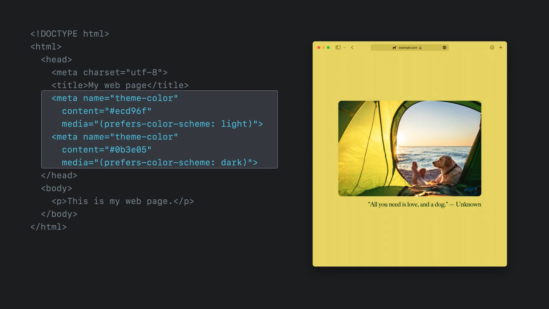
I love the colour of the page 'bleeding' into the 'tab area' - providing they can maintain a decent level of contrast. It looks really nice in the provided example. Of course, I hope they've used `<meta name="theme-color"...` instead of the background colour so pages with a white background and a black header don't end up with white chrome.

They do use theme-color and only fallback to either page background color or header background color when theme-color is not present[1][2]

[1]: https://files.grid.in.th/z3ox7o.jpg

[2]: https://developer.apple.com/videos/play/wwdc2021/10029/

Re: Safari 15 on Mac OS, a user interface mess

#142

Linked article refers to the changes in Safari as "thoughtless UI", which is a fairly common argument used against changes that people don't like. Against Apple, Microsoft, WinAmp, Reddit, etc. But let's be fair and note that there quite certainly a lot of very proud, considerate, intentional designers and developers who are behind this change. People who probably put thousands (millions?) multiples of "thought" in c…

Apple has increasingly delivered “looks good, feels bad” design since the Jobs era, and I suspect this is organizationally endemic.

I think it was more specific to a small group of powerful people, because it seems to be reversing. Slowly, but I can see that progress is being made.

Re: Safari 15 on Mac OS, a user interface mess

#143

Linked article refers to the changes in Safari as "thoughtless UI", which is a fairly common argument used against changes that people don't like. Against Apple, Microsoft, WinAmp, Reddit, etc. But let's be fair and note that there quite certainly a lot of very proud, considerate, intentional designers and developers who are behind this change. People who probably put thousands (millions?) multiples of "thought" in c…

Reminds me of how almost any corporate logo redesign works. Company makes a new logo, everyone is outraged by how awful and horrible it is, then we get used to it. The Discord logo redesign was one of those logos that elicited a very odd amount of outrage for what it was. Multiple video essays were made about just how terrible the logo is [0]. It's really not a bad logo at all. It's a minor change. But once you get u…

And the new one appeals to a different market - personally I thought the old one was pretty ugly, especially with how it would shatter into a ton of spinning fragments when it was loading. It said "hello this is a safe space for Gamerz", and I am very much not a Gamerz.

Now it doesn't say that. And now I'm less inactive on the various discord chats I've been invited to. Most of which are not really full of Gamerz anyway - but staring at that very Gamerz logo for a few seconds every time I opened the thing made me not want to open it.

Re: Safari 15 on Mac OS, a user interface mess

#144

Linked article refers to the changes in Safari as "thoughtless UI", which is a fairly common argument used against changes that people don't like. Against Apple, Microsoft, WinAmp, Reddit, etc. But let's be fair and note that there quite certainly a lot of very proud, considerate, intentional designers and developers who are behind this change. People who probably put thousands (millions?) multiples of "thought" in c…

Colors bleeding into chrome could make the line of death less clear, and therefore put users at risk.

"the line of death"?

Re: Safari 15 on Mac OS, a user interface mess

#145

I vehemently disagree that vertical space used is negligible. Due to standard aspect ratios, the vertical space of the display is at a premium. 1920*1080 means you have 840 less vertical pixels than horizontal - it makes a lot of sense to me to try to reclaim some of that space for actual content instead of widgets.

Which is why it makes it so strange that no browser designers seem to get that the way to go is to stack tabs in a vertical list instead of horizontally. It would use more space but the space is in less demand so it wouldn't matter anyhow.

So until the browser designers get a clue I will be stuck with Firefox and the Treestyle tabs plugin which is the least horrible solution for people that use a lot of tabs.

Re: Safari 15 on Mac OS, a user interface mess

#146

Linked article refers to the changes in Safari as "thoughtless UI", which is a fairly common argument used against changes that people don't like. Against Apple, Microsoft, WinAmp, Reddit, etc. But let's be fair and note that there quite certainly a lot of very proud, considerate, intentional designers and developers who are behind this change. People who probably put thousands (millions?) multiples of "thought" in c…

> Linked article refers to the changes in Safari as "thoughtless UI", which is a fairly common argument used against changes that people don't like. Against Apple, Microsoft, WinAmp, Reddit, etc. [...] someone saying "Whoa...this is different and I don't like different."

Back in the 90s Microsoft did put some research effort into Windows 95 and i do not really remember much of a blowback to the new UI despite being radically different from Windows 3.1. There were a lot of people complaining for the higher system requirements, how Win95 felt slower and even how "infantilized" DOS by forcing a GUI on them, but as far as the Windows UI itself goes pretty much everyone agreed was a big improvement to the point that other UIs started copying it to a functional level (ie. not just the window theme). There were even projects that recreated it on Windows 3.1 (Calmira).

To this day a lot of people consider Windows 95 to be one of the best and most well thought UIs.

(and honestly even though i think that overall Win2K is peak Windows, i do believe that ever since Win98 Microsoft started taking a form-over-function approach - see the toolbar buttons losing their relief and becoming shapeless elements indistinguishable from any other icon despite having different interaction with the user)

Sure, some reactions in UI changes tend to be "i do not like different" but that doesn't make all reactions so. And even then, do not dismiss the pure "i do not like different" reactions either: people spent time and energy to learn the UI they use, unless a change is a radical improvement (e.g. Win3.1 -> Win95) they are very justified to be pissed off at how the designers of the new UI wasted all that effort and nullified their knowledge for marginal gain (assuming there is any at all... or even worse, becoming harder to use like many overpadded mobile-first UIs look on desktops).

(the same applies to changes programmers often dislike too, like languages, APIs, frameworks, etc - for many users UI changes are the equivalent of Python2 to Python3, except as users are often powerless to do anything about UI changes, they happen way more often)
Re: Safari 15 on Mac OS, a user interface mess

#147
post #132

I vehemently disagree that vertical space used is negligible. Due to standard aspect ratios, the vertical space of the display is at a premium. 1920*1080 means you have 840 less vertical pixels than horizontal - it makes a lot of sense to me to try to reclaim some of that space for actual content instead of widgets.

But the tradeoff here isn't between a few dozen pixels vertically and a few dozen horizontally. It's 28 vertical pixels in exchange for cutting the horizontal space for the address bar and tab bar each in half , roughly.

Who really needs an address bar spanning the entire width of their screen? If you run into an URL that long then it's highly unlikely to contain useful information anyway. Or do you regularly notice yourself scanning through 400 characters of query string gibberish and thinking "that information was so useful that I always need all of it on screen"?

Re: Safari 15 on Mac OS, a user interface mess

#148

I believe this new design is the best Safari design 'in the constraints of the new Big Sur design language'. I'm liking it mostly because the Big Sur's new toolbar is too thick. With the menubar, toolbar, and the tabbar, 106px of my total 800px height display gets to display non-content information, much of which is clutter when I'm trying to focus on the webpage. It's a whopping 13.3%! Most of this comes from the th…

[deleted]

Re: Safari 15 on Mac OS, a user interface mess

#149

Linked article refers to the changes in Safari as "thoughtless UI", which is a fairly common argument used against changes that people don't like. Against Apple, Microsoft, WinAmp, Reddit, etc. But let's be fair and note that there quite certainly a lot of very proud, considerate, intentional designers and developers who are behind this change. People who probably put thousands (millions?) multiples of "thought" in c…

UI changes are only good if they improve usability. By far most UI changes these days are only done for the sake of looking different and "fresh", UI design has become purely fashion driven. Where's the scientific research and white papers going along with the Safari UI changes which clearly justify point by point why every single change makes sense, all backed by user studies? All I usually see is "emotional bullshi…

S/UI/clothing; your argument suggests the move to add color to fabric doesn’t make sense because it is simply fashion and has aught to do with the interface presented by a shirt. I think the parent comment nails it on subjectivity; the form of a thing is as much a part as its function. The luxury goods industry attests as much.
Post reply on HN