A 3D live map of the London Underground
brunoimbrizi.com
A 3D live map of the London Underground
1–10 of 24 posts
Re: A 3D live map of the London Underground
#2This is a nice illustration of WebGL but the Hacker News title ("A 3D live map of the London Underground") is overblown.
Live? if you can choose the speed of the trains then it is not really representing a live scenario.
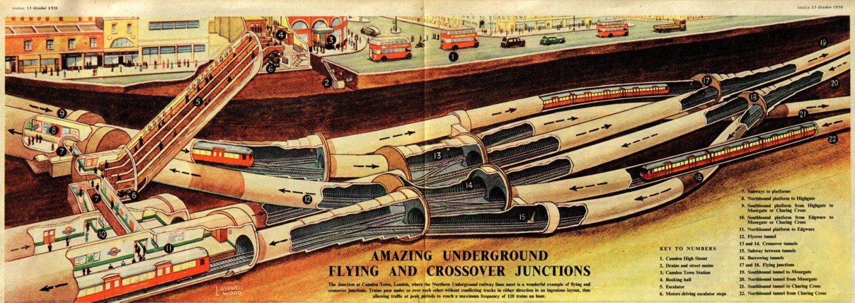
3D? There's some jiggling of the tunnels but Camden Town station appears to have 2 tunnels and doesn't feature any of its 3D cross-platform glory illustrated here: https://simanaitissays.files.wordpress.com/2013/01/camdentow...
Re: A 3D live map of the London Underground
#3It seems that the circle line is missing. I guess that all its stations are shared with other lines, so the network is not missing much, but still it would be nice for the sake of completeness...
And agree with the previous comment, it would be awesome if the map was truly "live".
Re: A 3D live map of the London Underground
#4http://tracker.geops.ch/ got submitted to HN a quite a few times but never got traction.
It's only 2d and missing parts of the Transport for London infrastructure, but it's truly global otherwise.
http://tracker.geops.ch/?z=2&s=1&x=-3057.5011&y=5968203.1664...
Re: A 3D live map of the London Underground
#5Here is a genuinely live, but two dimensional map: http://traintimes.org.uk/map/tube/
You can click on the trains to get ETAs.
Re: A 3D live map of the London Underground
#6It's not live, this is (almost) live: http://traintimes.org.uk/map/tube/
Re: A 3D live map of the London Underground
#7Here is a genuinely live, but two dimensional map: http://traintimes.org.uk/map/tube/ You can click on the trains to get ETAs.
The locations are estimates, but will be between the right stations.
Re: A 3D live map of the London Underground
#8This is just a visual experiment, it has no intention to be used as a service. It is live because it is pulling live data from the TfL prediction summary API, which returns approximate arrival times for the next 30 minutes. The default simulation speed is 5 and it can be adjusted to 1 for an experience as 'live' as http://traintimes.org.uk/map/tube/
As for the Circle line, it is just commented out in the code because it wasn't really adding anything. The prediction summary doesn't return isolated data for the Circle (at least it didn't when I made this experiment) so I had to improvise by merging District, H&C and Metropolitan. It was an approximation of the approximation. It wasn't looking great, so I just left it out.
Re: A 3D live map of the London Underground
#9Use WIFI in tunnels.
Re: A 3D live map of the London Underground
#10amazing.