Live data from Hacker News

NeXT Logo Presentation by Paul Rand to Steve Jobs [pdf]

jacobmorse.com

21–30 of 44 posts

Re: NeXT Logo Presentation by Paul Rand to Steve Jobs [pdf]

#21

Earlier quoted context omitted.

Well, fair enough. I don't think you would be a good designer though. As brutal as that may sound, design is a full contact sport. I'd say the same to you in person.

Your comment fascinates me, as if you feel you can uniquely tease out the objective from what most consider largely subjective. I'm not contesting, just curious for elaboration. Is it designer hubris, like audiophile, or wine tasting hubris, or a reproducible, measurable thing? Are you implying that he'd be a bad consumer as well, because he responds abnormally, and that other laymen would have less appreciation for…

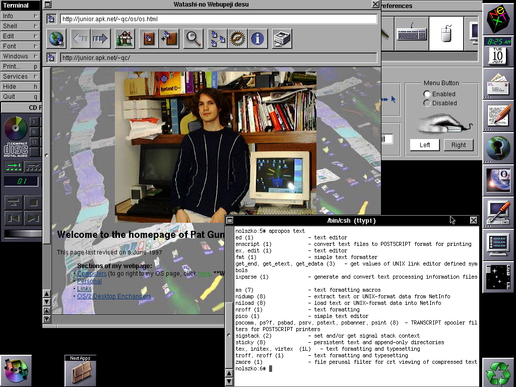
would that logo look good scaled down on a computer display from 1986? No. It is objectively bad.

All I had to do to invalidate that design was to think of the place it will most often be used.
Re: NeXT Logo Presentation by Paul Rand to Steve Jobs [pdf]

#22

In the trade we call this "post-rationalisation" and it's worse than worthless, it magically adds value to the worthless. Good design, especially good logo design, is self evident and doesn't need this kind of drivle. Also, it's objectivley a bad logo. Always has been. Always will be. It makes me angrier than it should, but that's why designers design I suppose.

My favorite example of "post-rationalization" is the BREATHTAKING Design Strategy behind the new Pepsi logo of the last decade.

http://www.goldennumber.net/wp-content/uploads/pepsi-arnell-...

The bit about Pepsi energy fields and globe dynamics is my favorite, but it is all kind of amazing.

Edit:

By comparison, this NeXT logo document seems pretty tame. Mostly describing the intent behind font choices and getting people's attention. Making the 'e' small does help prevent the all-caps design from looking like it has 'EXIT' in it.

And for what it's worth, I kind of like the NeXT logo. It looks a bit dated today, but it's not bad. Very 80s futurist.

Re: NeXT Logo Presentation by Paul Rand to Steve Jobs [pdf]

#23
post #15
post #9

Earlier quoted context omitted.

Why is it objectively bad? Logos are pretty subjective things.

It's as subjective as claiming that Bieber is the greatest musician of all time.

I don't know... The Mystery Sonatas are quite good aren't they? https://www.youtube.com/watch?v=mB6N7rIvdck ;)

Re: NeXT Logo Presentation by Paul Rand to Steve Jobs [pdf]

#24
post #22

In the trade we call this "post-rationalisation" and it's worse than worthless, it magically adds value to the worthless. Good design, especially good logo design, is self evident and doesn't need this kind of drivle. Also, it's objectivley a bad logo. Always has been. Always will be. It makes me angrier than it should, but that's why designers design I suppose.

My favorite example of "post-rationalization" is the BREATHTAKING Design Strategy behind the new Pepsi logo of the last decade. http://www.goldennumber.net/wp-content/uploads/pepsi-arnell-... The bit about Pepsi energy fields and globe dynamics is my favorite, but it is all kind of amazing. Edit: By comparison, this NeXT logo document seems pretty tame. Mostly describing the intent behind font choices and getting peo…

I put an asterisk in my second comment that was meant to link to the very example. I forgot to do it, glad you brought it up.

Re: NeXT Logo Presentation by Paul Rand to Steve Jobs [pdf]

#25
post #16

In the trade we call this "post-rationalisation" and it's worse than worthless, it magically adds value to the worthless. Good design, especially good logo design, is self evident and doesn't need this kind of drivle. Also, it's objectivley a bad logo. Always has been. Always will be. It makes me angrier than it should, but that's why designers design I suppose.

i'll go a step further and say he's never made a good logo. Ever.

I loved the old UPS logo, but I put that down to luck.

Re: NeXT Logo Presentation by Paul Rand to Steve Jobs [pdf]

#26
post #12

The NeXT logo probably would not be the choice today as it doesn't scale down small enough for favicons, mobile screens and so on. However, nobody really ever got to see a NeXT machine apart from Tim Berners Lee. The web really was 'next' so it all worked out well in the end.

id Software famously used them as well.

To put more flesh on the bone, there were apparently about 40,000 NeXT users in 1993, many highly loyal. https://books.google.ie/books?id=QDsEAAAAMBAJ&pg=PA54&lpg=PA... So while the NeXT system certainly wasn't a mass-market hit and the company struggled financially, it wasn't quite as quirky and deeply obscure as it may seem nowadays.

Re: NeXT Logo Presentation by Paul Rand to Steve Jobs [pdf]

#27

Earlier quoted context omitted.

I personally feel its a great logo, for just one reason: It stands out, and is instantly identifiable. And I think the "drivle" is excellent, as it gives a window to the way the designer has thought about the design. And I can relate with most of what he has to say. I am sure, with multiple iterations over the current logo (just like what Apple's main logo went through), you'd arrive with something elegant with all t…

On the face of it, you make some good points. Here's why I think you're wrong. I could point out that 'It stands out, and is instantly identifiable' is the weakest of arguments in defence of a design. I could photocopy my arse and stick the words 'Burger King' next to it, set in comic sans. That would tick all the boxes that sentence mandates. But that's as cheap a retort as it was an argument. It's not enough to be…

[deleted]

Re: NeXT Logo Presentation by Paul Rand to Steve Jobs [pdf]

#28

In the trade we call this "post-rationalisation" and it's worse than worthless, it magically adds value to the worthless. Good design, especially good logo design, is self evident and doesn't need this kind of drivle. Also, it's objectivley a bad logo. Always has been. Always will be. It makes me angrier than it should, but that's why designers design I suppose.

[deleted]

Re: NeXT Logo Presentation by Paul Rand to Steve Jobs [pdf]

#29
post #11

Earlier quoted context omitted.

I disagree. I think the logo is nice, I think it looks ok even in small size, I don't think it unbalanced the NeXT machines when it was put on them, I think the colors are cute and the font is sharp.

Well, fair enough. I don't think you would be a good designer though. As brutal as that may sound, design is a full contact sport. I'd say the same to you in person.

Can you point us to some of your superior logos?

Re: NeXT Logo Presentation by Paul Rand to Steve Jobs [pdf]

#30

Earlier quoted context omitted.

Your comment fascinates me, as if you feel you can uniquely tease out the objective from what most consider largely subjective. I'm not contesting, just curious for elaboration. Is it designer hubris, like audiophile, or wine tasting hubris, or a reproducible, measurable thing? Are you implying that he'd be a bad consumer as well, because he responds abnormally, and that other laymen would have less appreciation for…

would that logo look good scaled down on a computer display from 1986? No. It is objectively bad. All I had to do to invalidate that design was to think of the place it will most often be used.

>would that logo look good scaled down on a computer display from 1986? No. It is objectively bad.

BS, it looked just fine:

http://www.osdata.com/system/ui/screens/next.jpg

And in fact he printed it in various scales (large to tiny), in both color and black and white, to show how it still looked identifiable and good (not shown properly in TFA, you can find the design studies with the various sizes on the web easily, its part of the same document).

Post reply on HN