gold and blue, due to the price of the paint components, were hallmark of an expensive art painting through the history until very recently. Thus using those colors allows to exploit that association and puts your movie at perceived level of the old masterpieces. That also correlates nicely with the fact that cheap or produced in other countries inferior color film (like in the USSR for example) didn't have good blue…
Why Every Movie Looks Sort of Orange and Blue
91–100 of 114 posts
Re: Why Every Movie Looks Sort of Orange and Blue
#92Earlier quoted context omitted.
I'm in the same boat: it's weird seeing the comments describing the blu-ray as "green-ray" and that things are SO GREEN when I literally can't see it. For those of you with decent color sight, was the original... more orange?
The original looks more green-orange and flat. The blu-ray looks more green-blue and contrasted. The original feels 'warm' and the blu-ray feels 'cool.'
Colloquially people with normal vision tend to say "green" when they refer to teal (i.e. green-blue or just generally green with some blue in it). Because I don't actually perceive the green part of the hue, the blue is much stronger for me.
I absolutely agree with the "warm" vs "cool" thing, though.
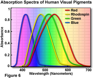
[0]: http://micro.magnet.fsu.edu/primer/lightandcolor/images/huma... (the fourth "pigment", Rhodopsin, is what we use in low-light conditions)
Re: Why Every Movie Looks Sort of Orange and Blue
#93Earlier quoted context omitted.
The original looks more green-orange and flat. The blu-ray looks more green-blue and contrasted. The original feels 'warm' and the blu-ray feels 'cool.'
Ah, that explains it. I'm technically green deficient. Because of how colour vision works, green perception partially overlaps with red perception[0], so I tend to think of green as more of an "earth tone" (essentially brown). Colloquially people with normal vision tend to say "green" when they refer to teal (i.e. green-blue or just generally green with some blue in it). Because I don't actually perceive the green pa…
Interesting. Yes that's the opposite the effect it has in me. Teal is a washed-out blue...
The original/DVD release of the Matrix did have a visually distinctive green tint in the scenes taking place inside the Matrix. But it felt soft, warm, and flat. It was also subdued in some scenes, such as the training dojo. The scenes in the real world lacked the filter and felt harsh, cold, and rigid by comparison. It was a great artistic choice.
The new blu-ray release (and the sequels) have the entire movie feel like the harsh, cold, rigid reality, and have heightened the contrast to make it worse :(
EDIT: I have no color blindness.
Re: Why Every Movie Looks Sort of Orange and Blue
#94That and davinci and you'll be fine
Re: Why Every Movie Looks Sort of Orange and Blue
#95Earlier quoted context omitted.
Steven Soderbergh's Traffic (2000) made heavy use of this, too, to distinguish different locales and parts of the story. The Mexico/Benicio Del Toro partions were heavy on gold/orange, burnt, sepia, while the Washington/Michael Douglas parts were blue, cool.
Yeah, Breaking Bad always painted everything a lurid yellow for scenes in Mexico.
Re: Why Every Movie Looks Sort of Orange and Blue
#96Funny to see Amelie there as a counter-example - it's pretty much my favourite movie, and one of the things I love about it is the autumnal quality of the light. Normally I wouldn't notice that kind of thing at all, perhaps it's the contrast with all the orange-and-blues (or maybe just the exceptional loveliness of the film itself)
Amelie uses a lot of red and green. Jean-Pierre Jeunet made "City of Lost Children" which also has a strong red green palette. He also directed "Delicatessen" that used a chemical process to give the film a gold glow.
Re: Why Every Movie Looks Sort of Orange and Blue
#97If you are interested in colour grading, this is a wonderful piece of software - http://3dlutcreator.com That and davinci and you'll be fine
Re: Why Every Movie Looks Sort of Orange and Blue
#98I much prefer the result when the manipulation of colour is achieved through lighting on the set or location.
Two examples of films I think have fantastic use of colour in the lighting are Indiana Jones and the Temple of Doom and Desperately Seeking Susan.
Re: Why Every Movie Looks Sort of Orange and Blue
#99Re: Why Every Movie Looks Sort of Orange and Blue
#100Danny Boyle's Sunshine [0] also made good use of colour - the interior of the ship had no reference to red, orange or yellow to make the appearance of the sun more striking. [0] https://en.m.wikipedia.org/wiki/Sunshine_(2007_film)