Visualizing AWS Storage with Real-Time Latency Spectrograms
sysdigcloud.com
Visualizing AWS Storage with Real-Time Latency Spectrograms
1–10 of 19 posts
Re: Visualizing AWS Storage with Real-Time Latency Spectrograms
#2I really want to lop off the 'ns' and '10 sec' divisions of all the charts and expand the resolution...
Re: Visualizing AWS Storage with Real-Time Latency Spectrograms
#3Nice job on the graphics for the post. Thanks for taking the time to animate and annotate well.
Re: Visualizing AWS Storage with Real-Time Latency Spectrograms
#4> Every few seconds one of the writes takes forever [~5s]. You can notice the long periods of inactivity, and after that a green dot at the right of the chart: that’s our slow call. What is likely happening is: the local cache saturates and when that happens the application has to wait until the local data is pushed to the remote volume. Boy, you sure don’t want one of your critical code paths to hit one of these slow calls.
I'm surprised that there's no asynchronous way that the FS cache will flush itself i.e. when it reaches 50% capacity, and rate-limit incoming requests if it's too full. The idea that an FS cache is so dumb that it can't do anything while it's flushing its entire self is a bit scary - I'd expect that circular buffers and granular locking mechanisms could be used to great effect here. Is this kernel code? Userspace code? Is there research into this? Fundamental tradeoffs that I'm missing?
Re: Visualizing AWS Storage with Real-Time Latency Spectrograms
#5> Every few seconds one of the writes takes forever [~5s]. You can notice the long periods of inactivity, and after that a green dot at the right of the chart: that’s our slow call. What is likely happening is: the local cache saturates and when that happens the application has to wait until the local data is pushed to the remote volume. Boy, you sure don’t want one of your critical code paths to hit one of these slo…
It would be interesting to see the client/benchmarking program. It almost sounds like it could be single-threaded ... which would mean the delay is an artifact of the benchmark only having one op outstanding, rather than something inherent in the storage layer.
Re: Visualizing AWS Storage with Real-Time Latency Spectrograms
#6Well done!
Re: Visualizing AWS Storage with Real-Time Latency Spectrograms
#7cool project
Re: Visualizing AWS Storage with Real-Time Latency Spectrograms
#8cool project
Re: Visualizing AWS Storage with Real-Time Latency Spectrograms
#9That's clever and well executed. Wrong palette though :P
Red implies problems, green implies "normality", but here this association is misplaced. Perhaps a typical "fire" palette would be better - from dark brown to red to orange to yellow and, ultimately, to white for the extremes.
Re: Visualizing AWS Storage with Real-Time Latency Spectrograms
#10That's clever and well executed. Wrong palette though :P Red implies problems, green implies "normality", but here this association is misplaced. Perhaps a typical "fire" palette would be better - from dark brown to red to orange to yellow and, ultimately, to white for the extremes.
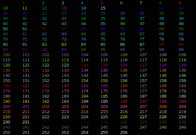
OP here. Unfortunately the ansi palette is pretty limited so I didn't have a lot of flexibility in the color choice. That said, this can definitely be improved. I can work on it if people find it useful.
In the meantime, it's very easy to tune the colors your own: just modify this line https://github.com/draios/sysdig/blob/master/userspace/sysdi... in your local version of the script, using this as a reference http://misc.flogisoft.com/_media/bash/colors_format/256_colo....