Live data from Hacker News

OS X 10.10 Yosemite: The Ars Technica Review

arstechnica.com

111–120 of 233 posts

Re: OS X 10.10 Yosemite: The Ars Technica Review

#111

Off topic from the review but handy since people were talking about crashing: Learned a cool trick tonight: Yosemite was taking a while to install, so I did some googling and learned you can see the installer's log by typing CMD-L during the install process.

protip: delete /usr/local/Cellars and posibbly LiveTex before upgrade OSX.

Re: OS X 10.10 Yosemite: The Ars Technica Review

#112
post #28

I can't wait for the 'flat' fad to be over.

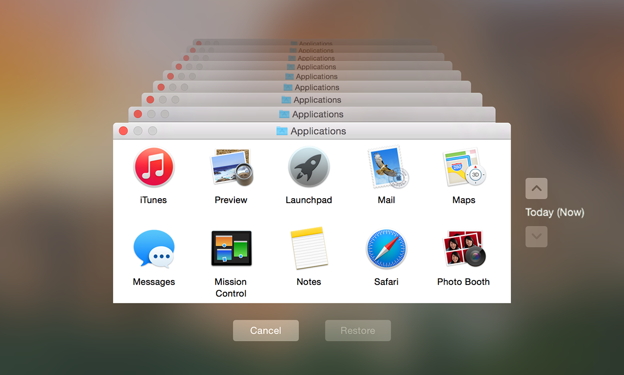
Me too. Take a look at Time Machine. As the author said, Time Machine made "backups fun, so people will want to do it". I think the time vortex background helps in achieving that. And they removed it.

http://cdn.arstechnica.net/wp-content/uploads/2014/10/time-m... | http://cdn.arstechnica.net/reviews/os/mac-os-x-10-5.media/ti...

Re: OS X 10.10 Yosemite: The Ars Technica Review

#113
post #111

Off topic from the review but handy since people were talking about crashing: Learned a cool trick tonight: Yosemite was taking a while to install, so I did some googling and learned you can see the installer's log by typing CMD-L during the install process.

protip: delete /usr/local/Cellars and posibbly LiveTex before upgrade OSX.

I'm curious, why should I delete /usr/local/Cellars?

Re: OS X 10.10 Yosemite: The Ars Technica Review

#114
post #54
post #50

Earlier quoted context omitted.

As ericd says, a lot of those little flourishes actually aid human perception and cognition. Yes, we don't need giant flashy effects or lots of animation, but that doesn't mean that the most functional design is the most minimal. Also, it's kind've ironic that you can now have a 5k display to show off your flat, monochrome circles...

This. Shadows (fake 3D), textures, colors, and other elements may seem like a gimmick, but they are fundamentally crucial in visual cognition of the UI. What's sad is that so much UI design is driven by meaningless trends instead of more precise research data on how well UI elements work.

well you get things like Google's Material design that have things like depth perception and strong color contrast.

It's not like we're abandoning everything, it's more about discovering new ways of doing things and then mix and matching until we get to something useful and coherent.

Re: OS X 10.10 Yosemite: The Ars Technica Review

#115
post #92
post #84

Earlier quoted context omitted.

20 terminal windows? Is there any reason you are not using screen/tmux?

Eh, why bother when iTerm2 gives me the same splitting and tab features :)

I used to have the same question, but having a remote tmux session that persists forever has turned out to be awesome.

Re: OS X 10.10 Yosemite: The Ars Technica Review

#116

Earlier quoted context omitted.

Yes, but it's not the same as turning the display off. The GPU is still outputting signal to the Macbook Pro screen.

what the.. why? The screen is unusable without the backlight.

Perhaps latency? Suppose it takes 0.5-1 second to switch between "Off" and "Lowest brightness" when turning On/Off the GPU, that could create a bad experience when every other brightness change is instantaneous. Though it is a great power optimization idea, if the (unknown to me) downsides aren't too bad!

Re: OS X 10.10 Yosemite: The Ars Technica Review

#117
post #2

What's missing here for me is some kind of performance evaluation. If I upgrade my 2011 MBA from Mavericks to Yosemite, should I expect any change in performance, for better or worse? Did the power management change in any significant way? Apple's mobile OSs have a way of obsoleting older hardware. I'm curious to know if their desktop OSs are trending that way as well, or if they're making performance gains instead.

I've had serious performance issues with Yosemite. For one, dragging around windows became extremely janky; this appears to be caused by the transparency (and the limitations of my first-generation Retina MBP), as the option to disable it fixes the jank. For another, opening a new tab in Safari started lagging about a full second before I could start typing in the address bar, which is a ridiculous amount of time compared to the previous version or competition. I was able to fix this by disabling Top Sites, but while I don't actually use Top Sites much, I never had to disable it before, and most users won't know to do that, making it a serious regression. (Chrome actually takes quite a while to load its equivalent - I don't know whether it's for the same reason or not - but it does it asynchronously, so I can start typing in the address bar almost immediately.)

On top of that, there are serious performance issues with the built-in Japanese IME, although I'm not completely sure how much of this is new, and I experienced a bug where WindowServer would randomly start hogging CPU, which may or may not be related to said IME.

Given all these problems, I'm surprised that the general consensus seems to be that the performance is good. But maybe I'm somehow a special case. (The Safari issue is the most egregious - is it that many OS X users don't use Safari in the first place?)
Re: OS X 10.10 Yosemite: The Ars Technica Review

#118
post #68
post #62

Earlier quoted context omitted.

As you say super flat might not be great, but all the designs preceding the current trend where extremely harsh on the visuals. From windows XP to 7, the windows default themes and colors where disturbingly flashy and "in your face". OSX was more bland but aqua was still kitch and unneedingly strippy. iOS6 app's ultra textured or "realistic" interfaces were the peak of that trend IMO. In the real world, not everyone…

Oh, I definitely agree, XP's playskool-esque design was way over the top, and OS X's excessive animations/reflections/etc. are obnoxious. It does seem to be getting better in that regard. I like most of Bootstrap's choices, and those seem to be diffusing out.

Meh... I'm actually a fan of XP's design, although I can't tell how much of that is actual aesthetic appreciation and how much just nostalgia. Colors are nice, yet the interface as a whole was actually less flashy than its successors, as the last pre-GPU-compositing Windows, making for a solid whole. But I also liked Aero's glossiness, which I'm happy to see somewhat reflected in Yosemite - nor did I ever have an issue with OS X, although iOS 6 was a bit much for my taste. (On the other hand, I also like iOS 7. The only design I seriously don't like is Google's, for reasons I'll elaborate on the off-chance anyone cares.)

Re: OS X 10.10 Yosemite: The Ars Technica Review

#119
post #28

I can't wait for the 'flat' fad to be over.

OS X isn't flat. There is still shading and drop shadows. They just turned down the gloss from 11 to something less overbearing. When the UI gets chromed to the hilt like iOS6 or older OS X versions, it becomes a distraction from the app/content.

Re: OS X 10.10 Yosemite: The Ars Technica Review

#120
post #92

Earlier quoted context omitted.

Eh, why bother when iTerm2 gives me the same splitting and tab features :)

I used to have the same question, but having a remote tmux session that persists forever has turned out to be awesome.

A remote session doesn't help when you're trying to run commands on your local system.
Post reply on HN