Good Old Excel is the Ultimate Data Visualization Tool
insights.qunb.com
Good Old Excel is the Ultimate Data Visualization Tool
1–10 of 14 posts
Re: Good Old Excel is the Ultimate Data Visualization Tool
#2"Less is more" : love the spirit :) Nice tips.
Re: Good Old Excel is the Ultimate Data Visualization Tool
#3Lighting everything is a fashion which will disappear. People need to BE ABLE to read as FAST as they can. Light fonts are that perk which makes things 'look' great but convey little information.
Otherwise, great and clear ideas.
Re: Good Old Excel is the Ultimate Data Visualization Tool
#4Excel is not at all a bad visualization tool...it's just that the lowest-common denominator of white-collar types use it, hence, the seemingly many terrible examples. By the time you're skilled enough to figure out R or D3, you're less likely to do something completely ugly...often because it's hard to add flair. However, D3 is starting to see way too many people who think adding force-directed balls is a good visualization, when such an interface is worse than what most Excel visualizations end up being.
I was hoping the OP would focus on the beauty of the table as a visualization, something I wish was used more often despite its simplicity.
Tufte's small multiples is a kind of table, and a very effective one. This was one of my favorite examples he uses in his books, and helped to get Gotti acquitted:
http://www.thejuryexpert.com/wp-content/uploads/gotti.jpg
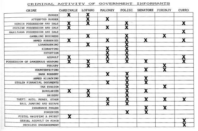
Here's a modern take by the NYTimes:
http://www.nytimes.com/interactive/2012/08/24/sports/top-fin...
Re: Good Old Excel is the Ultimate Data Visualization Tool
#5Lighting everything is a fashion which will disappear. People need to BE ABLE to read as FAST as they can. Light fonts are that perk which makes things 'look' great but convey little information. Otherwise, great and clear ideas.
I think that using gray scales actually focuses the user on more valuable assets on the data visualization. But you're right, it's also a fashion. Thanks for your comment.
Re: Good Old Excel is the Ultimate Data Visualization Tool
#6Excel is not at all a bad visualization tool...it's just that the lowest-common denominator of white-collar types use it, hence, the seemingly many terrible examples. By the time you're skilled enough to figure out R or D3, you're less likely to do something completely ugly...often because it's hard to add flair. However, D3 is starting to see way too many people who think adding force-directed balls is a good visual…
"the beauty of the table as a visualization": you are right, I shall try a blog about that. Thanks for your priceless urls.
Re: Good Old Excel is the Ultimate Data Visualization Tool
#7They succeeded in demonstrating their alternate thesis that Excel can be made to look less bad than default Excel. However, that is a lot of clicking for some cookie cutter visualizations.
I would posit that an "ultimate" visualization tool would allow me to exploratorily map aspects of my data to various aesthetic properties of the plot, such as size, color, shape, and transparency. I'd also expect to be able to get something reasonably close to publication quality straight out of the software without a whole bunch of tweaks.
I was hoping that this post would show me something about visualization workflow or extensions they'd written to ease some of the old pain points. As it is, they lead with a statement that is pretty laughable if we compare to ggplot2 or Tableau.
Re: Good Old Excel is the Ultimate Data Visualization Tool
#8They succeeded in demonstrating their alternate thesis that Excel can be made to look less bad than default Excel. However, that is a lot of clicking for some cookie cutter visualizations. I would posit that an "ultimate" visualization tool would allow me to exploratorily map aspects of my data to various aesthetic properties of the plot, such as size, color, shape, and transparency. I'd also expect to be able to get…
ggplot2 and Tableau are high-end tools, meant for experts. My intent here is to show that an average organization can do a pretty good job with the tools they already have.
The data discovery tech we're baking will actually totally simplify the way people visualize / discover their data. But until it's shipped, I'm just claiming people can use excel. Thanks anyway for your comment.
Re: Good Old Excel is the Ultimate Data Visualization Tool
#9The problem with Excel is not visualization, it's sharing and updating. If you want to compete in visualization, look at Power Point, not Excel.
I really look forward the day somebody tackles the issue of sharing/updating spreadsheets across many users that speak different languages, are in different countries, etc.
Re: Good Old Excel is the Ultimate Data Visualization Tool
#10They succeeded in demonstrating their alternate thesis that Excel can be made to look less bad than default Excel. However, that is a lot of clicking for some cookie cutter visualizations. I would posit that an "ultimate" visualization tool would allow me to exploratorily map aspects of my data to various aesthetic properties of the plot, such as size, color, shape, and transparency. I'd also expect to be able to get…
ggplot2 and Tableau are high-end tools, meant for experts. My intent here is to show that an average organization can do a pretty good job with the tools they already have. The data discovery tech we're baking will actually totally simplify the way people visualize / discover their data. But until it's shipped, I'm just claiming people can use excel. Thanks anyway for your comment.
And I can appreciate that, though you can see why the sensational title might confuse someone on the intent.
Also, I'd argue that Tableau doesn't require any particular expertise beyond what is required for Excel. Though Tableau isn't my preferred tool, I've seen great results come from total novices. It has the side benefit of sneakily training people to "think beyond the canned" and to develop novel visualizations that may better get to the heart of the relationships present in the data.
I get it that ggplot2 requires some minimal coding ability, however I've also seen good (i.e. superior to stock excel) results come out of never-before-coded grad students in an only nominally quantitative discipline. Certainly the business people who power our economy and command great sums of wealth are capable of such modest feats?