Live data from Hacker News

iOS 7 before and after screenshots

tapfame.com

131–140 of 165 posts

Re: iOS 7 before and after screenshots

#131

Earlier quoted context omitted.

If I saw the "after" UI of Hipmunk without having seen the "before" UI, I would have been totally lost. Where are the buttons? What is a label and what is tappable!? It is even worse with touch, there is no hovering cursor that changes appearance. I honestly think "flat" is going to take a long time to work out the kinks. I think it is here to stay a while, for better or worse.

> What is a label and what is tappable!? If only there were an easy way to find out. I honestly think people are making too big a deal about this. The kind of people who download apps are not going to have an issue exploring the UI of new apps to figure out how they work. And it's not that hard to figure out just by looking either. Verbs, arrows, and nouns that don't label something adjacent to them should all be cli…

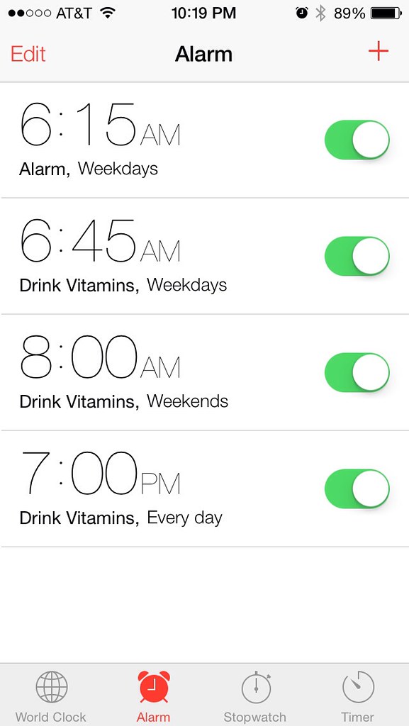
Speaking as a 39 year old developer curmudgeon who routinely downloads new apps: I am not going to click around and discover your interface if it isn't obvious in the first few minutes.

As an example, the new flat google maps app is a disaster. It took me weeks to figure out how to do fairly simple things, like how to cancel turn by turn directions. My wife is totally lost, as a long time iphone 4 user trying to use the flat iphone 5 version. When she tries to navigate while I am driving, she is constantly confused while I say, "no! just swipe down hard enough that the app thinks you are going back, then click on the box, then click the x, then swipe up, and stand on your left foot!"

But we have to have a map, so we use it.

As a startup, this is what you should think about: Is your app as useful as google maps? If not, then you can't afford to make it unusable with a trendy flat interface.
Re: iOS 7 before and after screenshots

#132
post #35

Don't care for the white backgrounds everywhere. Going to be even more difficult to use at night. Wish there was a way to choose a theme, like we had in the 90's.

Themes don't work; Windows Phone has two choices and a lot of developers simply support only of them.

The way themes have worked historically is that the application isn't consulted.

Re: iOS 7 before and after screenshots

#133

Earlier quoted context omitted.

> What is a label and what is tappable!? If only there were an easy way to find out. I honestly think people are making too big a deal about this. The kind of people who download apps are not going to have an issue exploring the UI of new apps to figure out how they work. And it's not that hard to figure out just by looking either. Verbs, arrows, and nouns that don't label something adjacent to them should all be cli…

Speaking as a 39 year old developer curmudgeon who routinely downloads new apps: I am not going to click around and discover your interface if it isn't obvious in the first few minutes. As an example, the new flat google maps app is a disaster. It took me weeks to figure out how to do fairly simple things, like how to cancel turn by turn directions. My wife is totally lost, as a long time iphone 4 user trying to use…

Honestly, not a huge fan of newmaps, and I'm a googler. But most people I know have figured out how to use it. I did too after playing with it for a bit. People will figure things out, especially if there are no non-flat alternatives.

Re: iOS 7 before and after screenshots

#134
The number take-away from this for me is wow, Apple wields an awesome power. They move to change design conventions, and boom! - a worldwide ecosystem of designers and developers scramble to retrofit every aspect of their complex applications to match the changes. Microsoft could only dream of having that power. I've been on Windows Phone for over a year now and at this point in time they seem years away from even having anything resembling this sort of following. The difference of course is that one phone feels exciting and dynamic to own, and the other feels completely and utterly barren.

Re: iOS 7 before and after screenshots

#135
post #44

Don't care for the white backgrounds everywhere. Going to be even more difficult to use at night. Wish there was a way to choose a theme, like we had in the 90's.

Use the home button triple-click trick for night reading. http://lifehacker.com/5957534/invert-your-phones-colors-for-... Another thing that really helps is f.lux for iphone: http://justgetflux.com/ios.html But this sadly requires jailbreaking.

Thanks, I do remember that. There is the problem though of those apps which use a dark theme, that therefore become light upon negative view. Hence, why I'd prefer a single theme enforced.

Re: iOS 7 before and after screenshots

#136

Earlier quoted context omitted.

The problem seems to be some people tend to do more than flatten their designs dimensionally (as in gradients, bevels, specular highlights etc). They also 'flatten' the design as in reducing contrast, reducing lines/borders and other ways of separating and organizing information/data. That's the problematic part to me. Hipmunk did that here. SeatGeek is an example of almost pure dimensional flattening. It's pretty mu…

Reducing contrast is really a problem in my opinion for users. I totally agree with you. SeatGeek is elegant (I like the visual), but as with most flat designs, affordance is a problem. I believe that the word Filter on the right side of Great Deals might be clickable/tappable text (based on my previous flat design button hunts and the previous iOS7 image with a gear). The problem is, I don't know for sure without ac…

> Reducing contrast is really a problem in my opinion for users.

The most terrifying example, in my opinion, is the team selector on the InfiniteHoops app. It keeps the skeumorphic 3-dimensionality of the old selector, but strips out all of the color and context and makes the text hard to read, turning the whole thing into a real mess.

Re: iOS 7 before and after screenshots

#137
post #4

The "after" screenshots don't seem to have anything in common anymore. Some of the apps look like Android, some look like Windows Phone, some look like Palm webOS. The previous iterations at least shared a few button styles and navigation bar styles, but now it seems like everyone has taken the opportunity to reinvent those too. It's certainly ok by me that app developers are taking more liberties in making their app…

> if the visual presence of the OS disappears entirely from > apps, This actually was one of the goals of the redesign: make content the most important thing on the screen.

But look at, for example, "Days To Go". I think it's a very typical iOS 7 design, and it meddles the content with the UI: the caption looks exactly the same as the actual content.

On iOS 6, you knew what was the "window frame" (UI) and what was the "window" (content), and you could look through the frame without any cognitive effort. Now both parts look the same.

Re: iOS 7 before and after screenshots

#139

Earlier quoted context omitted.

> if the visual presence of the OS disappears entirely from > apps, This actually was one of the goals of the redesign: make content the most important thing on the screen.

But look at, for example, "Days To Go". I think it's a very typical iOS 7 design, and it meddles the content with the UI: the caption looks exactly the same as the actual content. On iOS 6, you knew what was the "window frame" (UI) and what was the "window" (content), and you could look through the frame without any cognitive effort. Now both parts look the same.

I don't believe any of the default iOS 7 apps use gradients like that.

http://farm6.staticflickr.com/5330/9023342228_8341c60043_b.j...

Re: iOS 7 before and after screenshots

#140
post #23

Earlier quoted context omitted.

I noticed that too. Lots of the new apps have a distinctly "Android" feel to them, even to the point of Fancy having what looks clearly like an Android menu button (though not in the standard Android location). A fun flame war to start (i.e. let's please not) would be to argue whether this is due to app designers feeling an increasing need to target Android or whether it's because the truth is that iOS's "new look" s…

The "three lines to represent a menu" metaphor has existed for years now. It just hasn't been as widely used until probably in the last year or so. I wouldn't use it to assume that iOS apps are being designed from Android apps or vice versa. You're just making baseless extrapolations.

aka the "hamburger" button.
Post reply on HN