Programming Trends on StackOverflow
dodgycoder.net
Programming Trends on StackOverflow
1–10 of 64 posts
Re: Programming Trends on StackOverflow
#2I can't help but think this would be better visualised as a time series with time on the X-axis and a number of series drawn as lines.
Re: Programming Trends on StackOverflow
#3I can't help but think this would be better visualised as a time series with time on the X-axis and a number of series drawn as lines.
Yes that's how I originally tried it, but it was hard to pick out the trends since a bunch of lines were grouped together. Admit that the way its been done here is fairly strange, hopefully its useful to someone.
Re: Programming Trends on StackOverflow
#4I can't help but think this would be better visualised as a time series with time on the X-axis and a number of series drawn as lines.
Yes that's how I originally tried it, but it was hard to pick out the trends since a bunch of lines were grouped together. Admit that the way its been done here is fairly strange, hopefully its useful to someone.
Given that ultimate volumes aren't relevant, I think a stacked line chart (with colours for each language) might be appropriate. You might need to bunch together the least popular languages as "other" to get that to work though.
What struck me however was how little the popularity of the largest languages changed in terms of their question frequency.
Re: Programming Trends on StackOverflow
#5Does the data provide views by tag? I'm a frequent beneficiary of SO content, but rarely have to ask new questions myself. Measuring views could give a more accurate depiction of how many devs are working on each tag.
Re: Programming Trends on StackOverflow
#6I can't help but think this would be better visualised as a time series with time on the X-axis and a number of series drawn as lines.
Yes that's how I originally tried it, but it was hard to pick out the trends since a bunch of lines were grouped together. Admit that the way its been done here is fairly strange, hopefully its useful to someone.
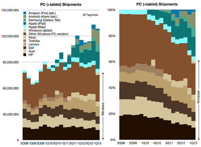
Another option would be a stacked area graph like this (the one on the right)
http://www.asymco.com/wp-content/uploads/2013/06/Screen-Shot...
Re: Programming Trends on StackOverflow
#7Does the data provide views by tag? I'm a frequent beneficiary of SO content, but rarely have to ask new questions myself. Measuring views could give a more accurate depiction of how many devs are working on each tag.
It does provide that yes but I think it could be easy to skew that when a handful of questions get a huge number of views due to being linked somewhere like the stack exchange newsletters, or other places.
Re: Programming Trends on StackOverflow
#8I can't help but think this would be better visualised as a time series with time on the X-axis and a number of series drawn as lines.
Yes that's how I originally tried it, but it was hard to pick out the trends since a bunch of lines were grouped together. Admit that the way its been done here is fairly strange, hopefully its useful to someone.
[deleted]
Re: Programming Trends on StackOverflow
#9Earlier quoted context omitted.
Yes that's how I originally tried it, but it was hard to pick out the trends since a bunch of lines were grouped together. Admit that the way its been done here is fairly strange, hopefully its useful to someone.
Another option would be a stacked area graph like this (the one on the right) http://www.asymco.com/wp-content/uploads/2013/06/Screen-Shot...
Agreed that would be better, thanks. I'll try that next time.
Re: Programming Trends on StackOverflow
#10Surprised to see Objective C dropping; I wonder why that is? It sure doesn't feel like iOS is getting more web view apps, and with the increased frequency and quality of apps on the App Store in lieu of iOS porting, you'd think it would go up.