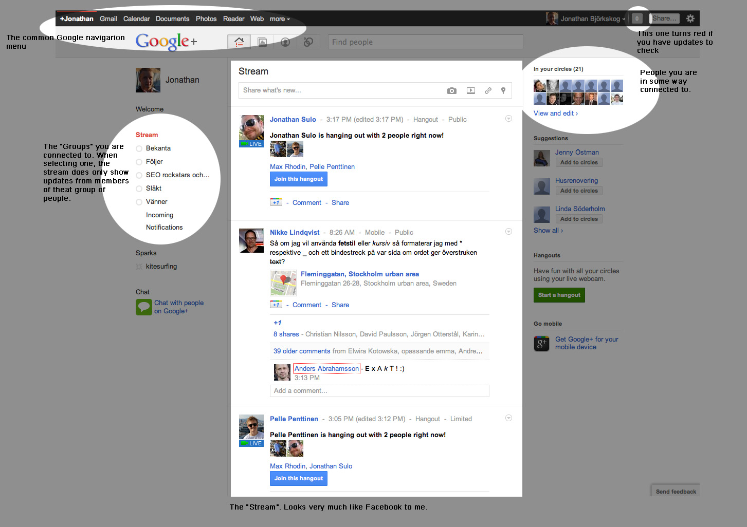
I find the two-column layout hard to deal with. I think I have figured out an algorithm for visually determining the chronological order of the posts, without having to read the timestamp in each post. But my algorithm requires considerable visual and intellectual effort. Is there an intuitive way to see the chronology of the posts? BTW, I'm not a huge fan of facebook's two-column layout either, but at least the arro…
New Google+ is beautiful?
51–60 of 82 posts
Re: New Google+ is beautiful?
#52Earlier quoted context omitted.
Disclaimer: I work for Google. For what it's worth, I felt the same way when I first dogfooded the new multi-column layout. I couldn't figure out how to read my stream. While reading a post, I kept getting distracted thinking about where I should focus my attention on next. It made scanning my stream more stressful and I was confident that I did not like it. This was before they added the option to switch to a single…
First off, I admit that I am hypersensitive to any form of bastardization of language. So please don't hate me for I'm going to say, I'm just a victim of my hypersensitivities. But: the word "stream" in the English language means "a steady flow or succession." Or, if you prefer the CS definition, it means "a sequence of data elements made available over time." When I'm looking at a set of boxes of different heights a…
Re: New Google+ is beautiful?
#53Earlier quoted context omitted.
Disclaimer: I work for Google. For what it's worth, I felt the same way when I first dogfooded the new multi-column layout. I couldn't figure out how to read my stream. While reading a post, I kept getting distracted thinking about where I should focus my attention on next. It made scanning my stream more stressful and I was confident that I did not like it. This was before they added the option to switch to a single…
First off, I admit that I am hypersensitive to any form of bastardization of language. So please don't hate me for I'm going to say, I'm just a victim of my hypersensitivities. But: the word "stream" in the English language means "a steady flow or succession." Or, if you prefer the CS definition, it means "a sequence of data elements made available over time." When I'm looking at a set of boxes of different heights a…
1) Streams branch and merge all the time.
http://www.mightystreamradio.com/PHOTOS/STREAM%20PHOTO%202.j...
If anyone's bastardizing the language, it's computer scientists being overly restrictive with their allusions.
2) http://en.wikipedia.org/wiki/Muphrys_law
> But please, let's don't call it a stream.
"But please, let's not call it a stream."
Re: New Google+ is beautiful?
#54Earlier quoted context omitted.
Disclaimer: I work for Google. For what it's worth, I felt the same way when I first dogfooded the new multi-column layout. I couldn't figure out how to read my stream. While reading a post, I kept getting distracted thinking about where I should focus my attention on next. It made scanning my stream more stressful and I was confident that I did not like it. This was before they added the option to switch to a single…
First off, I admit that I am hypersensitive to any form of bastardization of language. So please don't hate me for I'm going to say, I'm just a victim of my hypersensitivities. But: the word "stream" in the English language means "a steady flow or succession." Or, if you prefer the CS definition, it means "a sequence of data elements made available over time." When I'm looking at a set of boxes of different heights a…
Re: New Google+ is beautiful?
#55Earlier quoted context omitted.
Mine is. They do reset the sort order back to "top stories" once in awhile which is annoying but I always just set it back to sort by date
Yes but the majority or people just use the top stories sort and are happy with it. I think people who want everything in chronological order are the type of people who don't want to miss a post - even though most posts on Facebook/Google + aren't important enough to matter if you miss them.
Re: New Google+ is beautiful?
#56Re: New Google+ is beautiful?
#57Earlier quoted context omitted.
Given the fact that I can switch to one-column layout, I should probably shut up now. But just for the sake of a lively debate, let me say this: if I can't read the thing, I can't skim it either. I just don't know how to move my eyes around. Instead of skimming for the posts that I find important, I would end up making a random choice between things I see and things I overlook. But then perhaps that's fully intended…
Disclaimer: I work for Google. For what it's worth, I felt the same way when I first dogfooded the new multi-column layout. I couldn't figure out how to read my stream. While reading a post, I kept getting distracted thinking about where I should focus my attention on next. It made scanning my stream more stressful and I was confident that I did not like it. This was before they added the option to switch to a single…
However, this is not the same view as the previous interface. This was the (very) old:
http://2.bp.blogspot.com/-tUWGu4XpE2Q/UVj5I-YMCQI/AAAAAAAAAi...
And here is the most recent old:
http://cdn.dejanseo.com.au/wp-content/uploads/2012/04/Google...
and the new (single stream):
http://www.wojdylofinance.com/wp-content/uploads/2013/05/Scr...
Since the sides were filled (with random stuff that, granted, you mostly ignored) the whitespace wasn't an issue. With those things removed, the vacuousness is much more noticeable. Also, the color of the whitespace wasn't that ugly gray that screams out "I'm not doing anything! Fill me with something!". Unfortunately, reducing the window size doesn't help because the chat panel will now overlap it. Speaking of which (and this is a change that I'm actually quite upset about), it is now much more difficult to determine which contacts are actually online.
I stared at the panel for a bit, tried to figure out why the people at my contact queue didn't seem to have any green indicators (they were all offline), then tried to determine who _was_ online (difficult since the indicator just blends into the photo, and clicking on a user's profile doesn't always reveal their status). Looking again today, it's still difficult to determine who is actually online.
Re: New Google+ is beautiful?
#58Earlier quoted context omitted.
First off, I admit that I am hypersensitive to any form of bastardization of language. So please don't hate me for I'm going to say, I'm just a victim of my hypersensitivities. But: the word "stream" in the English language means "a steady flow or succession." Or, if you prefer the CS definition, it means "a sequence of data elements made available over time." When I'm looking at a set of boxes of different heights a…
I would normally let this go, but I really dislike the holier than thou attitude with your "bastardization of language". Computer Science and mathematics would be much poorer if it didn't allow for people to generalize concepts. So let's get started. 1) Streams branch and merge all the time. http://www.mightystreamradio.com/PHOTOS/STREAM%20PHOTO%202.j... If anyone's bastardizing the language, it's computer scientists…
http://en.wiktionary.org/wiki/let%27s
What I find really interesting is that in British English, it's "Don't let's." How does that happen? But we digress.
Re: New Google+ is beautiful?
#59Plus, the too many actions argument is silly. Each post constitutes at least one action, usually a few. Just the way of the social network world.
Re: New Google+ is beautiful?
#60I prefer open source social networks. And decentralized with that, such as Diaspora.