Live data from Hacker News

Why I created Comic Sans

connare.com

61–70 of 137 posts

Re: Why I created Comic Sans

#61

Dude. Creative Writer changed my life. I had forgotten about it until I read this article. I was experimenting with long-form fiction writing and screenplays at like 7 or 8 years old thanks largely to that program.

Putting backgrounds on my English essays in school, with Creative Writer, got me extra marks.

Back then, different fonts weren't used at all.

Now, we have more fonts than we can shake a stick at, but still no easy way for lay people to access new/different fonts. System fonts rule on for a while longer.

Re: Why I created Comic Sans

#62

Comic Sans as a font needs no defense. Just like a good band with bad fans, we don't balk at Comic Sans, we balk at the people who use comic sans for inappropriate things. (Or to use a more computery analogy, there's nothing wrong with capital letters or all-caps, but some users use them inappropriately). City memo minutes should not be distributed in Comic Sans. Wedding invitations should probably not be in Comic Sa…

Actually there are better alternatives which can replace Comic Sans entirely but to the newbie wannabe designer who wants to get something out, if you argue this, you get a response as if you've recommended ruby to a php developer (Ok, maybe not that strong). The activism against them look quite similar: http://www.sitepoint.com/friends-dont-let-friends-use-comic-... vs http://me.veekun.com/blog/2012/04/09/php-a-fractal-of-bad-de...

Re: Why I created Comic Sans

#63
post #8

One of the reasons people don't like Comic Sans is because it was overused, largely thanks to being included with a bunch of default Microsoft tools. It was also use in the wrong contexts. Amusingly, I think the same holds true of the typeface that sparked the whole thing: Time New Roman. Far too many people use it for far too much, sometimes in the wrong context. So maybe we should all use Times less too! (I tend to…

No one has ever been fired for choosing Times ;)

Seriously, people don't care and they don't choose Time as much as it is either the default or the only font they know of.

And honestly, I use the default pretty much all the time (which seldom is Times nowadays). Back in early school I was told Verdana was better and since it was more spacious that made a strong argument for it as well, since it was easier to fill a page... I truly don't feel that I can say that a font is better than another one. It might look better but that might just as well be in a comic-sans way which would just be a disaster. Afraid of that I keep to the default.

Word processors should be much better at communicating this, the only thing they do is give you a default but other than that offer no help. For the typical person that whole font list would be better off removed entirely (and yet it has always had such a high priority among the GUI settings).

Re: Why I created Comic Sans

#64

Comic Sans as a font needs no defense. Just like a good band with bad fans, we don't balk at Comic Sans, we balk at the people who use comic sans for inappropriate things. (Or to use a more computery analogy, there's nothing wrong with capital letters or all-caps, but some users use them inappropriately). City memo minutes should not be distributed in Comic Sans. Wedding invitations should probably not be in Comic Sa…

You can add the Pope's official commemorative photobook as another bad example. ( http://www.vatican.va/bxvi/omaggio/index_en.html )

Which font would you have used?

Re: Why I created Comic Sans

#65
post #8

One of the reasons people don't like Comic Sans is because it was overused, largely thanks to being included with a bunch of default Microsoft tools. It was also use in the wrong contexts. Amusingly, I think the same holds true of the typeface that sparked the whole thing: Time New Roman. Far too many people use it for far too much, sometimes in the wrong context. So maybe we should all use Times less too! (I tend to…

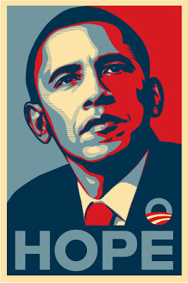
Speaking of fonts losing favor because of overuse, look what's happened to Gotham since the Obama campaign used it in their 2008 campaign. I first saw it used in the old Chicago 2016 olympics pitches [1], and then started seeing it more and more, but after the presidential campaign [2], it started showing up everywhere [3] to the point that it's lost much of its original power and mystique.

[1] http://sarabot2000.typepad.com/sara/images/2007/06/05/chicag...

[2] http://3.bp.blogspot.com/_4tQRaybbR9Q/TVIPdMUeGhI/AAAAAAAAA9...

[3] http://1.bp.blogspot.com/_4tQRaybbR9Q/TVIUjyKhjsI/AAAAAAAAA_...

Re: Why I created Comic Sans

#66
post #49
post #36

Earlier quoted context omitted.

>> Cambria and Calibri its default header and body fonts. >> A Serif title with Sans body-text for the web makes content easier to read, and the inverse is true for print. You are very correct. So, in a way, Microsoft got it all mixed up in the font selection thing mentioned above, no?

Cambia is a serif, while Calibiri is a sans. How is it mixed up?

A Serif title with Sans body-text for the web

the inverse is true for print. i.e., Sans for header and Serif for body for print documents.

Now, re-read this: Microsoft did partly address that by making Cambria and Calibri its default header and body fonts (for Word)

Did they get it mixed up? I think so.

Re: Why I created Comic Sans

#68
"Design for hackers" also has an interesting section about comic sans that can be found here as a blog post:

http://kadavy.net/blog/posts/why-you-hate-comic-sans/

Especially interesting is the discussion that comic sans is actually a good font when it comes to aliasing. ("Comic Sans isn’t Used as Intended")

Re: Why I created Comic Sans

#69
Regarding Comic Sans misuse, I suspect many people are looking for a "handwritten" font, of which Comic Sans is often the first similar sort of thing, and people gravitate to it.

Re: Why I created Comic Sans

#70

Comic Sans as a font needs no defense. Just like a good band with bad fans, we don't balk at Comic Sans, we balk at the people who use comic sans for inappropriate things. (Or to use a more computery analogy, there's nothing wrong with capital letters or all-caps, but some users use them inappropriately). City memo minutes should not be distributed in Comic Sans. Wedding invitations should probably not be in Comic Sa…

"Comic Sans as a font needs no defense."

I disagree, it's just not a good font. It has zero contrast (not suitable for display text and print), no harmony (not suitable for body text), and it's poorly hinted (not suitable for screen text). It looks more like finger painting than comic lettering [1]. It's not even a true sans serif; in the article, the author admits to cheating.

There are way better fonts that Microsoft could've licensed for MS Bob, like Helvetica Rounded [2] or Dom Casual [3].

[1] http://www.myfonts.com/fonts/hanoded/inky-fingers/

[2] http://www.myfonts.com/fonts/adobe/helvetica-rounded/

[3] http://www.myfonts.com/fonts/paratype/dom-casual/

Post reply on HN