> There are other aesthetics my brain associates with AI, like beige/cream colors, orange accents, and serif typefaces Something to consider regarding the narrow space AI-created designs align on: LLMs are trained to write consistent code. This makes sense for something like a billing or a backend function - you want that code to be consistent. The problem though is that LLMs write code to represent designs as well,…
The ramen one looks extremely AI. It's mostly the atrocious copywriting, and wonky responsiveness, but even overlooking those things you can tell. On the Tarot one, the 3D card in the bottom is both very elaborate and also pointless. No human would've put effort into making that. Not bad per se! But AI.
Specifically, AI loves to separate headers with //
Web devs gonna focus on web dev things. But, I’m more interested in the works of artists like https://www.rooperainisto.com/ and https://andreaciulu.com/ who embraced the glitchy aesthetic of early AI image generation and made it integral to their art instead of fighting it.
I don't think these look "bad" exactly, but they do look like AI, and I don't think that's just because I know they are.
I don't think I'd clock the ramen one as AI, if not for the main image being AI generated.
They both read as hyper-polished pastiches of existing, well-established aesthetics. The cyberpunk one in particular employs just about every genre trope I can think of. There's no sense of stylistic ingenuity or choice - e.g. deliberately breaking from convention or leaving things out.
An irony to this is that the front-ends generated by older models are gonna end up looking distinctive. If you rock a Claude Sonnet 3.7 (or was it Sonnet 4) mid-2025 purple gradient background forever you've set yourself well apart
Oh no, I just realised we’re going to have a nostalgia wave for old school AI in 20 to 30 years. Well maybe not you and I but it’s gonna happen.
The tiny icons are good. There was a touch device fad that surfaced, and is subsequently dying, now that people realise that using laptop screen realestate more efficiently helps those doing actual work.
Agreed. Maybe I'm in the minority, but in the screenshot comparisons I greatly preferred the AI products. The Mac OS stuff seems bloated.
I had the same reaction as well, the macOS designs looked busy and cluttered. I was surprised that AI companies had landed on something more refined.
If nothing else: why is the left sidebar in macOS Liquid Glass on a raised panel? There's no need for it, and that's a whole round-rect of unnecessary visual clutter that can be removed.
> There are other aesthetics my brain associates with AI, like beige/cream colors, orange accents, and serif typefaces Something to consider regarding the narrow space AI-created designs align on: LLMs are trained to write consistent code. This makes sense for something like a billing or a backend function - you want that code to be consistent. The problem though is that LLMs write code to represent designs as well,…
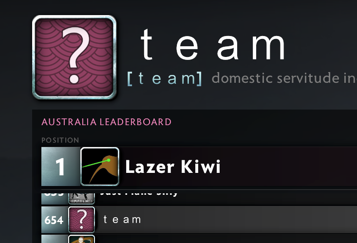
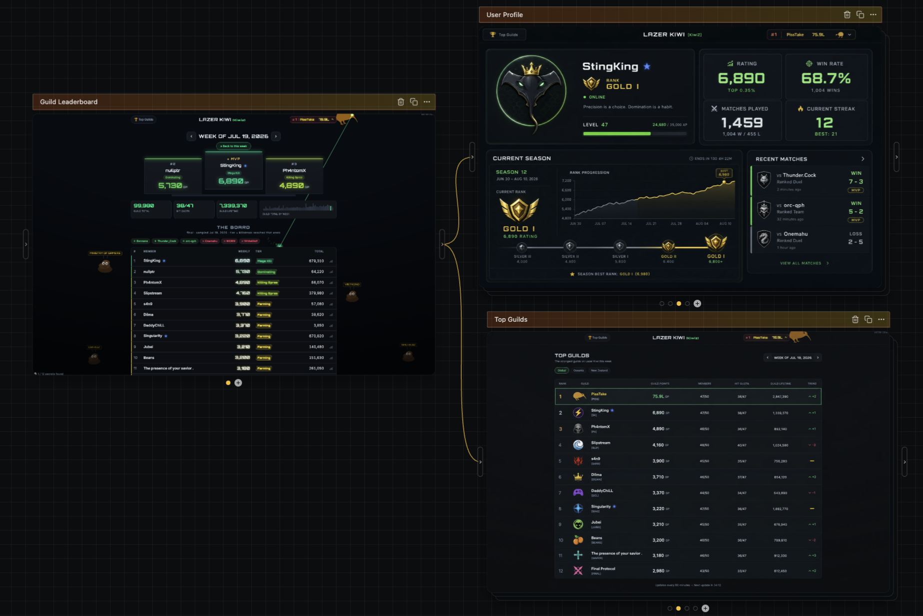
maybe, but you can do wacky things, eg I put together https://scores.lazer-kiwi.workers.dev/ It's a dota2 guild (#1 guild in autralasia) website and I have a bot that extracts the scores and publishes peoples progress on the website with a relatively basic table and stats, as a random side quest all kinds of weird stuff got built in ( you can shoot all kinds of things, if you hover over the number in the # column of…
You definitely can do fun/creative things with LLMs, but they need a lot more steering/handholding. IE if you add an additional page to the lazer kiwi leaderboard, it's likely the first pass will be somewhat more generic than the homepage.
One of the other advantages of diffusion is that it does really, really well with style transfer, meaning designing additional pages in the same style ends up pretty easy. As an example, here are designs of a user profile page and a top guilds page, using the look/feel of a screenshot of your homepage: https://image.non.io/5415e0e0-9264-4bad-988e-8d9d3885b518.we...
> There are other aesthetics my brain associates with AI, like beige/cream colors, orange accents, and serif typefaces Something to consider regarding the narrow space AI-created designs align on: LLMs are trained to write consistent code. This makes sense for something like a billing or a backend function - you want that code to be consistent. The problem though is that LLMs write code to represent designs as well,…
I tried your tool just now, on my iPhone. I am really kind of stuck and frustrated. I cannot get that first box, the one you can type into, that’s on a grid into a state where I can interact with it. Stuff is jumping around after I try to move the canvas around, unexpected stuff. I can’t figure it out.
Oof, apologies. I have not done any work at all on mobile to make this work.
> There are other aesthetics my brain associates with AI, like beige/cream colors, orange accents, and serif typefaces First, they took my em dash. Now, they’re taking my neutral background with orange accents.
They first starting appearing after Fable in my memory. The first HTML docs I generated with Fable had that cream serif with orange highlight look. I thought it looked awesome until I saw it on every other vibe-coded website...
> For example, there’s the hamburger menu (≡) which saw a proliferation during the rise of mobile due to the constraints around screen size. Speaking of this, GitHub replaced theirs with a pancake emoji. Maybe related to the stacked pull-requests announcement earlier today.