Live data from Hacker News

Screenshots of Old Desktop OSes

typewritten.org

301–310 of 407 posts

Re: Screenshots of Old Desktop OSes

#301

I really wish Windows 11 had a Windows 2000 mode. I want a grey, boxy UI, but I also want al the modern technologies Windows has introduced since—DirectStorage, D3D12, fast SSDs, device-independent pixels and vector UIs, all written directly against a Windows API that is modernised, safe, and easy to use. No React, no ads in my weather app; the only browser on my computer will be the browser itself.

Go with Win 10 LTSC or use Win Server as a daily. Both are crap-less and can be fully debloated in minutes.

Windows 10 doesn’t have the UI that the parent is asking for. Windows 7 was the last one that had that. Windows 11 isn’t much different in terms of UI from Windows 10 after tweaking a couple of things.
Re: Screenshots of Old Desktop OSes

#302

Earlier quoted context omitted.

But do you see that title bar buttons are bad explicitly because you have to hunt for title bar edges? That you were more or less forced to adopt these KDE shortcuts so that you could work around the fact that they had cannibalized the title bar for a purpose it was not designed for. You were forced to change your workflow and everybody else is having to be forced to adapt because they changed a metaphor that has rem…

The arguments in this thread-- amounting to "it's a good general practice because I happen to like it" (rather than "it is a sane / discoverable / usable default") are precisely demonstrating why these issues exist. UX design is treated as a subjective matter, as if it is equally valid to clearly label UI elements as it is to have magic, nondescript UI pixels that serve as vital control surfaces. Go watch videos of t…

I already weep deeply for what we have lost, and what we cannot imagine, and what we can imagine and build but nobody would use because they are too ignorant to learn and adapt.

My argument for the titlebar is that it was at least researched UI/UX convention done by Apple/IBM/Microsoft at the nascence of personal computing. These are the primitives that arose from that research.

It is not out of what I happen to like that I argue this. I personally am deeply frustrated by cursor-y window controls. I much prefer a tiled interface with a top menu bar and copious keyboard shortcut compositions. I, if I could, would Never use the mouse, and if I needed axial control for a 3d environment would prefer to use an analog stick of some sort. Unfortunately those are not the conventions we have for general computing, especially in the workplace.

We are in general forced to use the conventions given to us by the major OS providers. One of those used to be the titlebar, with which you could use the cursor to control the window. The insistence of the current tech industry to shove any button they like up there without regard for these conventions that have been set for decades (and were in many cases of this sin set by their company: M∫/M$ --the integral symbol is a slop 'S') is causing real economic harm in terms of lost productivity from broken muscle memory and wasted actions

Re: Screenshots of Old Desktop OSes

#303

Amazing walk through memory lane, and super useful. One big omission though - starting in the early 1990s, we should be seeing some Linux desktops in there, but I didn’t see any through 1995 or so when I stopped browsing. Also, Irix would be nice to get — although I don’t recall if SGI had much in the way of custom vibes for their window managers, they certainly had amazingly cool 3D demos. A nice vibe coding project…

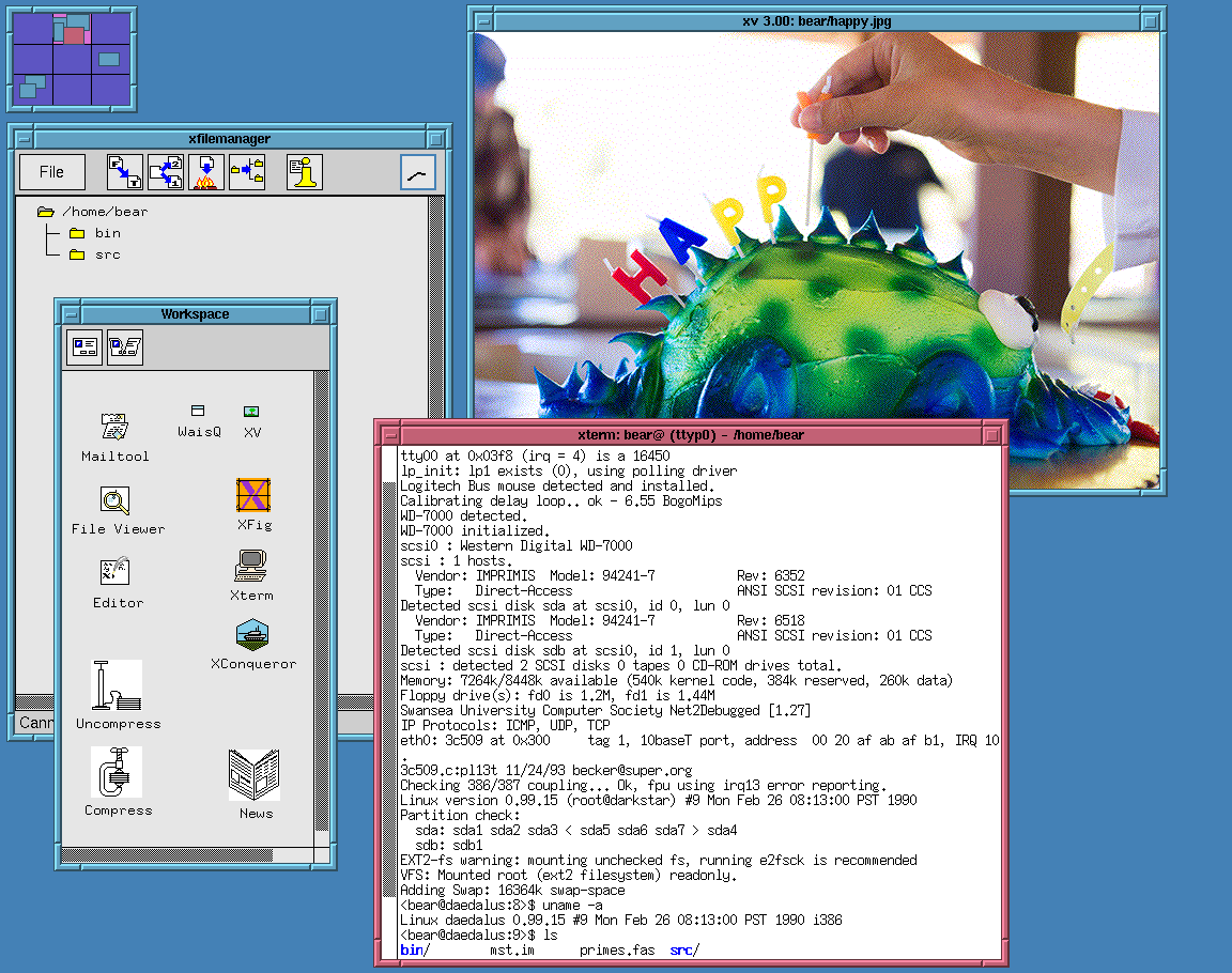
There's a Slackware screenshot from 1994:

http://www.typewritten.org/Media/Images/linux-0.99p15-fvwm-m...

Re: Screenshots of Old Desktop OSes

#304

Amazing walk through memory lane, and super useful. One big omission though - starting in the early 1990s, we should be seeing some Linux desktops in there, but I didn’t see any through 1995 or so when I stopped browsing. Also, Irix would be nice to get — although I don’t recall if SGI had much in the way of custom vibes for their window managers, they certainly had amazingly cool 3D demos. A nice vibe coding project…

Notably, NeXT scrollbars were also on the left edge of the window, the logic being that (at least for left-to-right languages) most people focus on the left side of the document more often. I remember liking it. I wonder why Apple swapped back to the right-hand scrollbars with OS X. I guess just because that's what classic MacOS and nearly everyone else did.

I wonder if it's righthanded mouse users? I'm using a vertical ergo mouse beneath my monitor, and your comment made me realize that it's quite similar to if I just.. reached for the scrollbar and pulled it. As opposed to having to cross the whole screen, metaphorically.

There's also the distraction factor. Maybe having the bar moving on the left edge competes with moving from line to line, and the general anchoring edge of the F shaped reading pattern.

Total speculation on my part.

Re: Screenshots of Old Desktop OSes

#305
post #49

Earlier quoted context omitted.

Operating systems of that era were designed based on UX research to help people use the unfamiliar operating system. Subsequent ones were designed by UI designers, and opinionated senior managers, who already knew how to use them, and took out usability features to make them "look nicer". This sort of worked when the opinionated manager was Steve Jobs. Most managers are not Steve Jobs. > in some applications they see…

> This sort of worked when the opinionated manager was Steve Jobs. Steve indirectly had a hand in this, by emphasizing the humanities. That, unfortunately, backfired as a sort of positive feedback loop. Someone hired a few underemployed artists onto the team, and the artists invited all their friends and soon took over the department. People that in an alternate timeline would be smoking weed whilst sculpting wood in…

> Can anyone name a single substantive UI improvement in the last 20 years?

That thing Windows has where you can drag a window to the top of the desktop and it pops up a few quick options for resizing. I would love it if KDE Plasma had this.

Re: Screenshots of Old Desktop OSes

#306

Earlier quoted context omitted.

> This sort of worked when the opinionated manager was Steve Jobs. Steve indirectly had a hand in this, by emphasizing the humanities. That, unfortunately, backfired as a sort of positive feedback loop. Someone hired a few underemployed artists onto the team, and the artists invited all their friends and soon took over the department. People that in an alternate timeline would be smoking weed whilst sculpting wood in…

> Can anyone name a single substantive UI improvement in the last 20 years? That thing Windows has where you can drag a window to the top of the desktop and it pops up a few quick options for resizing. I would love it if KDE Plasma had this.

I'm fairly certain (an earlier iteration of) that came out in Windows Vista which is nearly 20 years ago. It was called Aero Snap.

Re: Screenshots of Old Desktop OSes

#307
I live for Old UNIX screenshots, you just made my day, my week, my month ... ok my year! Thanks!

I also love to collect old xpm icons from that era, and try and assemble arcane FVWM configs that weave them in.

Oh, NsCDE is a great start if anyone wants to emulate some of the Solaris screenshots in the collection.

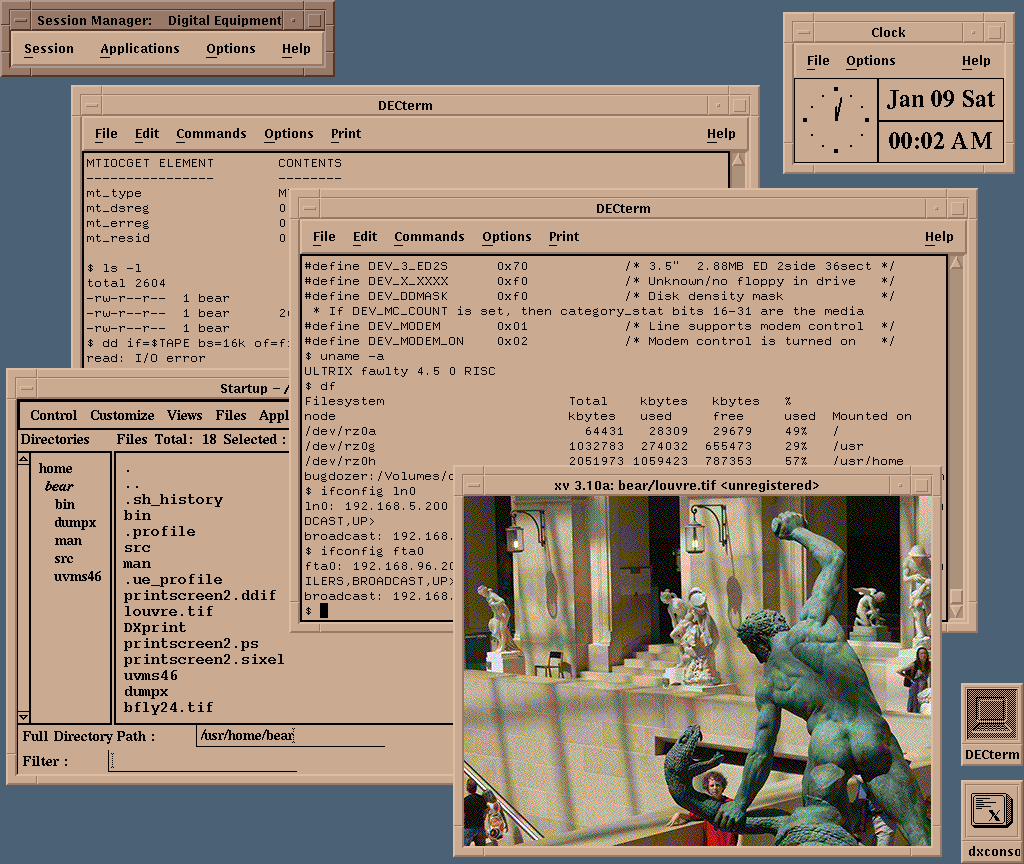
http://www.typewritten.org/Media/Images/decwindows-ultrix4.5... Reviewing the screenshots here, I realize profoundly that something about the idealism of the 1990s is baked into them; the 1990s a time before the bad vibes of commercialism mostly destroyed the interwebs.

Re: Screenshots of Old Desktop OSes

#308
post #96

Earlier quoted context omitted.

I am starting to think the top half of the screen should be the desktop, the bottom half should be the start menu but already activated and full of programs. No conventional bottom panel-bar with a start button. A right-most column should exist that fills up with a list of opened windows. [1] When I first saw Win95 with a cleared desktop, I immediately thought - where has everything gone? Why is this empty? Decades l…

I just turn off desktop icons. Bam! Problem of messy desktop goes away.

But how would I find notebook_file(12).txt?

Re: Screenshots of Old Desktop OSes

#309
post #49

Earlier quoted context omitted.

Operating systems of that era were designed based on UX research to help people use the unfamiliar operating system. Subsequent ones were designed by UI designers, and opinionated senior managers, who already knew how to use them, and took out usability features to make them "look nicer". This sort of worked when the opinionated manager was Steve Jobs. Most managers are not Steve Jobs. > in some applications they see…

My pet peeve is spacing. My usual resolution is 1920x1080 (scaled or not) and it feels I could cram more information in an old 1024x768 desktop. You have to maximize most windows to get it to show enough information.

Same here. The Teams meeting page layout pisses me off on a regular basis, with way too much useless space around everything, tons of unhideable icons and crap filling half the screen, and all the actual content crammed into a little box. I'm sitting here with a 4K 27" monitor and all that space and resolution is just wasted. Yeah you can work around it, but what a PITA.

Re: Screenshots of Old Desktop OSes

#310

Earlier quoted context omitted.

> Can anyone name a single substantive UI improvement in the last 20 years? That thing Windows has where you can drag a window to the top of the desktop and it pops up a few quick options for resizing. I would love it if KDE Plasma had this.

I'm fairly certain (an earlier iteration of) that came out in Windows Vista which is nearly 20 years ago. It was called Aero Snap.

I didn't know that. I actually used Windows until 2019 and only learned about this feature last week. Well, that does it: UI has only gotten worse.
Post reply on HN