[deleted]
Japanese game devs face font dilemma as license increases from $380 to $20k
161–170 of 213 posts
Re: Japanese game devs face font dilemma as license increases from $380 to $20k
#162Earlier quoted context omitted.
They indeed can but licensing on fonts from most companies is perpetual. Especially from the independent traditional ones. So its possible they might be bought in future but the new owner can't change license retroactively. Also there is very high chance they already got offer from HGGC and simply refused it, because some similar notably independent type foundries got bought recently.
What is a foundry?
Sorry. Its name for a company that designs/distributes typefaces. It is a relic from past to call it this. In the past those companies were not only designing the typefaces but also manufacturing the physical matricies that were cast from metal.
Its similar to how some people say leading to mean line height. Lead strips were used for space between lines of text.
Re: Japanese game devs face font dilemma as license increases from $380 to $20k
#163Earlier quoted context omitted.
What a wild take. Might as well ask why anyone should pay for anything once it's been made. While it's possible to commission a custom font and many companies do eg. Apple, IBM, Airbnb, Bytedance, Vercel, Github, Mozilla etc. Some even make them open source. However it's not really a viable option for anyone other than the largest organisations as it's far more expensive and time-consuming than just getting a licence…
> Might as well ask why anyone should pay for anything once it's been made. Nothing wild about it. That's simply the reality of intellectual work. Only the first copy need ever be paid for. That is the true cost of creation. The cost of all subsequent copies is approximately $0 with 21st century computer technology. All intellectual work is information. All information is bits. All sequences of bits are numbers. All…
Approximately no one would pay for the cost of any digital works in this model. A musician may take six months to compose a song. No one would pay 6 months salary for a song. This obviously leads to no one professionally creating anything.
Re: Japanese game devs face font dilemma as license increases from $380 to $20k
#164Earlier quoted context omitted.
When I select 'Japanese' on fonts.google.com the number of fonts drops from 1901 families down to 50. Selecting 'Hiragana and Katakana' raises the number to 81. That's still a lot of fonts, but it's not 2000. I guess designing a font for a language with 2100 different characters is probably a hassle.
> I guess designing a font for a language with 2100 different characters is probably a hassle. The ~2000 is the official count taught in schools, but the actually "commonly" used number in literature is around ~3000. And you actually want more than that, because people's names can use weird kanji which are used nowhere else. On the other hand, the vast majority of kanji are actually composed of a limited set of "subc…
For 楷書 type fonts this may be true, but you ought to know there’s more to it, don’t you?
Re: Japanese game devs face font dilemma as license increases from $380 to $20k
#165Monotype does not have the same consolidation with CJK when compared to the virtual monopoly it has with Latin script typefaces.
They still have a healthy selection of competitive companies to choose from such as Morisawa, Iwata, Motoya, Ricoh, JIYUKOBO, DynaComware, Arphic, Sandoll...
Re: Japanese game devs face font dilemma as license increases from $380 to $20k
#166Ah Monotype. Knew before reading the article it would be them. Their whole MO is buying up smaller type foundries, massively increasing the licensing fees and shaking down the previous customers. They send in auditors, demand to see traffic data and threaten fines. Happened to me twice now. Creating type is an extremely difficult and skilled discipline and designers deserve to be compensated fairly. However Monotype’…
The exact thing happened to us, too. Bought a font from a small foundry which then got acquired by Monotype two years down the road.
They started questioning us and assumed we had pirated the font. Send them the old receipt and told them politely to fuck off.
Never heard of them again luckily.
Re: Japanese game devs face font dilemma as license increases from $380 to $20k
#167Re: Japanese game devs face font dilemma as license increases from $380 to $20k
#168Earlier quoted context omitted.
I grew up in russia and every localized game always had godawful ugly thin fonts. I would always watch foreign gameplay videos with jealousy cause they had beautiful latin fonts. Now it's been years since I played a game in russian (almost a decade at this point I think) and I am so glad I don't have to put up with that anymore. Once in a while I see a screenshot from a cyrillic-using language translated game and pro…
It's the same for some non-Japanese games who don't take the time to think it through, worse case scenario is when they use Chinese fonts. Because Japanese and Chinese characters are slightly different, but Unicode decided to unify them under the same codes.... https://en.wikipedia.org/wiki/CJK_Unified_Ideographs
The same happens in reverse sometimes, e.g. the super skinny font in final fantasy pixel remasters:
https://images.rpgsite.net/image/da49c9a1/102696/original/FF...
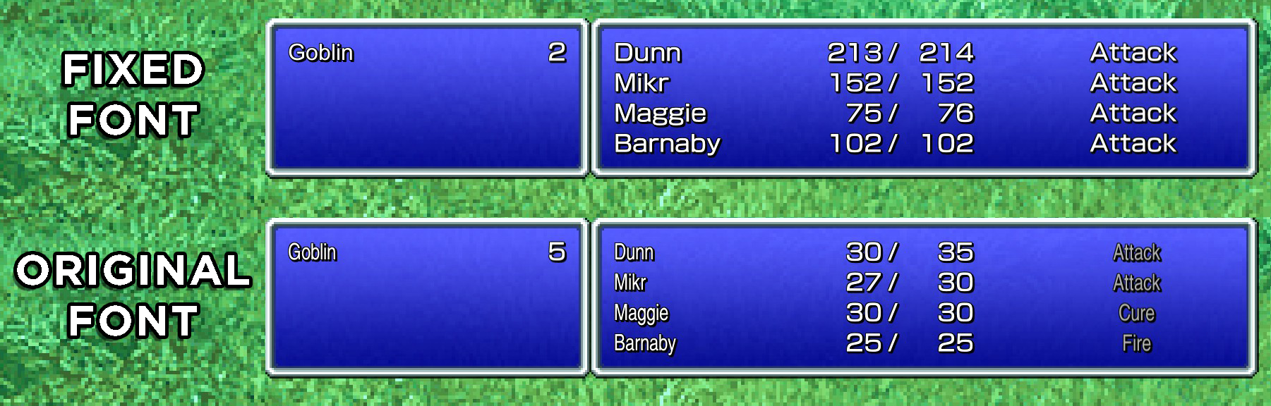
Ironically, they had a better Latin font _in the Japanese language version_ for all the genre loan abbreviations like MP/HP/LV etc., (https://terimaland.com/Memory/Steam_FinalFantasyPixelRemaste...) so that image is comparing the modded in Japanese Latin font vs the font the game includes by default.
(They also have a retro blocky "pixellated" font option iirc, which doesn't have the super narrow widths)
Re: Japanese game devs face font dilemma as license increases from $380 to $20k
#169Earlier quoted context omitted.
> I guess designing a font for a language with 2100 different characters is probably a hassle. The ~2000 is the official count taught in schools, but the actually "commonly" used number in literature is around ~3000. And you actually want more than that, because people's names can use weird kanji which are used nowhere else. On the other hand, the vast majority of kanji are actually composed of a limited set of "subc…
For 楷書 type fonts this may be true, but you ought to know there’s more to it, don’t you?
> For 楷書 type fonts this may be true, but you ought to know there’s more to it, don’t you?
With all due respect, this is the type of comment that really makes online discourse so exhausting.
Yes, I know! Unless you put up two pages of disclaimers and footnotes there's always someone who comes out of the woodwork and "um ackshually"ies you. It was only supposed to be a quick and dirty comment talking about the topic in general, and not an in-depth, ten page treatise on the subject.
If you have something to add to what I wrote, then please do so, but heckling random people who put up their comment up in good faith is not helping anyone.
Re: Japanese game devs face font dilemma as license increases from $380 to $20k
#170Earlier quoted context omitted.
> I guess designing a font for a language with 2100 different characters is probably a hassle. The ~2000 is the official count taught in schools, but the actually "commonly" used number in literature is around ~3000. And you actually want more than that, because people's names can use weird kanji which are used nowhere else. On the other hand, the vast majority of kanji are actually composed of a limited set of "subc…
Has anybody ever actually implemented an algorithmically composed kanji font? Because it seems like a hugely complicated undertaking. There are rules of thumb for how characters are composed, but getting something aesthetically pleasing out of the end result is more an art than a science. Even Korean Hangul, which is way simpler, has all sorts of funky kerning rules.
Droid Sans Fallback used this strategy during Android 1.x-2.x era. Its successor Noto Sans don't do the same.