Live data from Hacker News

Apple introduces a universal design across platforms

apple.com

91–100 of 1001 posts

Re: Apple introduces a universal design across platforms

#91

On top of wasting GPU cycles, such low-contrast graphics are terrible for older users. The Apple Music navbar is hilariously unreadable and distracting.

The URL bar at 02:11 in the video looks awful, with all the background shining through making the text hard to read from a distance. This is sort of hidden by the video having 3x zoom, making the text thicker, but unless they tweak the transparency it's gonna be a real visual mess on a real device.
Re: Apple introduces a universal design across platforms

#93
I really dig apple's work. It's so refreshing to get a tech event in 2025 where design is a huge focus and not just duck taping another LLM to everything. Design is expensive and it's clear they've invested a massive amount of resources into liquid glass. It's not perfect, but I think they'll iron out some of the contrast bugs.

Agreed with other commenters that crappy electron apps will look increasingly out of place (... slack ...). Too bad LLM's coding efficiencies haven't been used to try to get us back to native UIs from electron yet. Companies would rather pocket the savings.

Re: Apple introduces a universal design across platforms

#94
post #60

Every Electron app is going to feel incredibly out of place. And for the few that aren’t okay with feeling out of place, the devs of those apps will now have to contend with shipping more macOS specific styles and workarounds. I’m not looking to discuss Electron performance/etc so please ditch that discussion before it starts. I just find it interesting how comparatively tricky this particular UI styling might end up…

I mentioned this elsewhere, but if LLMs are improving developer performance so drastically, why are none of these gains being used to get back towards native app development?

Re: Apple introduces a universal design across platforms

#95
post #67
post #60

Every Electron app is going to feel incredibly out of place. And for the few that aren’t okay with feeling out of place, the devs of those apps will now have to contend with shipping more macOS specific styles and workarounds. I’m not looking to discuss Electron performance/etc so please ditch that discussion before it starts. I just find it interesting how comparatively tricky this particular UI styling might end up…

I won't be surprised if we see a CSS filter that attempts to model this in Safari. Then it'll just be a question of whether Chromium (and thus Electron) get it.

Yeah, for sure. That solves part of it.

Re: Apple introduces a universal design across platforms

#96

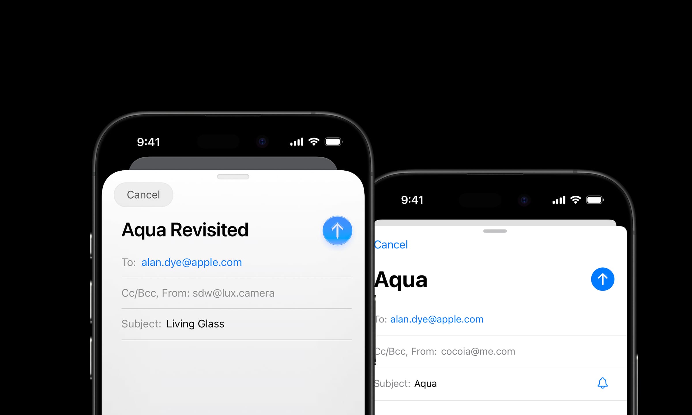
https://www.lux.camera/physicality-the-new-age-of-ui/ This blog's prediction got remarkably close. I've been a sucker for glass UI since the first Longhorn (later Vista) screenshots.

I figured out why I don't like the icons

https://www.lux.camera/content/images/size/w2400/2025/05/Mai...

zoomed out they look blurry and unrefined, but when viewed zoomed in and large (like how a designer probably created them) they look kinda nice. Too bad they will all be small on iphone.

Re: Apple introduces a universal design across platforms

#98
We have these brilliant high resolution displays, and these powerful, energy efficient GPUs that are always running and compositing frames like a game engine 120 times a second.

It's about time we start seeing more physicality in our user interfaces!

We can make things look convincingly like glass, or metal, or even materials that don't exist in reality. One reason for flat design is because it was the lowest common denominator and easy for devs to implement. If Apple makes it easy to implement this liquid glass stuff - Rectangle().background(.glass) or something - then it's going to be really successful.

Post reply on HN