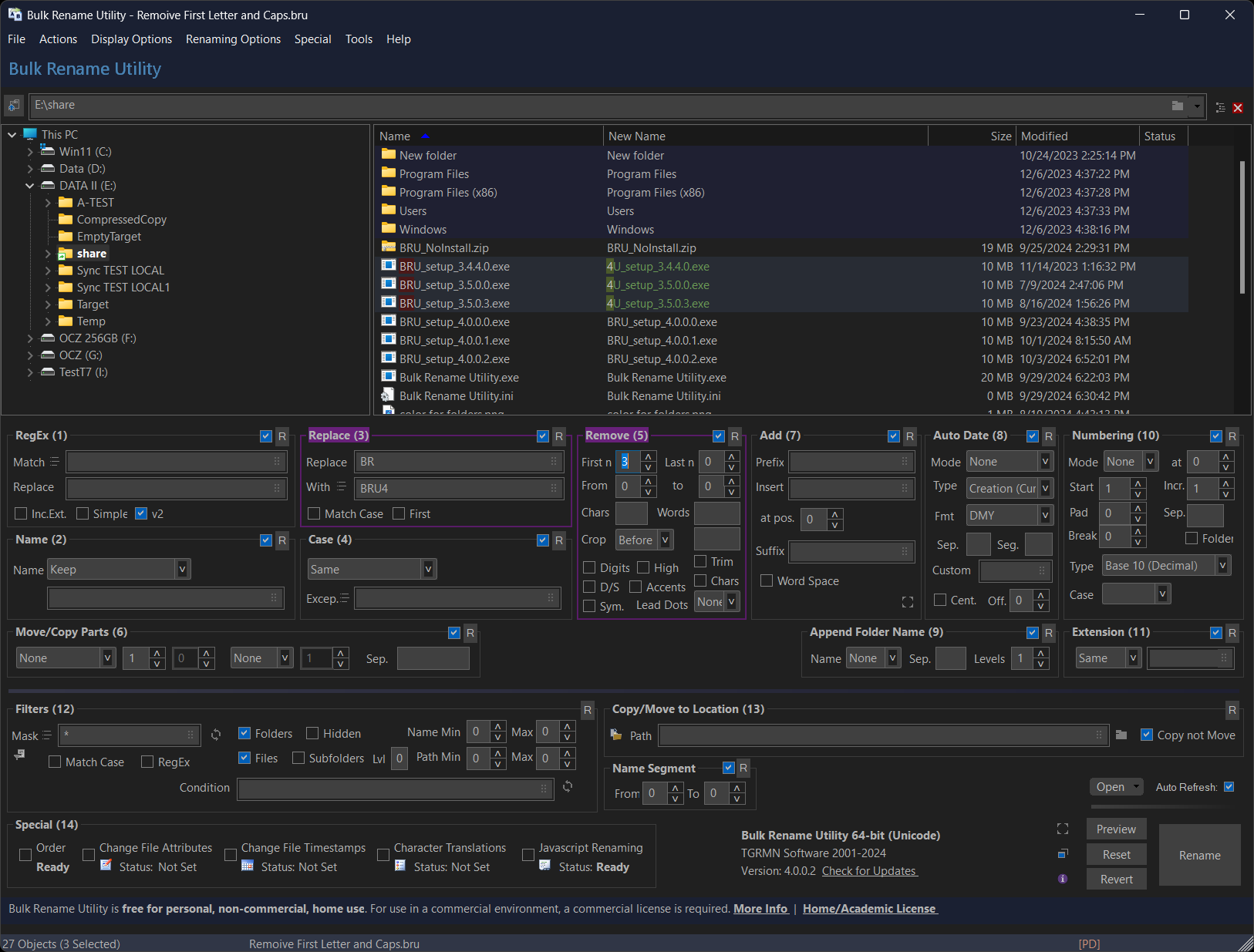
This is probably the most densely packed ui I have ever used[1] to rename photos from their EXIF data. It's not pretty, but I prefer this over a ten step wizard.
[1] https://www.bulkrenameutility.co.uk/assets/img-bru/darkmode....
241–250 of 392 posts
[1] https://www.bulkrenameutility.co.uk/assets/img-bru/darkmode....
This is probably the most densely packed ui I have ever used[1] to rename photos from their EXIF data. It's not pretty, but I prefer this over a ten step wizard. [1] https://www.bulkrenameutility.co.uk/assets/img-bru/darkmode....
Here is another utility that I use every day: https://www.mythicsoft.com/agentransack/information/#screens...
In one component you can see temp highs/lows, precipitation, cloud cover, humidity, wind speed, etc. by the hour, for the next week.
Full disclosure: I worked on this as a junior engineer, the lead engineer was fantastic. The code hasn't changed in 10+ years.
[0]https://www.wunderground.com/forecast/us/ca/san-francisco/37...
https://old.reddit.com We used to have an even denser display, but they sadly got rid of it. It was the original reddit mobile interface (served as a webpage, not an app). There is a screenshot on this blog post (by one of the guys who worked on it): https://pdx.su/blog/2023-04-06-rip-reddit-compact/
(Figure-ground is how we perceive three-dimensionality in a 2D space.)
This is one of the best arguments for skeuomorphism I've read. It doesn't address the _look_ (ie, brushed metal) but it absolutely addresses the _style_ (looks like a real toggle switch, a real button, etc.)
Craigslist!
Something you'll find in both ableton and after effects are smart, adaptable panel abstractions/conventions. Both have fairly rigid application frames and large distinct sections where discrete types of work happen. But they also have panels where things can get nearly to a free for all. Think custom video effect controls, or individual midi instruments. There are norms (knobs look and work similarly), but things can get totally custom as well (custom graphs, etc). Lastly, at the very edge (~1% of use cases), there are ways to escape the constraints of UI entirely. AE has a code editor for things like custom wiggle animations. Ableton has M4L (which subsequently supports JS and possibly some C, IIRC). You can get yourself into trouble here in ways you normally couldn't: it's possible to straight up break things.
Greedy whitespace nonwithstanding, the most pernicious modern UI trend you'll need to buck is the idea that your UI should be simple because it is for simple people. Sometime UI is cluttered because of sloppy design or bad abstractions. Sometimes UI is cluttered because it's meant to empower people who think and care about multiple things simultaneously. Modern UI trends will tell you not to serve a man a steak because a baby can't chew it. Serve steak, babies be damned.
I guess that was mostly about functionality, and only adjacent to density. For actual density: vintage (2016ish?) 538 tables, vintage (pre 2010?) stockkeeping and cashier UI. These are basically TUIs with just a hair more polish. * Much less text heirarchy. This means even line heights, which means easy dense grid layouts. Achieve contrast with boldness rather than size, side borders, inverted backgrounds, etc. * The opposite extreme: very big items for very big tasks. Wide touch areas for each food item that a server can rapidfire tap through, everything else tucked to the side. * Thoughtful truncation: grid layouts often ask that things overflow. Do they elipsis at the end? Do they drop the middle? Do they condense 3 pieces of information into 3 smaller pieces of information? Etc. * Prefer text to icons for all buttons, menus, etc. A tab menu of just text is easy to parse. Icons add noise, and non-text buttons force users to speculate instead of read. * Intentionally non-responsive panels. Having fixed sizes for sidebars, panels, etc makes it easier to reason about how subcomponents snap to grid, and greatly shrinks the workload created by having to allow for fluid item reflow.