Live data from Hacker News

Ask HN: What are good high-information density UIs (screenshots, apps, sites)?

news.ycombinator.com

221–230 of 392 posts

Re: Ask HN: What are good high-information density UIs (screenshots, apps, sites)?

#221

Google now forces designers to make huge interfaces on mobile. Tap targets smaller than 54px get a “tap target too small” penalty applied to the sites usability score. This score in turn can hurt your rankings for mobile searches. Which can in turn damage your business. So what are we to do?

The 48x48px touch target is estimated to be ~9mm. That's tiny for touching by finger, since you can't see through your finger to aim (styluses could do it). For mobile, look for UX patterns that don't hinge on my big thumb hitting a tiny patch of screen. For example, gestures like swipe to either side to expose actions for item. Most of the things talked about in this thread are not mobile UIs, and are not limited by…

Yeah, I have really big fingers as well. However for web forms, this rule really does make everything look too big IMHO. There are cascading impacts of these decisions as well, a field which is 48px tall must have a significant amount of padding around it as well, to look balanced with the field size. Typically the rule of thumb i've seen designers use is 50% of the field height. When you factor in field label sitting above the field things get even bigger. I did however recently find a pretty nice solution which moves the field label inside the field, allowing for a slightly more compact layout while still hitting the tap target size requirements. https://m2.material.io/components/text-fields#filled-text-fi...
Re: Ask HN: What are good high-information density UIs (screenshots, apps, sites)?

#222

Earlier quoted context omitted.

Came here to say the same. Old Reddit is such a fantasticly dense, yet readable UI. It doesn't have too much whitespace, but there is enough so there's always room to click on nothing. It is absolutely my preferred UI for consuming large amounts of information quickly.

Reddit absolutely dropped the ball with the redesign

And they keep dropping it...

They migrated from that React SPA to Lit web components and the UX still sucks

Re: Ask HN: What are good high-information density UIs (screenshots, apps, sites)?

#223
post #218

Earlier quoted context omitted.

So, SPAs are the communism of the web app world?

I have no idea what you mean.

I assume the analogy meant, "It's great in theory, but in practice no one does it right."

Re: Ask HN: What are good high-information density UIs (screenshots, apps, sites)?

#224

I'm working on a Hacker News front page with the idea of UI density as a foundational concept. https://hcker.news I haven't did a Show HN yet but I'd love to get some feedback on it first. It's got a lot of configurable views and can be made extremely dense (dense mode on + columns: auto). The aesthetic itself was made to deviate as little from the HN frontpage as possible. It's got a lot of filtering knick knacks li…

One of my biggest gripes against HN's front page is that there's so little context to go on --- just an My own news-page rewrite includes several paragraphs of lede context, which is probably a bit on the overkill side. But a hundred characters or so should help.

I'm also wrestling with the sort-order aspect. Current cut is time-ordered within sections (another thing I wish HN had), but I'm going to be extending the article count in the next iteration.

That said, your design is clean and light, I like it.

Re: Ask HN: What are good high-information density UIs (screenshots, apps, sites)?

#225

https://www.edwardtufte.com/

The premise of Tufte's work make sense until you try to apply it to functional and usable user interfaces. He has strong opinions strongly held but as someone who's designed industrial strength UIs for over 20 years (networking CLIs & UIs, CAD modeling/simulation, Devops dashboards, cybersecurity tooling) I've read all his books, attended his lectures... he's a king with no clothes

[deleted]

Re: Ask HN: What are good high-information density UIs (screenshots, apps, sites)?

#226
I’m making a new version [1] of https://www.physician.fyi that has this as a key trait since I'm trying to show medical practitioners' complete individual profiles as well as aggregate patterns across practitioners. I took inspiration from https://www.plasticlist.org. I'm still trying to figure out how to integrate the chart(s) and map now, so I'd appreciate any ideas.

[1] https://ibb.co/VYQpcz9Z

Re: Ask HN: What are good high-information density UIs (screenshots, apps, sites)?

#227
post #180

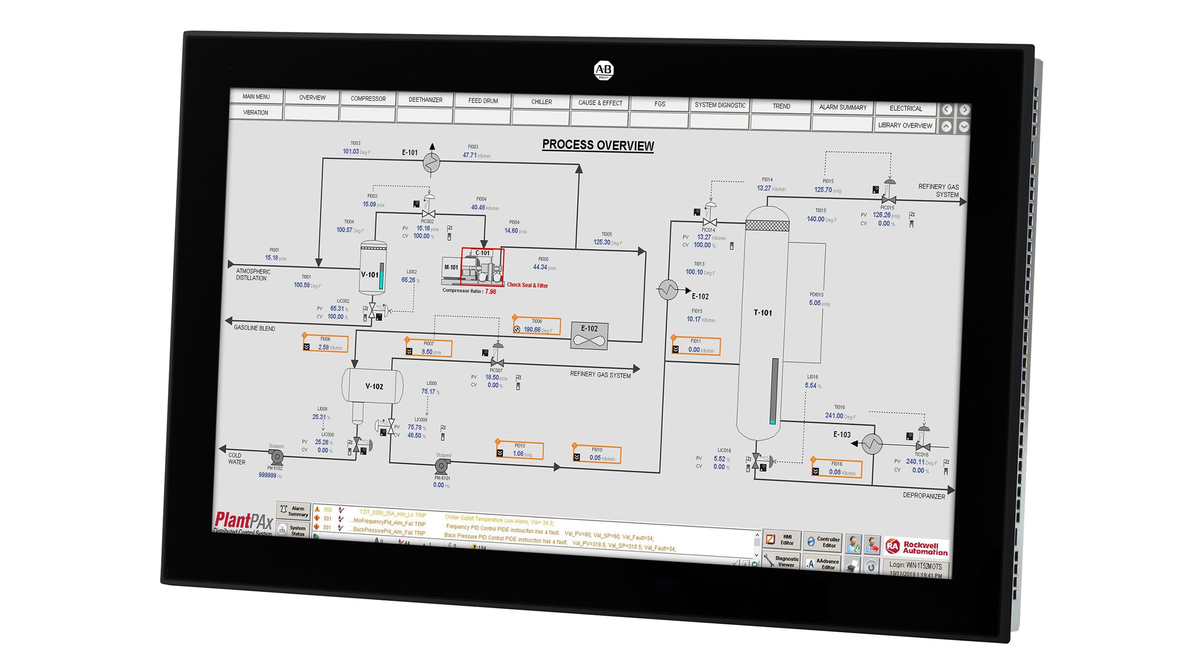
Do an image search for SCADA, they are the most information dense systems I've ever worked with.

General PLC HMI (Programmable Logic Controller, Human Machine Interface) design as well. Here's a good example:

https://rockwellautomation.scene7.com/is/image/rockwellautom...

Not only is this showing details for every tank, valve, pump etc in the system, it's also highlighting those which have warnings or alarms against them, so the operator knows which values are nominal and which ones need action to be taken. Depending on the system, you may also be able to tap on each value to pop up a dialog which shows that value on a graph, lets you set alarm thresholds, or lets you switch a piece of equipment from automatic to manual control (from the operator station) or local control (from physical buttons on the equipment) or maintenance mode (safely locked out).

I'm not claiming that all of these SCADA/PLC HMIs are good, but they're really interesting examples of what a user interface can look like when information density and usability matters more than being pretty, and where you can require your end users to have training to use the system.

Re: Ask HN: What are good high-information density UIs (screenshots, apps, sites)?

#228
post #21

I didn't see anyone mention the McMaster-Carr website [1]. It may not be the "densest" out there, but it's clean, functional, and nicely presents a lot of information at once. [1] https://www.mcmaster.com/

Wow that’s beautiful. The grayscale works surprisingly well with high fidelity. Thanks for sharing

Re: Ask HN: What are good high-information density UIs (screenshots, apps, sites)?

#229
post #106
post #86

I really like the density and legibility of weather underground's forecasts: https://www.wunderground.com/forecast/us/ca/san_jose

Used to be so much better before the acquisition, but I agree, they were wonderful at it for a while and some of the UI remains.

Agree. Weatherspark is great too — https://weatherspark.com/map?pageType=4&yearNumber=2025&ids=...

Each of those icons is a full year of weather data. Left to right is Jan to Dec. Bottom to top is the hours of the day. The pixel color tells you cold vs hot.

Post reply on HN