[deleted]
Ask HN: What are good high-information density UIs (screenshots, apps, sites)?
91–100 of 392 posts
Re: Ask HN: What are good high-information density UIs (screenshots, apps, sites)?
#92Chrome debugger tools? htop? visidata [1]? Clicker games are interesting in that they start bare and end up filling the screen with controls. Rerun visualizations come to mind too [2].
--
Re: Ask HN: What are good high-information density UIs (screenshots, apps, sites)?
#93We think about information density a lot at Levels.fyi. I don't think we're perfect but we do have a fairly dense UX: https://www.levels.fyi/t/software-engineer?countryId=254&cou...
Re: Ask HN: What are good high-information density UIs (screenshots, apps, sites)?
#94Agoda has worked well for me.
Re: Ask HN: What are good high-information density UIs (screenshots, apps, sites)?
#95Datadog does a good job with their logs explorer and custom dashboards.
Re: Ask HN: What are good high-information density UIs (screenshots, apps, sites)?
#96The Outlook calendar comes to mind: https://aspisfun.com/blog/wp-content/uploads/2022/08/outlook...
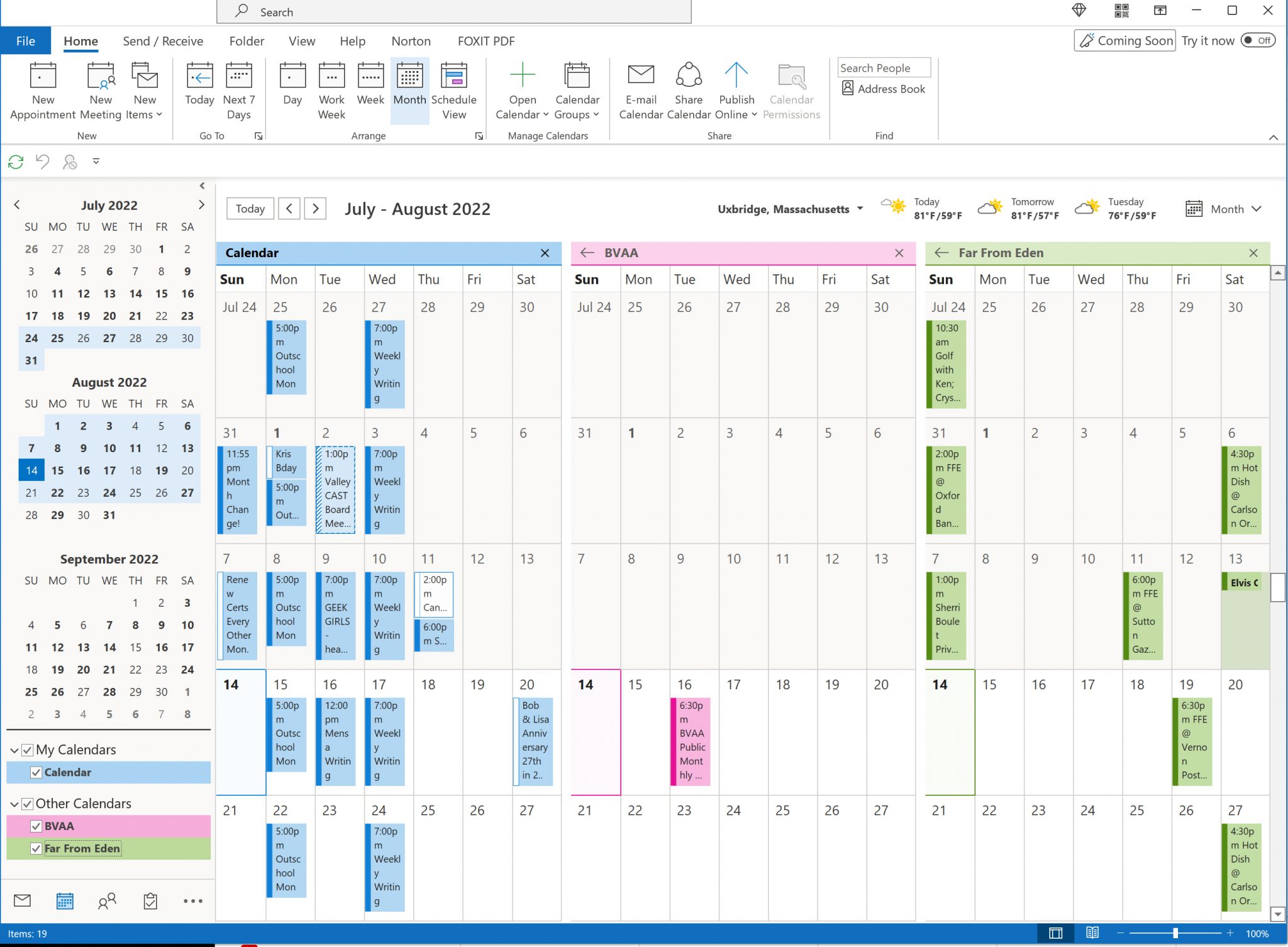
More: https://www.google.com/search?udm=2&q=outlook+calendar
Re: Ask HN: What are good high-information density UIs (screenshots, apps, sites)?
#97I think e621 would count. (Disclaimer it's a highly NSFW furry booru so I'm not going to provide a link on HN)
It has has one of (if not) the best tagging systems of any website and between the tags and search filters you can find anything you like.
Each page has a header with useful links, a list of tags to the left, and a grid of paginated images with basic stats on the rest of the page. Click an image and you get a bigger version of it with download options, all of the tags that apply to it specifically, and comments from users.
It's basically as good as it can be.
Re: Ask HN: What are good high-information density UIs (screenshots, apps, sites)?
#98Programs used by pro creatives. Some people regularly spend 8h/day using a single such product as their primary work tool. E.g. pro desktop versions of photo, print, video, sound, etc editing software usually feature good UX and high information density. One well known example of that is Blender - here is a chapter from their manual about its user interface: https://docs.blender.org/manual/en/latest/interface/window_…
This is the answer! Information density is not inherently a virtue. For many tasks, you want to focus the user's attention, which usually means less density. But professionals often want as much as possible accessible from a single screen, so they don't need to click around too much.
In addition to creative software, look at professional stock/crypto trading platforms, EHRs, POS systems, CRMs, or any software targeted at a vertical—veterinarians, fleet management software, etc. Many of them will run counter to "good UI" best practices. But if you interview their users, you might be surprised by what they love about these interfaces.
Re: Ask HN: What are good high-information density UIs (screenshots, apps, sites)?
#99Earlier quoted context omitted.
And there's something utilitarian in its internal and external design. No flashy, no fancy.. 99% informational and low lag.
The low lag part is especially impressive. Here is Wes Bos taking a deeper dive into the intricacies of technologies used to accomplish this: https://www.youtube.com/watch?v=-Ln-8QM8KhQ
tl;dw - ASP.net, image sprites, yui, jquery, preloading, and caching
Re: Ask HN: What are good high-information density UIs (screenshots, apps, sites)?
#100I didn't see anyone mention the McMaster-Carr website [1]. It may not be the "densest" out there, but it's clean, functional, and nicely presents a lot of information at once. [1] https://www.mcmaster.com/
I'm going to go against the crowd and say that I prefer DigiKey and Mouser's sites over McMaster. The filter/apply pattern they use when trying to narrow things down is a lot quicker than waiting for Mcmaster's auto updating window. Usually, when I'm looking for something, it's not for an exact specific item, but to know what options are even there in the first place. Selecting ranges of things in McMaster has always felt a little cumbersome, but Digikey has always had it right.
The other thing McMaster does that's kind of annoying, but also kind of funny, is that they go out of their way to purge the branding of the items they stock. Very understandable why they do that, but sometimes they do it when it doesn't make sense. Want to buy a generic "graphing calculator" for $126 which is definitely not a Texas Instruments TI-83 Plus? Here you go! [1]. Look, you're not fooling anybody here.