Live data from Hacker News

Iconography of the PuTTY tools

chiark.greenend.org.uk

31–40 of 108 posts

Re: Iconography of the PuTTY tools

#31

> Providing a plain black-and-white version was another standard recommendation at the time. But I can’t remember why – I certainly never actually saw a computer running Win95 or later with a B&W display! Windows 95 can be convinced to run in monochrome: http://toastytech.com/guis/miscw95bw.png (from http://toastytech.com/guis/misc2.html )

monochrome displays were common in low end laptops, but they were so expensive there weren't many around.

Re: Iconography of the PuTTY tools

#32
post #11

> I can’t remember why the lightning bolt was yellow. With hindsight that seems the strangest thing about it; cyan would have been a more obvious choice for electricity. Possibly it was just to contrast more with the blue screens of the computers. I had to stop and consider this, because it seemed to me that yellow was "obviously" the correct color. And indeed a few image searches confirmed this: a yellow lightning b…

this also caught my attention. the author also questions why the screens are blue I think he has just forgotten that in the late 90s, these color choices were entirely obvious and followed the Windows design precedent, which is why he probably didn't think much about it at the time

I'd accuse windows of knowingly setting expectations by choosing a blue screen as the default, but they were using it before the BSOD was even a thing

Re: Iconography of the PuTTY tools

#33
post #19
post #11

> I can’t remember why the lightning bolt was yellow. With hindsight that seems the strangest thing about it; cyan would have been a more obvious choice for electricity. Possibly it was just to contrast more with the blue screens of the computers. I had to stop and consider this, because it seemed to me that yellow was "obviously" the correct color. And indeed a few image searches confirmed this: a yellow lightning b…

Simon Tathum is British and I have never knowingly seen a lightning bolt coloured cyan hereabouts. Our "Danger of death" signs are black on yellow (1) To be fair an image search for lightning does look decidedly cyan on royal, with purple, red and more options. (1) https://www.hse.gov.uk/electricity/nearelectric.htm#signs

*Tatham

Re: Iconography of the PuTTY tools

#34
PuTTY icons stand the test of time. Literally looks like it’s out of 1996. While SVG versions are nice, it would have been a great opportunity to introduce a cleaner, more modern style. I digress though, I bet people would riot because they can’t find it in their start menu.

Congrats on the revamp. My ADD pixel brain always looked at the lightning bolt with cringe as it activates my OCD “pixel lines need to be perfect”.

Re: Iconography of the PuTTY tools

#35
post #19

Earlier quoted context omitted.

Simon Tathum is British and I have never knowingly seen a lightning bolt coloured cyan hereabouts. Our "Danger of death" signs are black on yellow (1) To be fair an image search for lightning does look decidedly cyan on royal, with purple, red and more options. (1) https://www.hse.gov.uk/electricity/nearelectric.htm#signs

*Tatham

My finger slipped across most of the keyboard, or I fucked up.

You decide!

Re: Iconography of the PuTTY tools

#36
post #24
post #19

Earlier quoted context omitted.

Simon Tathum is British and I have never knowingly seen a lightning bolt coloured cyan hereabouts. Our "Danger of death" signs are black on yellow (1) To be fair an image search for lightning does look decidedly cyan on royal, with purple, red and more options. (1) https://www.hse.gov.uk/electricity/nearelectric.htm#signs

Perfectly documented warning stickers for everything is such a British thing. Together with fused plugs and on/off switches for every socket. As a foreigner who lived in London for a few years I believe the UK leads the world in self-deprecation. No country complains about itself more while being so absurdly well-organized.

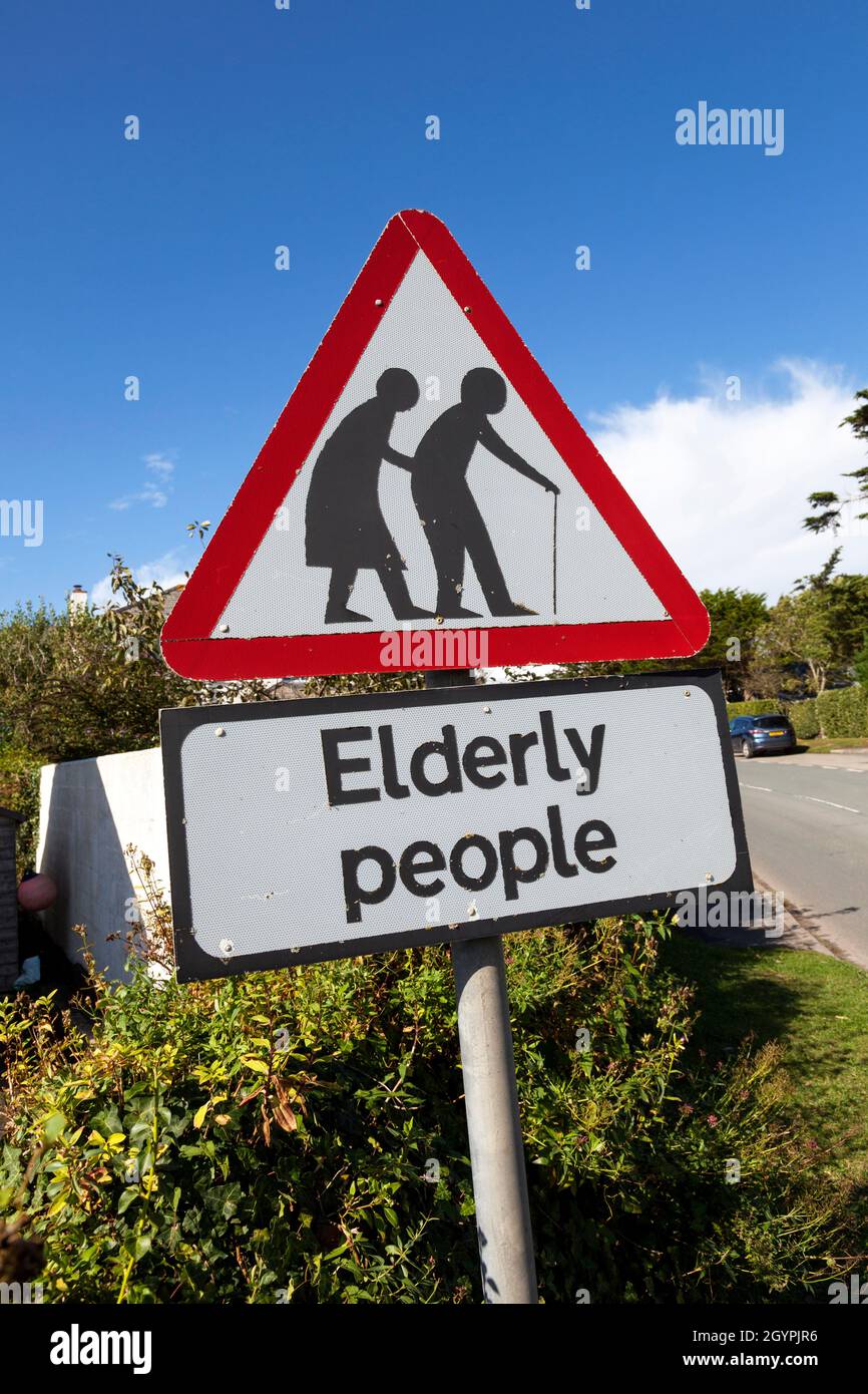
The "Elderly People" road signs win for me: https://c8.alamy.com/comp/2GYPJR6/an-elderly-people-roadside...

The first time I saw one of these I stopped to take a picture. It just seems the most ridiculous thing to warn people about, as if somehow "elderly people" can't cross the road.

Re: Iconography of the PuTTY tools

#37
post #36
post #24

Earlier quoted context omitted.

Perfectly documented warning stickers for everything is such a British thing. Together with fused plugs and on/off switches for every socket. As a foreigner who lived in London for a few years I believe the UK leads the world in self-deprecation. No country complains about itself more while being so absurdly well-organized.

The "Elderly People" road signs win for me: https://c8.alamy.com/comp/2GYPJR6/an-elderly-people-roadside... The first time I saw one of these I stopped to take a picture. It just seems the most ridiculous thing to warn people about, as if somehow "elderly people" can't cross the road.

I'd saw we need them in the US, but no one walks here - and by the way people ignore the warning signs for children, I assume it'd have no effect anyways.

Re: Iconography of the PuTTY tools

#38
post #24
post #19

Earlier quoted context omitted.

Simon Tathum is British and I have never knowingly seen a lightning bolt coloured cyan hereabouts. Our "Danger of death" signs are black on yellow (1) To be fair an image search for lightning does look decidedly cyan on royal, with purple, red and more options. (1) https://www.hse.gov.uk/electricity/nearelectric.htm#signs

Perfectly documented warning stickers for everything is such a British thing. Together with fused plugs and on/off switches for every socket. As a foreigner who lived in London for a few years I believe the UK leads the world in self-deprecation. No country complains about itself more while being so absurdly well-organized.

"while being so absurdly well-organized."

I note a z in organized ...

I do get where you are coming from: My mum used to joke about a fictional sign that said "Please do not throw stones at this sign". Some of our signage is absolutely laughable.

We do have road signs that proclaim: "New signage" or "New road system" etc. The locals know what has changed already and non locals are encountering it for the first time anyway, so why bother.

Across the entirety of the UK, our road signage is pretty rock solid. There may be a few degenerate cases but all sharp corners have chevron warning signs and they do save lives.

Re: Iconography of the PuTTY tools

#39
> So I wrote a piece of code that drew all the components of each icon image in a programmatic way

I was fortunate enough to spend a bunch of time hanging out with Simon in the 2000s and learned a great deal about a bewildering array of topics, and the above is such a representative example of the way he approaches problems.

Re: Iconography of the PuTTY tools

#40
post #38
post #24

Earlier quoted context omitted.

Perfectly documented warning stickers for everything is such a British thing. Together with fused plugs and on/off switches for every socket. As a foreigner who lived in London for a few years I believe the UK leads the world in self-deprecation. No country complains about itself more while being so absurdly well-organized.

"while being so absurdly well-organized." I note a z in organized ... I do get where you are coming from: My mum used to joke about a fictional sign that said "Please do not throw stones at this sign". Some of our signage is absolutely laughable. We do have road signs that proclaim: "New signage" or "New road system" etc. The locals know what has changed already and non locals are encountering it for the first time a…

> We do have road signs that proclaim: "New signage" or "New road system" etc. The locals know what has changed already and non locals are encountering it for the first time anyway, so why bother.

I'm not sure it's as absurd as it sounds. Do you look at the signage you pass every day? I suspect I don't.

When they put in a new stop sign near where I live (in the US), things were less safe for a long time because people consistently drove through it without slowing. Since this was not a consistent problem with any other stop sign nearby, I believe it was not willful disobedience but people so used to there being no stop sign there that they literally didn't see it.

(Even with literal neon pennants on it, people kept driving through it anyway, but you'd at least sometimes see people skid to a stop partway through the intersection, presumably as their brains caught up. And eventually it penetrated locals' consciousnesses, and now they stop.)
Post reply on HN