Earlier quoted context omitted.
The second diagram is hard has what seems to be bitmap fonts and uses a flowing set of similar colours, making it harder to distinguish between the manufacturers, rather than distinct ones. While making for bad UX, it doesn't change the truth of the information at all, and it would be easy to fix these issues. Edit: Looks like someone already has: http://9to5mac.com/2012/07/13/nielsen-needs-to-work-on-their...
Fonts are still smaller to read, and Symbian, etc. are omitted from the labels. It also conveys a lot less information.
Lying with pictures: Smartphone manufacturer share by OS
31–40 of 75 posts
Re: Lying with pictures: Smartphone manufacturer share by OS
#32The original person who noticed this was a writer from 9to5mac and he made his own more accurate graphic a few days before this post was written. http://9to5mac.com/2012/07/13/nielsen-needs-to-work-on-their...
and I was having a hard time telling what % HTC for WinPhone 7 had in the OP. Again, this version might be proportionally more accurate, but it drastically reduces the amount of information. Nielsen's is the best so far, by far.
Re: Lying with pictures: Smartphone manufacturer share by OS
#33To compound that by appearing to have proportional sizes, but being completely wrong, is humorously incompetent. Reminds me of those joke maps showing NYC as dominating the US.
Re: Lying with pictures: Smartphone manufacturer share by OS
#34Why? Because if you make them perfectly proportional, the labels are hard to read. ;-) For example, try actually making sense out of the second diagram on that site. It's far harder to read than the first. You can actually only make sense of it by cross-referencing with the first diagram.
Re: Lying with pictures: Smartphone manufacturer share by OS
#35Earlier quoted context omitted.
There's more at stake than that -- malice or not, a simple, tidy diagram can bypass a human's critical faculties and increase the feeling that the false data (and whatever it's conclusion) are more true. For a statistical research organisation, this is straight up neglect! Part of my job involves electrical drafting, and though I'm positively anal about my drawings, if I manipulate the design to make the drawing more…
How much does it matter, though? A pie chart would paint a very different picture, with iOS as a clear minority.
Since 50% isn’t really a very important threshold (though that could be argued) I would very much argue against using a pie chart. (I prefer areas or lengths to angles.) Plus, a pie chart wouldn’t make it easy to add platform subdivisions.
Re: Lying with pictures: Smartphone manufacturer share by OS
#36Mind you, this is a good statistics lesson. My teenage students might get quite interested in a 'discussion' of the relative merits of various kinds of phone, before representing the data and then comparing it to UK.
US Mobile phone market share by OS and maker
Android 51%
Samsung 17%
HTC 14%
Motorola 11%
Other 9%
iOS (Apple) 34%
Blackberry 9%
Windows Mobile 3%
HTC 2.9%
Palm 0.1%
Other 0.2%
Windows 7 1.3%
HTC 0.5%
Samsung 0.5%
Nokia 0.3%
Symbian 0.9%
WebOS 0.6%
Above needs a clearer indication that the OS percentages are totals, and then split by manufacturer. I might try a two entry table so you could get market share by manufacturer or by OS, but then quite a few are single OS manufacturers.I find the rounding of the larger market shares to nearest percent a bit worrying given that Palm is being listed as a discrete total. The 'rounding error' on Apple's % could be bigger than HTC/Windows 7 for instance
Re: Lying with pictures: Smartphone manufacturer share by OS
#37It’s quite astonishing that so many people here prefer readability over correctness. What is wrong with you? Readability is optional. Correctness is not. That’s obviously the wrong tradeoff. Never outright manipulate your data to make it more readable! If you can’t make your data readable enough without manipulating it you just can’t present your data that way. Period. Find a better way. (I do not think there is any…
Re: Lying with pictures: Smartphone manufacturer share by OS
#38Re: Lying with pictures: Smartphone manufacturer share by OS
#39This is just generally a horrible way to make a chart that is intended to communicate relative size - it's worse than a pie chart because visually it's much harder to compare sizes of horizontal and vertical rectangles. To compound that by appearing to have proportional sizes, but being completely wrong, is humorously incompetent. Reminds me of those joke maps showing NYC as dominating the US.
Research I've seen suggests the exact opposite -- that people are great at estimating area of rectangles, and terrible at estimating area of circular or triangular shapes. They know which circle is bigger, but don't have any idea by how much bigger.
That said, pie chart slices work for simple data not because of area, but because all you have to compare is the simple length of the circumference segments. That's a single dimension, and easy to compare.
See "Pizzas: or Square? Psychophysical Biases in Area Comparisons", http://groups.haas.berkeley.edu/marketing/PAPERS/PRIYA/p5.pd... for how people lean on a single dimension for size or area comparisons.
Unfortunately, as this cell phone OS chart is trying to support comparison of multiple sets and subsets, circumference segments alone are inadequate to convey the relative sizes of the sets.
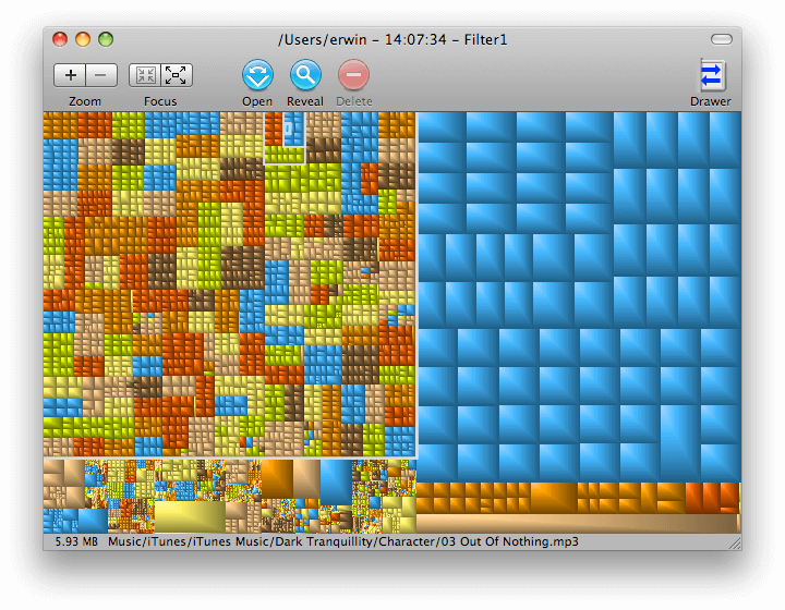
The more complex the information, the more the usefulness of the nested rectangles versus pie chart slices becomes clear. Imagine for example a visual representation of drive space usage by directory and subdirectory.
Here is a drive space chart using nested rectangles:
http://grandperspectiv.sourceforge.net/ScreenShots/1_0-Folde...
For comparison, here is an attempt do do the same using pie charts:
http://www.daisydiskapp.com/img/d4.png
In fact, if you use both apps, you'll see DaisyDisk is not able to give you the "grand perspective" in a single view, it requires clicking to zoom in on a slice it then expands to a full pie to drill down.
Re: Lying with pictures: Smartphone manufacturer share by OS
#40Can anyone explain the advantage of the original graphic over a nicely captioned table of data? Mind you, this is a good statistics lesson. My teenage students might get quite interested in a 'discussion' of the relative merits of various kinds of phone, before representing the data and then comparing it to UK. US Mobile phone market share by OS and maker Android 51% Samsung 17% HTC 14% Motorola 11% Other 9% iOS (App…
In any case, I think the correctly drawn rectangular chart conveys the significance in a single holistic glance, while the table above requires quite a few "memory registers" for comparing the sets and their parts.