Live data from Hacker News

Why ‘Ok’ Buttons in Dialog Boxes Work Best on the Right

uxmovement.com

61–70 of 83 posts

Re: Why ‘Ok’ Buttons in Dialog Boxes Work Best on the Right

#61
How did we end up with OK/Cancel in the first place?

When I run into an OK/Cancel box (usually on a web page using the generic built-in confirm()), it often feels to me like the meaning would be far more clear if the options were "yes" or "no", no matter which order they're displayed.

Is there a UI 'best practice' reason OK/cancel "won" over yes/no?

Re: Why ‘Ok’ Buttons in Dialog Boxes Work Best on the Right

#62
post #26
post #17

Earlier quoted context omitted.

In most of the world, though, it's Brake/Gas. And I personally prefer Cancel/OK because I usually want to click OK and my right thumb happens to be on the right side of the screen.

That just because if you had gas in the middle it would be uncomfortable for long drives. It's the same reason the clutch is on the side as well, not in them middle. I suppose you could swap the cluch and gas (leaving brake in the middle) - but clutch comes first, then gas, so the convention of first on the left is realized.

Possible, but more likely more people are right footed than left so it's more natural to control acceleration with your right foot vs. the more mechanical shift process.

Re: Why ‘Ok’ Buttons in Dialog Boxes Work Best on the Right

#63

Created an account just to say this... This is the wrong question all together. Yes/No is the wrong idea. Think about labeling the buttons Save/Reboot/Cancel, This allows the user to be sure they are going to get the expected results.

And if you do that you force the user to read all options, which is completely unnecessary.

If the question is "Reboot?" and you have Yes/No as alternatives I will see that it is a Yes/No-dialogue-box instantly, way before I read the buttons I see the button structure and recognize it as a typical Yes/No-dialogue-box.

I read the question and because I already know my alternatives I have go directly to the option I want, if the buttons change every time I have to read and assess the situation every single time. This is good for critical questions (like, do you want to format this drive?) but bad for common questions (such as Save?).

The author never even considered this, which is exactly why you should follow platform conventions. If you don't people are going to feel weird coming to your application and even if you manage to gain 10% in comprehension by switching to a non-standard layout you are going to loose 80% in comprehension and 10540% in speed just because you are different than what the user expected.

Android ICS changed the place for the Cancel/OK buttons when unlocking the sim-card, my muscle memory still haven't learned this despite using ICS for many months.

The only thing this article managed to get through to me was: follow your platform guidelines.
Re: Why ‘Ok’ Buttons in Dialog Boxes Work Best on the Right

#64

"...if you’re a knowledgeable and experienced designer ... then you can solve this problem through design analysis [as opposed to user testing]" But if you're an empirical scientist you will use user testing to confirm or deny your hypothesis rather than assuming your rationalisations hold in the real world.

That statement in the article is just wrong. A knowledgeable and experienced designer should be an experienced scientist who uses user testing to confirm rationalizations.

Yep. Testing 41 shades of blue gave Google products really nice designs.

Re: Why ‘Ok’ Buttons in Dialog Boxes Work Best on the Right

#65

Never take GUI advice from a web site that hardcodes the width of its paragraphs to 600px. Seriously, who does this in 2012?

People who understand, that there is such a thing as optimal line length, and that line running across 24" monitor does not have it?

Re: Why ‘Ok’ Buttons in Dialog Boxes Work Best on the Right

#66
To me the assertion that users read buttons the same direction they read text is bogus.

I'm an OS X user and I'm trained to read the right most button first as it has the description of what will happen (Save, Log Out etc.) Often it means I don't even have to read the rest of the dialog.

As others have pointed out, this indicates the whole idea that users will read all the options is bogus. But even when I do read them all (marginally complex set of options presented, or high risk scenario) I read the right most one first before skipping back to read left to right because I'm trained to skip to the right most button at the bottom of a dialog.

This invalidates much of the analysis on visual fixations and comes to the conclusion that placing the primary action on the left actually makes it easier under certain conditions (it's easier to track back to the left most button than to the right most).

It just goes to show that training can affect behaviour. If you did extensive eye-tracking tests explaining you're looking for high accuracy, with people who are unfamiliar with technology or who are used to the primary action being on the left, placing the primary action on the right will lead to less effort. But as the user is trained, the effort would probably increase.

Re: Why ‘Ok’ Buttons in Dialog Boxes Work Best on the Right

#67
post #24

Ok and Cancel are the wrong button labels anyway. The Apple HIG say that buttons should be labeled with verbs that signify the action taken. For example, Cancel/No/Yes becomes "Don't Quit" "Don't Save" "Save". Much more intuitive, and it gives additional reason to put the positive button last: users should be encouraged to read all the options available before deciding—and can get the gist by reading just the buttons…

    Save this document before quitting?


     -----------------------------------

    Save this document before quitting?


Re: Why ‘Ok’ Buttons in Dialog Boxes Work Best on the Right

#68
post #37

Earlier quoted context omitted.

This is what I came here to say- one more reason not mentioned for putting the primary action in the corner is that it's easier to find and fix on with your eyes and the mouse.

You don't have to find it. Few people do. People read through the buttons from left to right. The thing is, when dialog buttons use standardized vocabulary (ok, cancel, yes, no) you don't have to read the other button, you just assume it says the opposite of the first button. So I'd like the OP to provide some proof of this three scan pattern. I think that happens on a Mac where the buttons are labeled with verbs. Wh…

You've missed out some steps.

    1) Read first couple of words of dialog box
    2) Make decision
    if yes:
    3a) Find OK button
    4a) Click OK button
    if no:
    3b) Find Cancel button
    4b) Click Cancel button
vs.

    1) Read primary action button
    2) Make decision
    if yes:
    3a) Click button
    if no:
    3b) Find Cancel button
    4b) Click Cancel button
If all you're doing is hunting for the verb in the dialog box rather than reading all the text (perfectly legit timesaving tactic) then why not stick that all important verb in a standard position on the dialog box and make it clickable to reduce hunting and scanning?

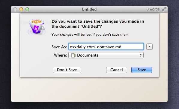
It's not about standardised vocabulary to easily find the primary action and Cancel, it's about standardised positioning. In OS X, far right is the primary action. The one next to it is Cancel. Any other options are placed further over. (http://osxdaily.com/wp-content/uploads/2011/08/dont-save-sho...) Similarly on Windows the left most is the primary action and the right most is Cancel.

Re: Why ‘Ok’ Buttons in Dialog Boxes Work Best on the Right

#69
post #24

Ok and Cancel are the wrong button labels anyway. The Apple HIG say that buttons should be labeled with verbs that signify the action taken. For example, Cancel/No/Yes becomes "Don't Quit" "Don't Save" "Save". Much more intuitive, and it gives additional reason to put the positive button last: users should be encouraged to read all the options available before deciding—and can get the gist by reading just the buttons…

Actually it becomes "Cancel", "Don't Save", "Save". While there is huge benefits in using descriptive verbs to describe the actions taken, there is also a huge benefit in having a single standard word for "What? No! I didn't want to do that. Stop!"

Re: Why ‘Ok’ Buttons in Dialog Boxes Work Best on the Right

#70

It's a rational explanation that just happens to be ... wrong. Cancel/OK suggests Cancelling first, OK'eying second. Whether your eye has already moved on from Cancel is secondary to the fact that you brain got implanted with Cancel as a primary option.

Unless you're trained to start with the right most button (something the article ignores).

Also, positioning isn't the only factor - you can also highlight the primary action with colour and texture, which I would guess is far more effective at implanting a button as the primary option than positioning. Most OS's do this as a part of their keyboard accessibility.

Post reply on HN