Should this be a map or 500 maps?
escapethealgorithm.substack.com
Should this be a map or 500 maps?
1–10 of 115 posts
Re: Should this be a map or 500 maps?
#2Quite a charming story and of course now I want to see the maps. Did I miss is somehow? Is there somewhere I can see the 500 maps?
Re: Should this be a map or 500 maps?
#3I hate overly designed news articles. I want to read the words and maybe see a couple of relevant pictures, thanks.
Similarly I suspect most of these different individual maps are just bad. Whimsy and idiosyncrasy are all very well in theory, but in practice they're mostly just annoying.
Re: Should this be a map or 500 maps?
#4Quite a charming story and of course now I want to see the maps. Did I miss is somehow? Is there somewhere I can see the 500 maps?
Exactly the same!
Re: Should this be a map or 500 maps?
#5I hate overly designed news articles. I want to read the words and maybe see a couple of relevant pictures, thanks. Similarly I suspect most of these different individual maps are just bad. Whimsy and idiosyncrasy are all very well in theory, but in practice they're mostly just annoying.
The worth here is actually in hindsight as now historians can learn a lot about localities and local perceptions. They don't care as much about aesthetics (or at least perceive them in a different manner)
But in general I assume you're right about the actual quality and it was hinted in the text. And when you take a look at the maps provided as examples, some of them are not accessible[1]. And for news articles, it really depends for me. Most of the time, I want the essence. But sometimes, especially with articles that are not actually news but a deeper analysis of a situation (e.g. ukraine war, palestine), I've read articles where on mobile it helped that they put extra effort in making the media work for the information by interleaving graphics, scrolling text, and so forth.[2] But as always this is also a matter of taste.
[1] e.g.: https://substackcdn.com/image/fetch/f_auto,q_auto:good,fl_pr... [2] I haven't bookmarked those texts and I am not sure if it is actual useful to pick one random example for this discussion so I just save my time searching for this one example I only vaguely remember.
Re: Should this be a map or 500 maps?
#6Quite a charming story and of course now I want to see the maps. Did I miss is somehow? Is there somewhere I can see the 500 maps?
Re: Should this be a map or 500 maps?
#7I hate overly designed news articles. I want to read the words and maybe see a couple of relevant pictures, thanks. Similarly I suspect most of these different individual maps are just bad. Whimsy and idiosyncrasy are all very well in theory, but in practice they're mostly just annoying.
Yeah I feel the same.
Interestingly, with the fact that the article is digital, surely we can leverage so many more different and interesting ways to present the information, but I feel like most prefer to just read the text.
I think it's because everyone reads a paper article in a different way. If you ask people how they read a magazine, you'll get as many responses as respondents. Some read back to front (I do that for some reason), some read articles from top to bottom, some scan through and look at the pictures and captions, then pulled quotes, then the main text. Some even read the paragraphs out of order and assembles it all afterwards.
Everyone consumes a body of text in a different way, and an article that jacks your scroll and does "fancy" stuff with the way you can access the content makes assumptions about how the reader prefers to consume the content, and this assumption is often very wrong for me personally.
Re: Should this be a map or 500 maps?
#8Quite a charming story and of course now I want to see the maps. Did I miss is somehow? Is there somewhere I can see the 500 maps?
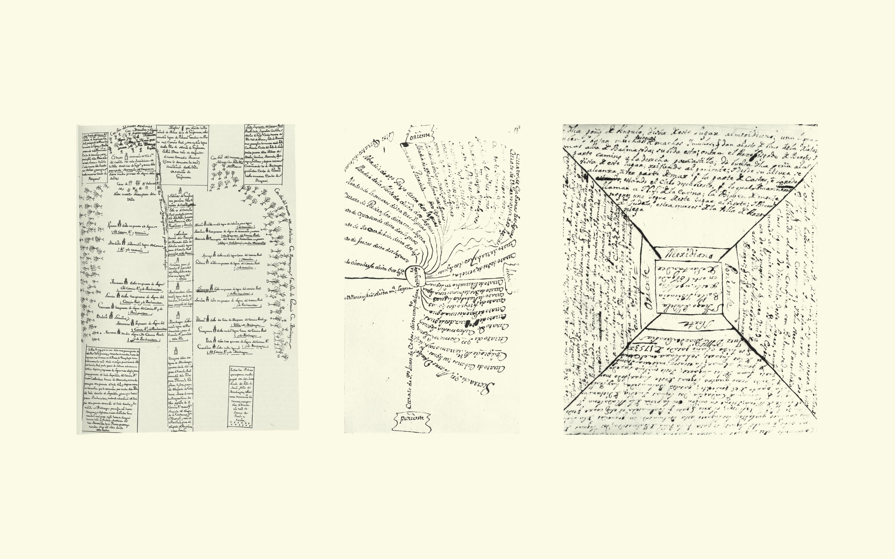
All the priest maps appear to be in the Spanish National Archives. There are a few academic articles about them . e.g. https://www.researchgate.net/publication/228910878_EL_LEVANT... (in Spanish)
Re: Should this be a map or 500 maps?
#9> Close your eyes and picture the design of a news article on the web.
For people with aphantasia: yes, there are actually people that can make/see pictures when eyes closed. Or even use their brain as CAD software.
As for us, sorry, can't do it.
Re: Should this be a map or 500 maps?
#10We had a lively discussion about Google Maps in my cycling group. It's very annoying to have a map that is only designed to show the fastest route, and that forcefully reroutes you to it. It doesn't let you avoid a road or favour another. It does not show named bike routes and hiking trails. It doesn't even let you keep the screen on without having directions.
For most people, the entire experience of using a map is constrained to this mediocre one-size-fits-all solution.
Personalisation in general is just gone too. Remember the crazy weird skins for Windows Media Player? Now you're lucky if you can pick the OS-wide highlight colour.
In the quest to build universal products, we ended up with a tech culture designed by committee. As software is eating the world, so does this culture.
A welcome change from this is OsmAnd, an insanely versatile and customizable map that can be adjusted to your exact needs.