Live data from Hacker News

Old People Icons That Don't Make Sense Anymore

hanselman.com

71–80 of 279 posts

Re: Old People Icons That Don't Make Sense Anymore

#71
I always wondered what was wrong with English. You know, using 'print' instead of a 'what-does-that-box-of-kleenex-mean' icon?

And for non-English speakers, is it really harder to learn what 'print' means than consulting a cheat sheet for what the icons mean?

Re: Old People Icons That Don't Make Sense Anymore

#73
I'm not sure that I agree with the "Photography" examples. Even for people who haven't seen actual Polaroid cameras, the icon is clearly some sort of camera. The author finishes his argument with a quote from a recent pop song, which probably means that Polaroid pictures aren't an extremely obscure reference. Also, I bet that Instagram's early adopters know exactly what Polaroid cameras are, and the reference isn't lost on them. I'd also be willing to bet that there's at least some overlap with early adopters and people who are aware of the Impossible Project. Those people would at least make the connection between analog photography and the filters that Instagram provides.

That being said, Polaroid-inspired icons are probably not ideal for every use.

Re: Old People Icons That Don't Make Sense Anymore

#74
post #40

There's a good article to be written on this subject, but this isn't it. "folders": we can go back to "directories" if you'd like. It's still what I say most of the time. "wrenches/screwdrivers/gears": This was the most baffling one. Who's never used a screwdriver? And he says it as if it's obvious. "phone": 75% of the US still has a landline (as of a year ago anyway), so I find "you haven't used this in 20 years" to…

I agree, I was very surprised that he doesn't even mention the "hourglass". It's true that it's less and less frequent but I would argue that it's more common than the floppy disk.

Re: Old People Icons That Don't Make Sense Anymore

#75
The reason we still use these old icons is because every single icon requires people to think about and learn what it represents. The only icons that don't require the user to think are ones they see all the time. If you've never seen an icon before you can only really guess what it means, the shorter the time it takes to guess, the better the icon is. It's for this reason that I don't like icon-only user interfaces, they require too much thinking and guessing from the user.

Take a look at these ones that show up when you select text in Android ICS: http://asset3.cbsistatic.com/cnwk.1d/i/tim/2011/10/18/ICS_co...

What on earth do they mean? I've been using ICS since January and I still don't know what they do except for the cut one. Because there's no way for them to show tooltips on hovering the only way to learn is to press it and try and work out what it just did.

Re: Old People Icons That Don't Make Sense Anymore

#76
post #55

This goes back a lot further than computer icons. Road signs for railway crossings still show steam trains. Men/Women signs for toilets show women in skirts that nobody wears, on images that hardly resemble people at all. My car has a snowflake for the AC button, even though snow doesn't come out of the vents when you switch it on. Interestingly, signs that ban music players in certain areas now look like Gen 1 iPods…

Indeed. This one used to mystify us on the UK driving test 25 years ago - way older than steam trains, and presumably anachronistic even when it was standardised: http://wwwdelivery.superstock.com/WI/223/1848/PreviewComp/Su...

It's not a UK sign. Most Europeans will recognize it, but I doubt it travels well, and even where it has local currency, many peoples grandparents won't remember these in real life.

Re: Old People Icons That Don't Make Sense Anymore

#77

It's not just icons. Phrases are the same. I'll bet many people here have never heard a broken record, but still have heard the phrase "sounds like a broken record."

I think the phrase "broken record" is used more when referring to someone repeating themselves over and over again.

Re: Old People Icons That Don't Make Sense Anymore

#78

I'd love to go to schools and get kids in groups like Or maybe they've learned all these icons and while not getting what they did mean, they understand what they mean now, like letters of a new alphabet. Like how many Asian script characters are descendants of more obvious pictograms of actions. They still have meaning even if they've evolved a bit and even changed.

I think those symbols are just learned.

Take folders. They look like this: http://upload.wikimedia.org/wikipedia/en/5/50/Earthwise.jpg

That makes it obvious where the symbol is coming from. The only problem is that those kinds of folders are not commonly used in Germany. I think I never saw a folder like that before I started using computers.

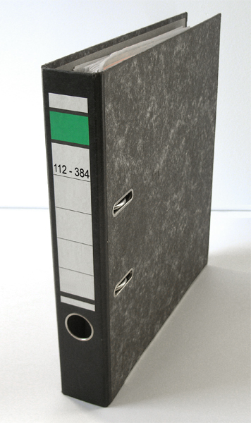
Folders look like this in Germany: http://upload.wikimedia.org/wikipedia/commons/d/d9/Lever_arc...

The word that is used in Germany to refer to folders („Ordner“ in German) actually refers to ring binders.

Yet I had never a problem dealing with folders on computers, even though the visual metaphor was unfamiliar to me.

Re: Old People Icons That Don't Make Sense Anymore

#79
post #70
post #33

So that's where radio buttons comes from! And yes my TV has rabbit ears, only they are the wifi antennas on my router :)

I also did not know the origin of the term radio buttons, though I DO recall that our old cars as a kid did have those type of buttons on them.

I looked into replacing the old AM radio in my ancient dodge with a modern one, but eventually decided I simply liked the look & feel of that pushbutton thingie, and anything more modern just looked wrong in that car.
Post reply on HN