I love the current infatuation with modeling old CRT display systems. Old graphics and videos from the "time before" rely a bit on how those display systems and signals worked in order to make low-color and resolution artifacts look "better" in terms of smoother color gradients and softer edges and diagonals. The shift to modern displays mades everything form that era look blocky and chunky. The thing that makes this…
Cathode-Retro: A collection of shaders to emulate the display of an NTSC signal
81–90 of 93 posts
Re: Cathode-Retro: A collection of shaders to emulate the display of an NTSC signal
#82I love the current infatuation with modeling old CRT display systems. Old graphics and videos from the "time before" rely a bit on how those display systems and signals worked in order to make low-color and resolution artifacts look "better" in terms of smoother color gradients and softer edges and diagonals. The shift to modern displays mades everything form that era look blocky and chunky. The thing that makes this…
I suspect it's also because the pictures weren't all that sharp to begin with, the brain filled in ('hallucinated') details. Perhaps more so with young observers.
Re: Cathode-Retro: A collection of shaders to emulate the display of an NTSC signal
#83I love the current infatuation with modeling old CRT display systems. Old graphics and videos from the "time before" rely a bit on how those display systems and signals worked in order to make low-color and resolution artifacts look "better" in terms of smoother color gradients and softer edges and diagonals. The shift to modern displays mades everything form that era look blocky and chunky. The thing that makes this…
> The thing that makes this all really "meta-interesting" is that everybody who remembers that time remembers it differently and so there's no "correct" way to do this. I suspect it's also because the pictures weren't all that sharp to begin with, the brain filled in ('hallucinated') details. Perhaps more so with young observers.
Original : https://ibb.co/VjwKkb8
With CRT shader : https://ibb.co/s6RgswK
Just zoom into the details like the Mario icon, the text, the guardrails, the edges of the polygons …
I know it looks blurry in the screenshot but this is totally unnoticeable once the game is in motion.
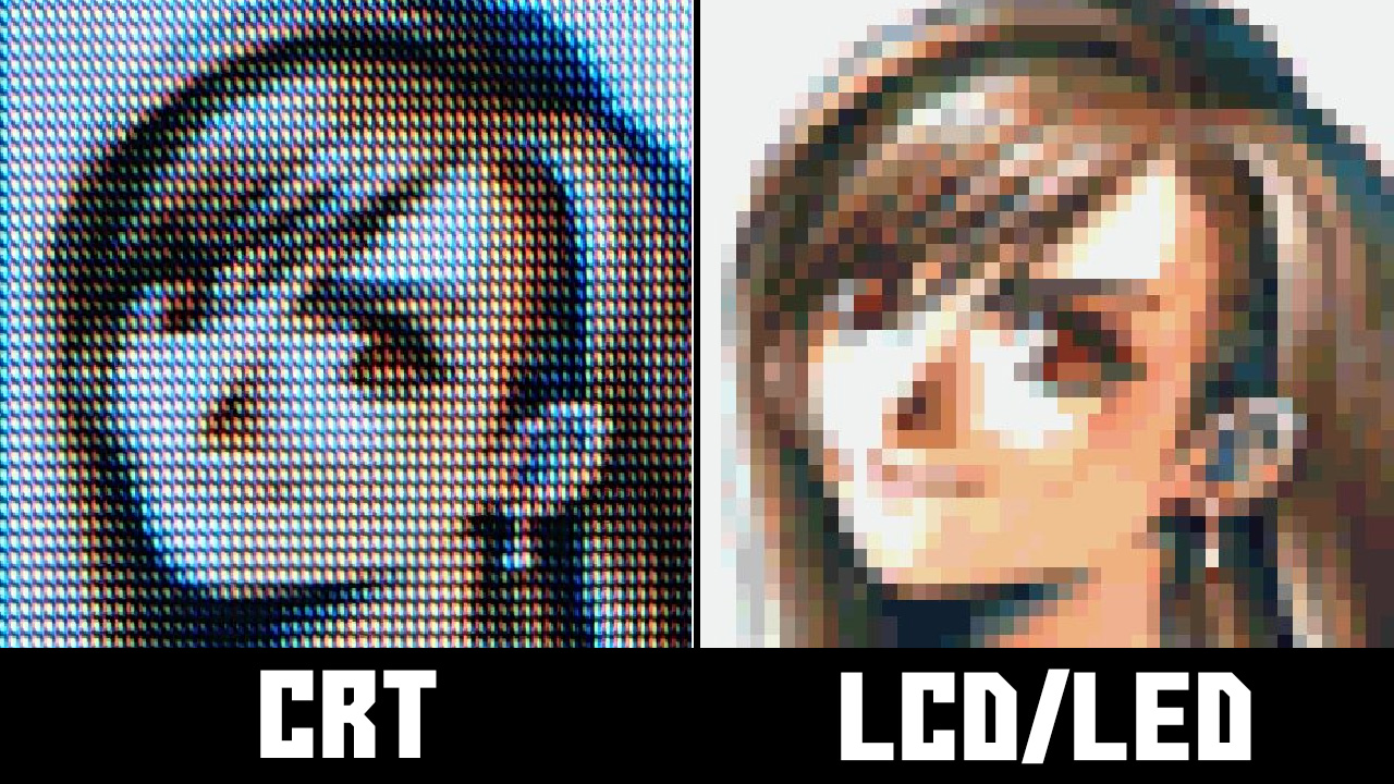
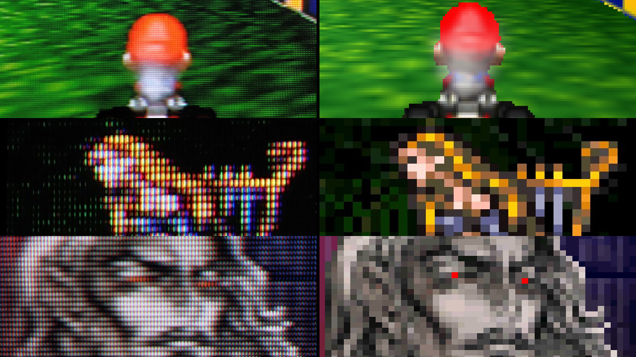
More interesting pictures :
https://wackoid.com/wp-content/uploads/2021/08/CRT-vs-LCD.jp...
https://wackoid.com/wp-content/uploads/2021/08/Final-Fantasy...
The point is that those games were made on CRT monitors so the CRT artifacts were in fact heavily used by the artists to render more precise images.
Original post from the two last pictures : https://wackoid.com/game/10-pictures-that-show-why-crt-tvs-a...
Re: Cathode-Retro: A collection of shaders to emulate the display of an NTSC signal
#84Earlier quoted context omitted.
Were you looking at color or black-and-white? I always felt Apple II graphics were pretty meh due to all the color artifacts/fringing on composite monitors (IIgs being the exception, those generally had RGB monitors.)
green-on-black for a ][+ is what I have, but should be getting a recapped ][e model
Re: Cathode-Retro: A collection of shaders to emulate the display of an NTSC signal
#85Earlier quoted context omitted.
> because artists on some games accounted for the fuzziness and used it to their advantage Everybody repeats this, but I've honestly never been convinced. Different screens and different systems had different types of different degrees of fuzziness. Designing for it seems like it would be impossible. I've never once seen an example of pixel art that looked good crisp and bad fuzzy, and then was somehow modified in a…
It doesn't make sense that people designed for the end result to be softer?
Re: Cathode-Retro: A collection of shaders to emulate the display of an NTSC signal
#86I always hated the weird fuzziness, soft lines, and curved image that old TVs imparted on games, it is amazing to me that entire communities have been built up around it. When I started playing games on an emulator and pixels were hard and square and the image was actually flat, I was like YES!!
https://www.pcmag.com/encyclopedia/term/flat-crt
They also look amazing but I recommend paying someone else to move them. Especially up stairs.
Re: Cathode-Retro: A collection of shaders to emulate the display of an NTSC signal
#87Earlier quoted context omitted.
It doesn't make sense that people designed for the end result to be softer?
No, it doesn't. How would you even do that? Nobody has ever managed to explain how that would result in a different design -- not that I've been able to find.
> Once the industry switched from hexadecimal to graphic editors, it wasn’t rare for graphic designers to have not one but two screens on their desk: a computer monitor and a CRT, the second one being used to display the result of the work made on the first one. It’s hard to tell whether this was a standardized practice or not, but we know that many developers, graphic designers as well as programmers, used that technique, from Kazuko Shibuya (Square) and Akira Yasuda (Capcom) to the developers behind Thunder Force IV (1992) who used many CRTs to take into account the specifities of each kind of screen. Masato Nishimura, graphic designer in charge of the backgrounds from Sonic CD, mentioned something he had been told about the first Sonic the Hedgehog (1991): the developers used up to 3 CRTs to previsualize the game and see how were rendered the scrolling and blur effects.
> This practice can be explained by at least 3 reasons. The first one is related to the differences in rendering between a computer screen and a CRT, the pixels look generally sharper on a monitor. The second one lies in the specificities of each machine: display resolution, shape of the pixels (rarely as square as one would expect), rendering of the colors -the red color bleeded on the others on Mega Drive, it was recommanded to add neutral colors around to compensate. The third reason is related to the second one but also concerns programmers: a workstation doesn’t necessary simulate every aspect of the machine for which a game is being developed. For example, the parallax scrolling effect featured in the Mega Drive game Thunder Force IV couldn’t be tested on X68000.
> Tatsuro Iwamoto, graphic designer on the first episodes of the Phoenix Wright / Gyakuten Saiban series released on Game Boy Advance, explained that he took account of that (sometimes unwanted) effect on Nintendo’s portable console.
Re: Cathode-Retro: A collection of shaders to emulate the display of an NTSC signal
#88Earlier quoted context omitted.
No, it doesn't. How would you even do that? Nobody has ever managed to explain how that would result in a different design -- not that I've been able to find.
https://vgdensetsu.tumblr.com/post/179656817318/designing-2d... > Once the industry switched from hexadecimal to graphic editors, it wasn’t rare for graphic designers to have not one but two screens on their desk: a computer monitor and a CRT, the second one being used to display the result of the work made on the first one. It’s hard to tell whether this was a standardized practice or not, but we know that many deve…
> Some graphic designers toyed with these specificities and mastered the 0.5 dot technique... “It’s a technique where by slightly changing the color of surrounding pixels, to the human eye it looks like the pixels move by around 0.5 pixels.” explains Kazuhiro Tanaka, graphic designer on Metal Slug (1996). His colleague Yasuyuki Oda adds that “Back in the old days, we’d say [to our artists] "add 0.5 of a pixel”, and have them draw in the pixels by taking scanlines into account. But with the modern Full HD monitor, the pixels comes out too clearly and too perfectly that you can’t have that same taste.“
That's a clear example, then, of something that looks worse in full-res. I hadn't been able to find an example like that before.
Thanks again -- this finally explains something I really didn't understand for the longest time.
Re: Cathode-Retro: A collection of shaders to emulate the display of an NTSC signal
#89Earlier quoted context omitted.
green-on-black for a ][+ is what I have, but should be getting a recapped ][e model
Those monochrome monitors were very sharp. In elementary school, I had a friend with a IIe at home.
Re: Cathode-Retro: A collection of shaders to emulate the display of an NTSC signal
#90Earlier quoted context omitted.
https://vgdensetsu.tumblr.com/post/179656817318/designing-2d... > Once the industry switched from hexadecimal to graphic editors, it wasn’t rare for graphic designers to have not one but two screens on their desk: a computer monitor and a CRT, the second one being used to display the result of the work made on the first one. It’s hard to tell whether this was a standardized practice or not, but we know that many deve…
Thank you! That explains it in detail that I'd never been able to find before. Especially the part that immediately follows: > Some graphic designers toyed with these specificities and mastered the 0.5 dot technique... “It’s a technique where by slightly changing the color of surrounding pixels, to the human eye it looks like the pixels move by around 0.5 pixels.” explains Kazuhiro Tanaka, graphic designer on Metal S…