"Get your employees addicted to work notifications" seems to be one of their core premises, and this redesign is yet another step in that direction. The biggest issue of this redesign for me was getting rid of the "unread message badge" both on the desktop app icon and the browser tab. They used to have a badge with numbers for missed notifications (e.g. direct messages) and one (empty circle) for unread messages, bu…
They also made a fairly subtle change to what the "new messages" status actually means. Previously, it meant you hadn't clicked on a channel yet. The status would clear as soon as the action was taken, even before the network requests to load the channel were finished. This meant you could go through and clear dozens of channels pretty quickly without reading them. Now, that status is only cleared after the client fu…
Slack: Our biggest redesign yet came to be
61–70 of 87 posts
Re: Slack: Our biggest redesign yet came to be
#62I realize that Slack is more complex then it appears, and able to do more things then it may seem. But by looking at those whiteboards and reading parts of the description, the amount of effort, people and time involved in a redesign was just a bit more than I was expecting. Looking at the images of the resulting whiteboards alone had me wondering "what could all of this possibly be about?". Details within details ab…
If they hadn't spent so much time, you would have noticed. That's the point. Adding features and capabilities to a without making it more complicated for users who only use a fraction of them ("chat and huddle app"), is part of why this is so complicated.
I get that idea ... been a software engineer for quite some time now. Users will quickly let you know how much they don't like it when you change things. It also means I should easily be able to answer all of my own questions, and shouldn't be surprised by the level of effort required.
I guess it comes down to the basic cost/benefit analysis, and if the answer is "redesign", doing what needs to be done while trying limit any downside. That would include your users asking why everything just changed. I don't enjoy reading messages written in all capital letters either, where it seems those 10 exclamation marks are required to clarify how much you dislike it.
Anyway, from here, based on that alone ... seems successful. Back to work and Slack messages.
Re: Slack: Our biggest redesign yet came to be
#63Confession time: I was never a real big fan of Slack's UI before. All channels and conversations being in the same pane just made everything so noisy. But now it's pretty atrocious. The Activity tab is uselessly cluttered. If someone is trying to get my attention in a thread and it's not a DM, I rarely ever see or notice it.
Maybe we just use Slack differently, but I find just staying in Home largely mimics the old interface. Enough so that I don't really mind this redesign. Anything that pops me out of Home is jarring and unwelcome.
I like that DMs are pulled out from channel activity. But "Home" for me is such a hot mess of hundreds of channels with no easy way to discern important things from noise.
Re: Slack: Our biggest redesign yet came to be
#64Earlier quoted context omitted.
Maybe we just use Slack differently, but I find just staying in Home largely mimics the old interface. Enough so that I don't really mind this redesign. Anything that pops me out of Home is jarring and unwelcome.
Before Slack I was a big "Inbox Zero" kind of guy. But Slack is such a noisy product that it has essentially trained me to ignore alerts. I like that DMs are pulled out from channel activity. But "Home" for me is such a hot mess of hundreds of channels with no easy way to discern important things from noise.
Re: Slack: Our biggest redesign yet came to be
#65I'm sure there's a substantial population that this redesign was successful for, but it's nobody I've talked to. I can no longer tell which of my slacks has pending messages at a glance, and my actually important channels' notifications are hidden in a sea of irrelevant ones when they used to be the only attention-attractors on the interface. I gather that you think the list of people and channels is just one aspect…
> I'm sure there's a substantial population that this redesign was successful for, but it's nobody I've talked to. I think the measurement of success in this case has less to do with the customer's feelings about the product and more about people understanding and using the full feature set of Slack. All the new features they've been adding in just kind of floated by and we never used them. Either they were embedded…
Instead of admitting adding new features just for the sake of adding new features, they want to force them into the faces of users still not wanting to look for them
Re: Slack: Our biggest redesign yet came to be
#66Please stop making every update require more screen space. Every time, more chrome, bigger fonts, more padding, more views that take over the whole viewport.
The other side here is that when I've designed apps that more dense, smaller font sizes and UI, people do then complain things are too small. Engineers are generally ok and appreciate density but more mainstream users often don't.
Re: Slack: Our biggest redesign yet came to be
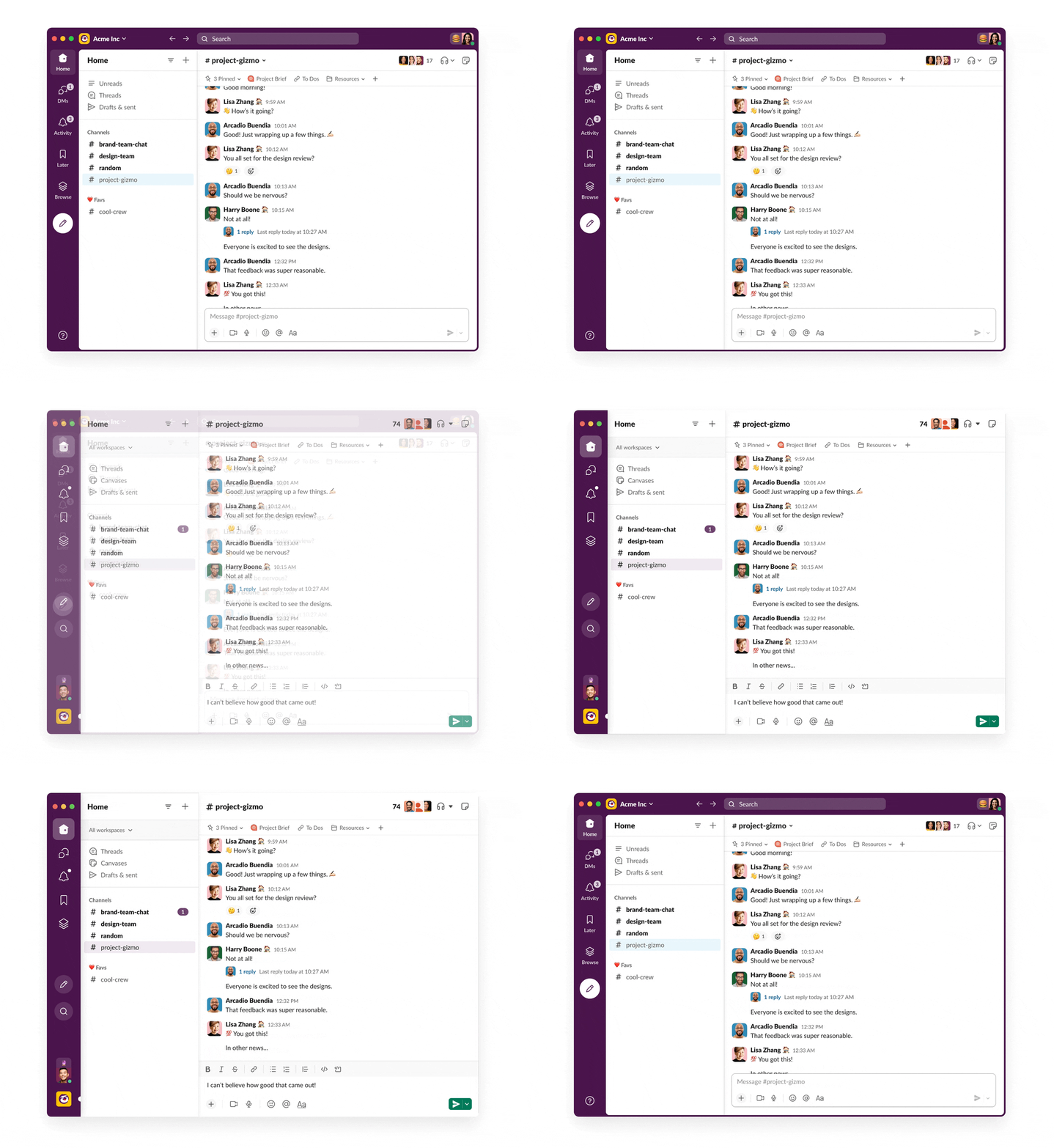
#67https://slack.design/wp-content/uploads/sites/8/2023/10/imag...
Re: Slack: Our biggest redesign yet came to be
#68Earlier quoted context omitted.
I do miss the density of something like mIRC way back when. I guess when everybody had an 800x600 screen we had to make the most of them. Maybe they could bring back the IRC bridge.
> Maybe they could bring back the IRC bridge. I think that could only happen if IRC added support for threading.
Re: Slack: Our biggest redesign yet came to be
#69Earlier quoted context omitted.
They also made a fairly subtle change to what the "new messages" status actually means. Previously, it meant you hadn't clicked on a channel yet. The status would clear as soon as the action was taken, even before the network requests to load the channel were finished. This meant you could go through and clear dozens of channels pretty quickly without reading them. Now, that status is only cleared after the client fu…
Maybe mute channels you don't intend to read?
Re: Slack: Our biggest redesign yet came to be
#70I guess the classic reaction to any design change is 'I hate this'... but damn I hate the slack redesign :< I can't see a quick overview of all my workspaces with notifications and have to hover with the mouse to see them - even though most of the rest of slack is designed to be used keyboard-only!
Cmd+Shift+s pops all the workspaces in the side bar like before the redesign. This is a new change after—I am sure—many many people complained about that very thing. Such a stupid change. Just show me the workspaces by default gosh darnit.