Live data from Hacker News

Screenshots from Windows 95

guidebookgallery.org

11–20 of 85 posts

Re: Screenshots from Windows 95

#11
I avoid Microsoft whenever possible, but I can say that they did a lot of things well with Windows 95.

I remember the pre-release hype of codename "Chicago", and even bought a book about their UI design, even though I was developing primarily for Unix workstations then.

Also, the Win95 widgets look would still be more effective than most desktop looks/skins/themes today. Just modernize with some aesthetic tweaks that don't throw out the baby that works.

Worst legacy of Windows 95, though: the extra keyboard keys where just Ctrl and Alt should be. New keys was a bold move, and made sense for their UI. But crowding my laptop keyboard with keys I don't want has cost me a lot of time for decades after, and made typing less fun.
Re: Screenshots from Windows 95

#12
This site makes some weird choices.

Calendar: "This GUI doesn't have this feature" -- yes it does. Double click the clock.

Clock: The old clock application is still part of Windows 95, but it's also in the corner.

Address book: Depends on the version of Windows 95. Ones that came with IE3 or IE4 have an address book.

CD player: maybe the floppy version lacked it? But Windows 95 definitely has a CD player.

Browser: CD versions of Windows 95 came with Internet Explorer; depending on the version of 95, it could be IE2, IE3, or IE4.

Desktop themes: Part of the Plus add-on. Most versions don't include it (some did, especially OEMs). Could probably count the Appearance tab of the display properties too.

Logout screen: Windows 95 has it, but you'll have to connect it to a Netware or NT domain to show it.

Good start, but those are the glaring omissions I spotted.

Re: Screenshots from Windows 95

#14
post #3

There's always a degree of subjectivity and personal taste, but I do consider this to be the peak of OS UIs. I have an "ironic" machine at home that is an old retina iMac, with Linux installed and themed with Chicago95. My attempt at a machine with a nice hardware, nice OS and nice UI :)

Windows 2000 might be the actual peak. It took the good parts of Windows 95 and 98 and combined them into something quite excellent.

All downhill ever since.

Re: Screenshots from Windows 95

#15
post #5

Earlier quoted context omitted.

Isn't a much bigger influence on Windows in general the IBM Common User Access material, which NeXTSTEP decidedly was not like? https://en.wikipedia.org/wiki/IBM_Common_User_Access The app UI / interaction model patterns go deeper than "they both have greyscale 3D bevels".

I don't think if you instructed someone to make a UI with greyscale 3D bevels it would look as close to NEXTSTEP as Windows 95 was. There's specific things like the source of light being on the top left, etc, which make them nearly identical.

There is a good reason to have a light source on the top: it's the natural position of the sun and of most artificial light sources.

Then it could be straight from the top, but you only get one side lit and furthermore it's not very natural as it happens rarely.

Then it's only two choices, from the left or from the right. A coin flip? Actually no. Top left lightning has a long history for some good reasons https://en.wikipedia.org/wiki/Top-left_lighting so we could say it's the only professional and safe choice

Re: Screenshots from Windows 95

#16
post #14
post #3

There's always a degree of subjectivity and personal taste, but I do consider this to be the peak of OS UIs. I have an "ironic" machine at home that is an old retina iMac, with Linux installed and themed with Chicago95. My attempt at a machine with a nice hardware, nice OS and nice UI :)

Windows 2000 might be the actual peak. It took the good parts of Windows 95 and 98 and combined them into something quite excellent. All downhill ever since.

Also took the good parts from Windows NT. I loved using Windows 2000. I remember being really mad when XP came out and it added all the colourful and curvy GUI elements - felt really dumbed down.

Re: Screenshots from Windows 95

#17
I do miss those clear buttons and input fields.

I cannot tell you how much my 70 something year old Mom gets confused trying to figure out what's clickable vs not on modern apps and OS.

Re: Screenshots from Windows 95

#18
post #14
post #3

There's always a degree of subjectivity and personal taste, but I do consider this to be the peak of OS UIs. I have an "ironic" machine at home that is an old retina iMac, with Linux installed and themed with Chicago95. My attempt at a machine with a nice hardware, nice OS and nice UI :)

Windows 2000 might be the actual peak. It took the good parts of Windows 95 and 98 and combined them into something quite excellent. All downhill ever since.

I agree with the choice of Windows 2000. The reaction to Windows XP was that it was too videogamish with its choice of colors and bezels. Then it lasted for so many years past Vista and in part Windows 8 that it became the reference Windows interface. Then the flat UIs mimicking the web and also the 80s with simple elements (we couldn't do complicated widgets back then, not enough pixels.)

Re: Screenshots from Windows 95

#19
post #5

Earlier quoted context omitted.

Isn't a much bigger influence on Windows in general the IBM Common User Access material, which NeXTSTEP decidedly was not like? https://en.wikipedia.org/wiki/IBM_Common_User_Access The app UI / interaction model patterns go deeper than "they both have greyscale 3D bevels".

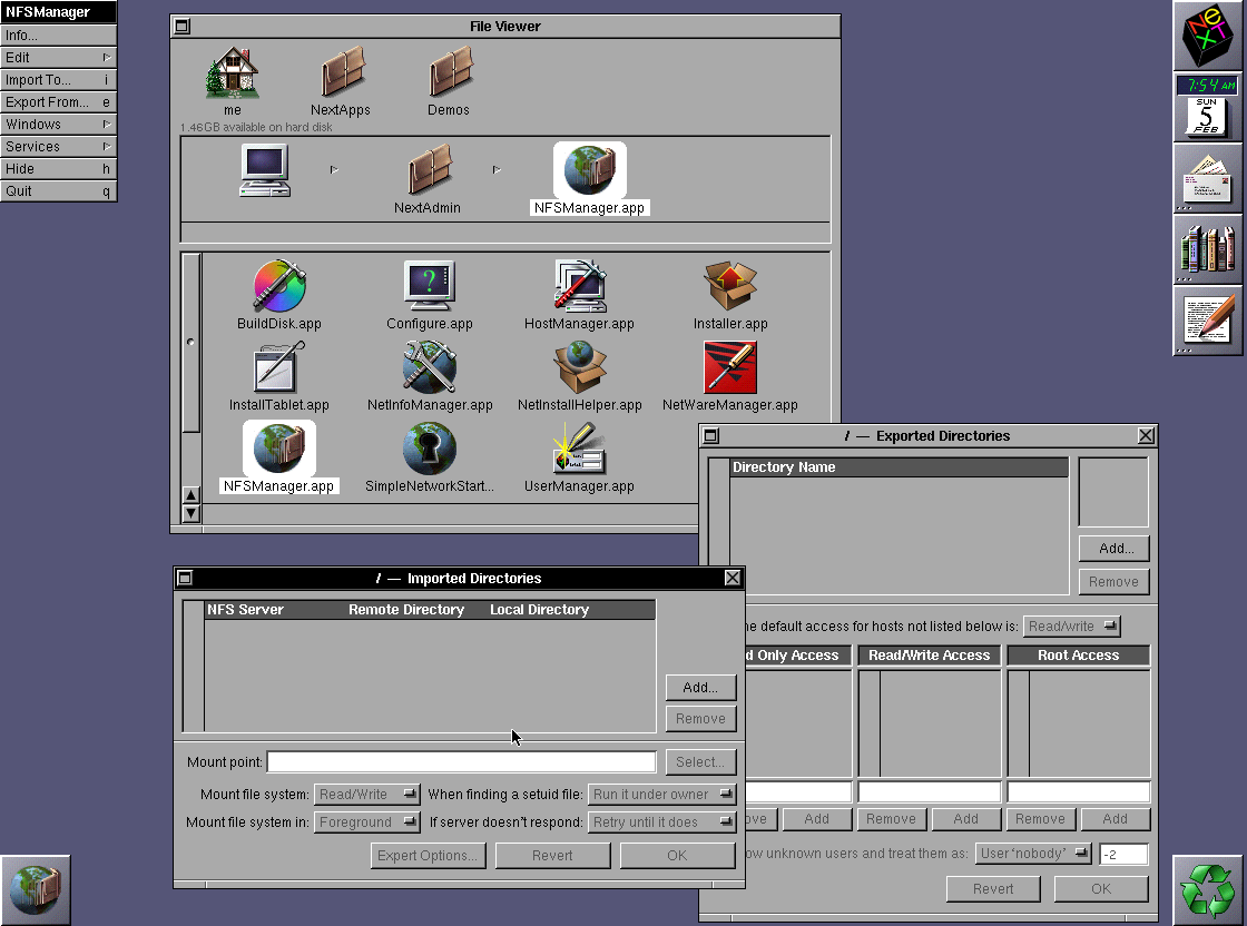
I don't think if you instructed someone to make a UI with greyscale 3D bevels it would look as close to NEXTSTEP as Windows 95 was. There's specific things like the source of light being on the top left, etc, which make them nearly identical.

For the reference: NextStep 3.3 screenshot

http://toastytech.com/guis/ns33nfsmanager.png

(3.0 released Sept 1992, 3.3 Feb 1995)

Windows 95 released Aug 1995.

Re: Screenshots from Windows 95

#20
post #8
post #3

There's always a degree of subjectivity and personal taste, but I do consider this to be the peak of OS UIs. I have an "ironic" machine at home that is an old retina iMac, with Linux installed and themed with Chicago95. My attempt at a machine with a nice hardware, nice OS and nice UI :)

I agree with you. Buttons were immediately identifiable as such, menus had keyboard shortcuts visible everywhere, all items always looked the same across all apps, and everything was really snappy. We've really gone backwards since.

Aqua (in early versions of OS X) did a fantastic job of combining all this clear usability with a lot of fun visual flair. Even the old Qt/GTK themes which emulated that look were pretty good.

It really is incredible how flat and boring modern macOS is.

Post reply on HN