Live data from Hacker News

AWS Icon Quiz

awsiconquiz.com

81–90 of 176 posts

Re: AWS Icon Quiz

#81
post #14

I have red green color blindness (deuteranopia) and i have no idea if my answer is right or wrong on until i change my monitor settings to high saturation. (I usually turn that off because it messes a lot with other colors)

Does it show which one is correct when you get it wrong? It would be cool to see what all the others were too.
Re: AWS Icon Quiz

#83
I tried my level best and got 2/20. I repeated with random guesses and got 5/20. I have used AWS on-and-off since 2018.

AWS icons are next to Egyptian hieroglyphs in difficulty. Google iconography isn't so bad (but bad enough still.)

Re: AWS Icon Quiz

#84
This was hilarious. Some of descriptions are great. "Dried arterial blood" is a nice vivid color descriptor.

It really puts into context how meaningless these icons are. I log into AWS all the time and did terrible on this quiz (4/20), despite having seen some of these icons hundreds of times at least.

Re: AWS Icon Quiz

#86
post #10

This reminded me of AWS in plain English https://expeditedsecurity.com/aws-in-plain-english/

It's interesting to me that many of the non-AWS products they list under "it's like" have equally incomprehensible names. API Gateway Should have been called: API Proxy It's like: 3Scale SNS Should have been called: Amazon Messenger It's like: UrbanAirship, Twilio Kinesis Should have been called: Amazon High-Throughput It's like: Kafka (It always gets me that someone actually named a large software product "Kafka".)

It makes me wonder too how many of these actually _are_ the "it's like". For example, I know that Elasticache actually is redis or memcached... makes me wonder if Kinesis isn't actually Kafka rebranded.

Re: AWS Icon Quiz

#87
post #10

This reminded me of AWS in plain English https://expeditedsecurity.com/aws-in-plain-english/

It's interesting to me that many of the non-AWS products they list under "it's like" have equally incomprehensible names. API Gateway Should have been called: API Proxy It's like: 3Scale SNS Should have been called: Amazon Messenger It's like: UrbanAirship, Twilio Kinesis Should have been called: Amazon High-Throughput It's like: Kafka (It always gets me that someone actually named a large software product "Kafka".)

I guess the point is not that other companies also have products with unrelated names, but if you happen to be familiar with Y then saying "Amazon x is just Amazon's version of Y" is very succinct.

Re: AWS Icon Quiz

#88
post #18

The only reason I can play this game is because "Icons with Labels" is impossible to deal with in the AWS console. I _really_ wish I could just set the labels myself. "AWS Simple Email Service." Were you worried I would forget it's an AWS service? Or worried that I wouldn't remember it's simple, or a service? Do you offer any other email service? Can I please just rename the label to "SES"? First world cloud console…

and then there's "flip a coin" about whether it's "AWS Foo" or "Amazon Foo". I think I once read that Amazon Foos were things that were used internally, too, and AWS Foos were things only sold to pay for rocket fuel and yachts (I kid, I kid; paying for all those Graviton fabs is some serious $$$ too)

Oddly, https://expeditedsecurity.com/aws-in-plain-english/ continues that AWS/Amazon schizophrenia.

Re: AWS Icon Quiz

#90
post #78

As a designer, I just want to say that if your instinct is to rag on these symbols for being incomprehensible, go ahead and try your hand at one or two. It may be humbling. Illustrating abstract concepts that are similar to other, related abstract concepts is extremely difficult. Remember that it's got to be legible in a footprint of a couple dozen pixels on a side. When you're done, make sure it isn't close enough t…

Not a fan of either, but Azure icons look like actual things: http://code.benco.io/icon-collection/azure-icons/ The AWS icons seem procedurally generated based on a hash of each concept's name.

Yeah, limiting yourself to minor variations of a 3x3x3 cube is pretty rough.

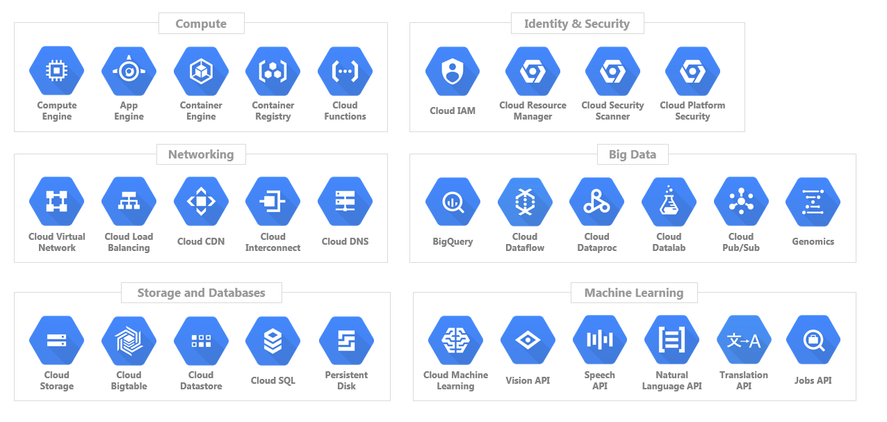
GCP shows you can have strong brand consistency (even a limited color palette) while still having decent illustrations [1].

[1] https://www.turbogeek.co.uk/wp-content/uploads/2019/02/word-...

Post reply on HN