Earlier quoted context omitted.
> People have a problem Why do you presuppose that others infer & arrive at the same interpretations you do? Isn't your own form of generalization from the subjective inferences made from your own individual mind, to the thoughts of others, presumptuous? I'm getting tired of the progressive tendency to read offence, bigotry, racism, sexism, transphobia, etc. into every little word & minutiae of nuance uttered by othe…
Did you read the post? I didn't think it was too subtle. Especially because it was so out of place.
Maps distort how we see the world
191–200 of 351 posts
Re: Maps distort how we see the world
#192Earlier quoted context omitted.
I read it as the post is simply pointing out something that a large percentage of the population was not even aware about. I don't think it goes any deeper than that.
Why is it important that poor people live near the equator? I expect that a large part of the population is aware of this fact. So bringing it up doesn’t contribute to the article and is a bit off in the article. Why not mention that the days are longer in the summer away from the equator. Or they people near the equator have darker pigment. Or many other true but irrelevant facts.
I like this site[1] for showing the true size of countries on a standard projection. Look at how much the US actually changes in size when you move it's latitude even a little.
Like it or not, the perception of scale of a problem is linked to apparent size - Africa looks smaller then it is, whereas the European countries look a lot larger then they are. When we talk about a problem affecting somewhere, the idea that "most of the world is experiencing it" is contraindicated by our maps even if only subconsciously.
[1] https://www.thetruesize.com/#?borders=1~!MTc0MzY1MDE.NTAzNDg...
Re: Maps distort how we see the world
#193Every flat map projection distorts something, so every projection has to optimize some parameter and trade off other utility. I'm constantly amazed at how hung up people are on apparent size of countries. If size is your thing, use some other projection! Mercator is and remains popular because it preserves local angles and shapes, which makes it simple use this projection to navigate by rhumb lines (compass headings)…
Something that jumps out at me with the size is that the arctic regions are often viewed as huge and massive. However, when viewed with their true size, it greatly highlights just how fragile they are.
Re: Maps distort how we see the world
#194Earlier quoted context omitted.
I read it as the post is simply pointing out something that a large percentage of the population was not even aware about. I don't think it goes any deeper than that.
Why is it important that poor people live near the equator? I expect that a large part of the population is aware of this fact. So bringing it up doesn’t contribute to the article and is a bit off in the article. Why not mention that the days are longer in the summer away from the equator. Or they people near the equator have darker pigment. Or many other true but irrelevant facts.
Maybe the future article will try to claim that we like Mercator because it matches apparent size to importance.
Maybe it'll try to claim that wealth differences are caused by different apparent size.
With the current fashion being to see all inequalities as imposed by force, the later seems more likely.
.
... And since the date on the post is a couple months ago, I looked for that follow up and it was two days later but mostly paywalled: https://unchartedterritories.tomaspueyo.com/p/are-maps-decei...
The blurb at least sounds like it is indeed exploring that second option, but the meat of whatever argument and conclusion isn't public.
Re: Maps distort how we see the world
#195Re: Maps distort how we see the world
#196Interesting post with eye opening stats (even after reading many posts like this I'm still amazed at how big Brazil is!) Another interesting effect maps have on worldview that was not mentioned is the placement of North at the top ( https://earthscience.stackexchange.com/questions/7960/why-is... ). The fact that in the South of Egypt was referred to as "Upper Egypt" has confused me to no end, since "clearly" it's the…
I suspect that north-as-top orientations were strongly influenced by the invention / importation of the magnetic compass.
https://www.mentalfloss.com/article/58426/why-north-always-m...>
Re: Maps distort how we see the world
#197Interesting post with eye opening stats (even after reading many posts like this I'm still amazed at how big Brazil is!) Another interesting effect maps have on worldview that was not mentioned is the placement of North at the top ( https://earthscience.stackexchange.com/questions/7960/why-is... ). The fact that in the South of Egypt was referred to as "Upper Egypt" has confused me to no end, since "clearly" it's the…
I received a gift from a friend in Uruguay that is from the clockmaker Girosur. The clock runs backwards, rhetorically asking “why is North up?” https://girosur.com/como-funcionan/
Re: Maps distort how we see the world
#198Every flat map projection distorts something, so every projection has to optimize some parameter and trade off other utility. I'm constantly amazed at how hung up people are on apparent size of countries. If size is your thing, use some other projection! Mercator is and remains popular because it preserves local angles and shapes, which makes it simple use this projection to navigate by rhumb lines (compass headings)…
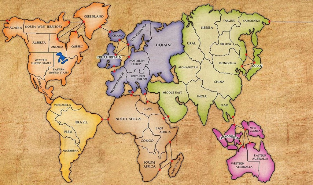
If you've ever played Risk, the Amero-Eurocentrism is extreme.
https://cdn.matthewhaeck.com/content/images/2015/02/risk.jpg
https://freeprintableaz.com/wp-content/uploads/2019/07/risk-...
North America: 9 territories, larger than Africa. Europe: 7 territories, as large as Africa. USA: 3 territories, Canada: 5, Australia: 2 China, India, Brazil which are all very large: 1
Re: Maps distort how we see the world
#199This is why I'm glad Google maps is available in a 3d globe! Even at relatively close zoom levels the subtle differences in scale are really noticeable. Unfortunately I'm not entirely sure how to get Google Maps to always start up in the 3d sphere mode. Half the time in firefox it just reverts back to a flat map.
It'd be pretty cool if they can show the map in the Mercator projection with a center the user can choose, as well as which way is up...
https://earth.nullschool.net/>
(There are many other reasons to love that tool, but the projections options is icing on the cake and/or planet.)
Re: Maps distort how we see the world
#200Earlier quoted context omitted.
> Every flat map projection distorts something, so every projection has to optimize some parameter and trade off other utility. I'm constantly amazed at how hung up people are on apparent size of countries. If size is your thing, use some other projection! That's the point of the post. The trade-offs between different projections are rarely discussed, considered or even mentioned outside very small cohorts because th…
> The trade-offs between different projections are rarely discussed, considered or even mentioned outside very small cohorts Not true. They're honestly discussed all the time to the point of becoming tiresome.
https://news.ycombinator.com/item?id=32532282
https://news.ycombinator.com/item?id=25104787
And it was something we covered in school on the 80s.
It’s an interesting post but not really revelatory.