Earlier quoted context omitted.
why must IDEs look like this? Qt Creator is currently my favourite IDE to develop C++ in (even if it does not use Qt) and it doesn't look like this.
I've used Qt Creator only once or twice, but my memory (and the handful of screenshots I see on google image search) is that it's pretty much the same. An editor rectangle embedded in a bunch of other crap with way too much vertical space above and below it dedicated to things that aren't very important. For reference, my emacs window has the gnome 3 panel and the window manager title bar as waste and that's it. And…
On the other hand, to my eyes at least, most other IDE's look something like this [6], [7] or very very extreme cases [8]. That is, they lose a lot of vertical space to tool bars.
When I'm developing on Linux and I'm not developing a Qt GUI application in C++, I use a mixture of text-mode vim, geany and gedit in a tiling window manager (that is, the "dock windows" in most IDEs are windows that I have tiled, or vim panels) with no window borders or decorations whatsoever [9].
[1] http://upload.wikimedia.org/wikipedia/commons/4/4d/QtCreator...
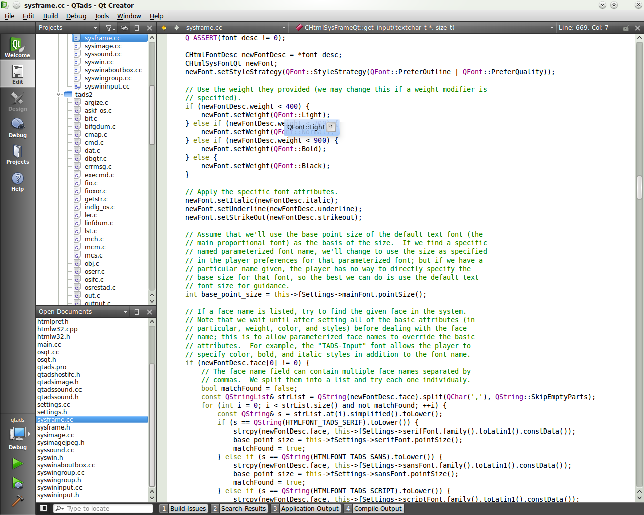
[2] http://www.developer.nokia.com/Resources/Library/Porting_to_...

[3] http://linux.leunen.com/wp-content/uploads/2009/03/qtcreator...
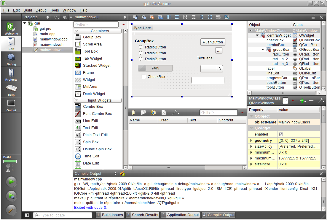
[4] http://lists.qt.nokia.com/pipermail/qt-creator/attachments/2...

[5] http://4.bp.blogspot.com/-teVIBJ45OEU/Twbi9_wQd_I/AAAAAAAAAY...

[6] http://www.eclipse.org/screenshots/images/SDK-RedFlag_Linux....

[7] http://www.hanselman.com/blog/content/binary/WindowsLiveWrit...
%20-%20Microsoft%20Visual%20Studio%20(Administrator)%20(5).png)
[8] http://swtswing.sourceforge.net/screenshots/images/EclipseMe...

[9] Not my screenshot, but similar: http://static.milkbox.net/ss/ss-2009-05-06.png
