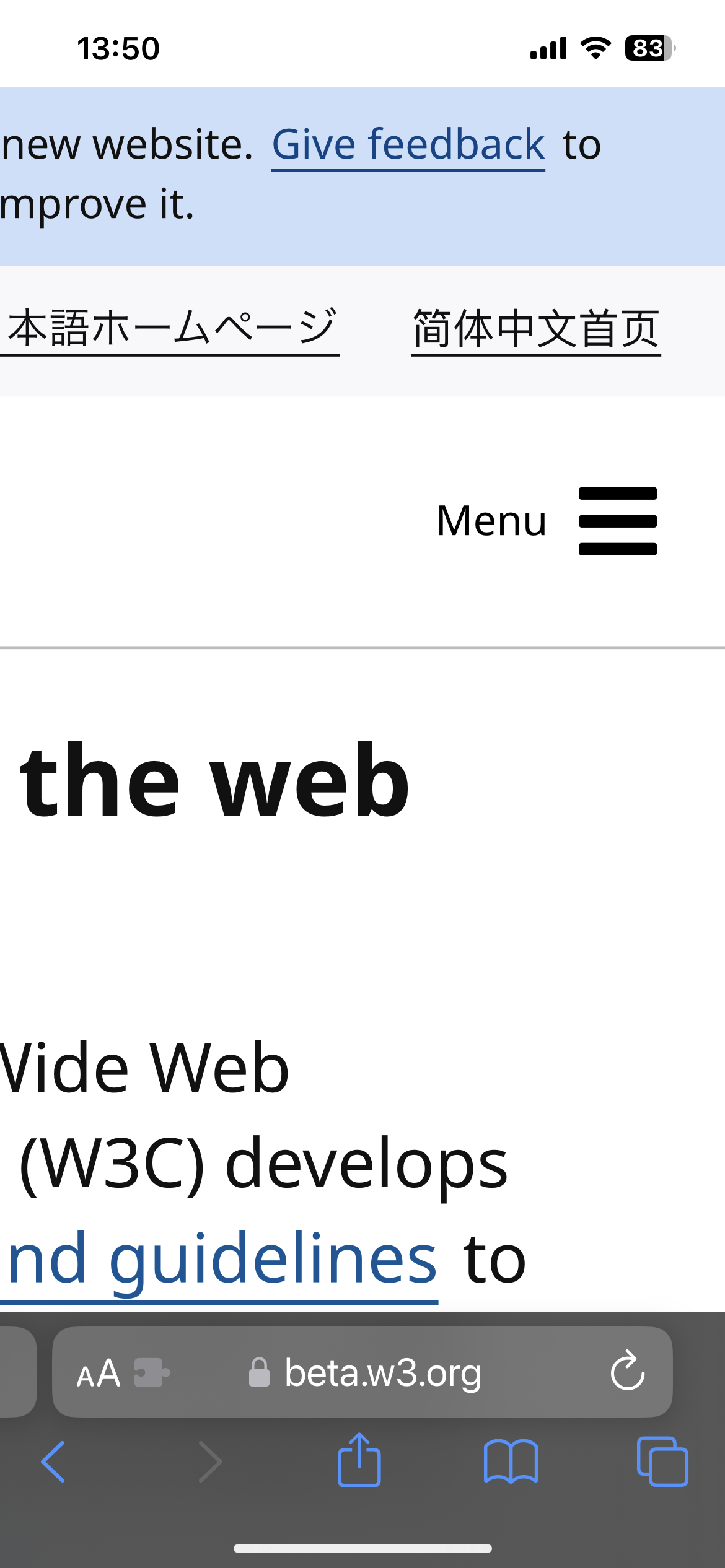
Zooms in when I click menu on IOS Safari https://s.natalian.org/2023-02-28/menu.png
W3C Beta Website
71–80 of 81 posts
Re: W3C Beta Website
#72[deleted]
Re: W3C Beta Website
#73If the designer is reading this thread. My fellow human, please swap out the corporate memphis landing page image with something that's less overused in web design today.
I like when softwares have quirky logos / graphics with personality, like Linux, Plan9, openbsd, there's a bunch more but can't think of them on the top of my head
Re: W3C Beta Website
#74Earlier quoted context omitted.
For people who don’t know, Corporate Memphis (aka Alegria, Homoglobo) is a style of illustrations that features extrahuman attributes, such as non proportional bodies and non-existing skin colors. It has been credited to Facebook, and was explicitly made to be modular (as in designers are replaceable). Obviously beauty is subjective, but to me this style has strong connotations of cynical corporations, eerie feelings…
I thought this style of artwork was quite common in the 90s in the corporate world?
I wouldn’t be surprised if it’s a reincarnation, such is the cycle of trends after all, but I’m pretty sure this iteration is fairy distinct. I would be super curious if you have some examples though. Are you thinking like clipart?
Re: W3C Beta Website
#75If the designer is reading this thread. My fellow human, please swap out the corporate memphis landing page image with something that's less overused in web design today.
I like when softwares have quirky logos / graphics with personality, like Linux, Plan9, openbsd, there's a bunch more but can't think of them on the top of my head
GNU Guile's one is pretty good IMO https://www.gnu.org/software/guile/
Re: W3C Beta Website
#76Zooms in when I click menu on IOS Safari https://s.natalian.org/2023-02-28/menu.png
Works fine here
Re: W3C Beta Website
#77Earlier quoted context omitted.
I thought this style of artwork was quite common in the 90s in the corporate world?
I wouldn’t be surprised if it’s a reincarnation, such is the cycle of trends after all, but I’m pretty sure this iteration is fairy distinct. I would be super curious if you have some examples though. Are you thinking like clipart?
Yes I think this style can be seen in clipart. I don’t have a great source but you can see the style in the examples in this article https://amp.smh.com.au/technology/microsoft-clip-art-is-dead...
Re: W3C Beta Website
#78Back in the day there use to be a joke website called "every fucking bootstrap site" [1] where it would lambast the popular design zeitgeist of the time. I really wish websites would opt for more distinctive looks rather than the massive homogenization we see across the web. Everything looks the same when it doesn't have to. Things can be stylized while accounting for accessibility and usability. I don't know what to…
Oh I love that site! Very appropriate demonstration for what is possible and what is not preferable. I agree that distinctive designs are far better. For the W3C I think they could best serve to have multiple versions of their website to best demonstrate the variety of websites that would occur-- information/static, production/dynamic, non-production/update-able-- since they have reputation as the web standards body.
Re: W3C Beta Website
#79If the designer is reading this thread. My fellow human, please swap out the corporate memphis landing page image with something that's less overused in web design today.
Yes please! There's no point in having the image/illustration too. Yes it would be dead/white space but thats not an issue at all
Re: W3C Beta Website
#80Information density. One thing I really dislike over the last 10+ years the web has brought is a huge reduction in information density. W3C old site was great at being dense on content/info. This site is not.
+1, the deemphasis/degrading of average information density has been disappointing as user. Old site should be kept and used as their ideal demonstration for information-dense websites.