Live data from Hacker News

I spent a year designing a low profile, minimal mechanical keyboard

electronicmaterialsoffice.com

251–260 of 688 posts

Re: I spent a year designing a low profile, minimal mechanical keyboard

#251

Love the design in general, nice and understated. I'm not sold on the typograhy for the numbers, it seems a bit overdone. The rotary encoder seems a bit pointless, I wouldn't know what to use it for other then volume perhaps? Could the aluminium base be replaced with more of the recycled plastics? If you are going for sustainable, that seems more sustainable then milling one of the more energy intensive materials we…

I have mainly been using the rotary encoder for volume, yes. I have to say it does _feel_ very nice though, much more satisfying than changing volume with vol up/down media keys.

I tested out using the encoder for other things like zoom in/out but I haven't found anything where it felt more useful than volume.

In regards to the case, the aluminium case gives the device a reassuring heft. My preference would be to make it out of some % of recycled aluminium but this is proving hard to source in low volumes.
Re: I spent a year designing a low profile, minimal mechanical keyboard

#252

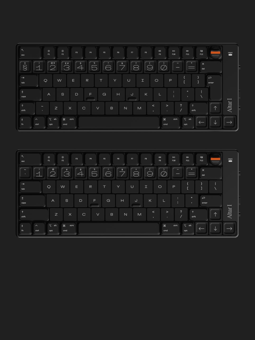
Web site advice: The spinning graphic is cool but it's very hard to get a decent look at the whole thing. I even tried clicking to pause it. It seems like all the pictures are partial or moving. As the keyboard goes: As others have noted, it would be really nice to see this design approach taken to a more full-sized standard keyboard. I think it's necessary to have some kind of tactile thing between function keys - a…

I don't have a cursor on the website. Is it just me? As soon as I click the link it simply goes invisible. I see some hover effects when I move around, though. Is this intended design as in "use your keyboard"? I mean I'd get the joke but it's a terrible idea ...

The site applies (for me) a custom cursor. Presumably it failed to load the graphic for you and thus you get no cursor at all.

Re: I spent a year designing a low profile, minimal mechanical keyboard

#253

This comment section is full of people complaining about a 70% keyboard not being a full-size keyboard, but that is what makes it a 70% keyboard. If it doens't fit your preferences or use-case then you are not the customer but it seems bizarre to focus so much on the sizing.

I suspect it's because keyboards are so personal for people who type a lot; it's very easy to see a keyboard and think, "That looks great, except that...". For me, when I see a 60% keyboard, I think, "Okay, but I want my damn separate function keys, arrow keys, and at least dedicated page up/down buttons"; when I see a 70% keyboard, I think, "Yeah, like that."

Personally, I'm typing on a Matias Mini Tactile Pro right now, and I suspect my dream keyboard would just be one of these with a design that didn't feel stuck twenty years in the past. I alternate between this and a Vortex Race 3, I think it is, with Cherry MX clears.

My biggest complaint with the Altar I isn't the layout, it's that it has no switch options, and I don't want a linear switch; that alone makes it Not For Me. (I also don't particularly like the choice to make GIANT NUMBERS; the marketing copy talks about being "typographically balanced" and I think, "But is it?") But it looks like a nice keyboard, and kudos to the designer for pulling it off.

Re: I spent a year designing a low profile, minimal mechanical keyboard

#254

Web site advice: The spinning graphic is cool but it's very hard to get a decent look at the whole thing. I even tried clicking to pause it. It seems like all the pictures are partial or moving. As the keyboard goes: As others have noted, it would be really nice to see this design approach taken to a more full-sized standard keyboard. I think it's necessary to have some kind of tactile thing between function keys - a…

Replying to myself, someone else said look at https://electronicmaterialsoffice.com/img/layouts.jpg in a browser window and deleted their comment (?)

Anyhow, just realized: no page down, page up, home or end keys? What? No.

Re: I spent a year designing a low profile, minimal mechanical keyboard

#255

I run a subreddit on mobile ergonomics ( http://reddit.com/r/ergomobilecomputers/ ) and spent the past year using raised tablet PC as my only machine, and curating the smaller subset of portable keyboard & computer setups. My advice: - drop the rotary encoder, it messes up the height for packing the keyboard away. - a 75% layout (i.e. having fn keys) is okay, but makes it a bit challenging to fit in with a 13" tablet…

Rotary encoder is a cool idea but something thinner with a “key” would be better perhaps.

Re: I spent a year designing a low profile, minimal mechanical keyboard

#256
post #137
post #105

Thoughts: - Excellent job - The font choices are bold. They don’t appeal to me personally, but nice job. - The sunk/raised key caps look nice but I’m not sure how they would perform in practice. - I couldn’t tell from the website what the second switch on the site does. Maybe USB/Bluetooth? - My strong preference is a key command for switching from Bluetooth/USB, and that the keyboard keep both active for instant swi…

The font thing is bigger than people might think. As soon as I saw the number row, I had such an immediate and harsh reaction to it that it surprised me. I almost couldn't believe that was the cause, but when I waited for the device to turn around again, that was definitely it. I don't even have to look at my fingers often, but I wouldn't be able to stand walking by those numbers on a regular basis. I don't think I'v…

I agree - for me I like the keyboard as a whole, but the bits that bug me are:

- the rotary encoder. I don't see what the aim of this is - what's the intended usecase?

- the font on the numbers. I feel like it should match the font used on the other keys instead, which I think I like but it's hard to tell because there's no good actual picture of the keyboard as a whole

- drop the model name on the right. I get that you've made a keyboard that is a design statement, but it would bug me as an owner. Move it to the bottom.

edit: for context, I already have a not dissimilar in terms of concept Keychron K3. That puts page up/down/home/end in that blank space on the right where you've put the model name. It does make the keyboard feel more cluttered, but I do find myself using those keys frequently.

oh, and is it backlit? I am assuming not from the specs, which is unfortunate. an understated, not too bright, white only backlight would be really nice to have on a keyboard like this.

Re: I spent a year designing a low profile, minimal mechanical keyboard

#259

It's a very artistic website, but it's awful for getting a good look at the actual product - you do not have a single static shot showing the whole keyboard in a size that means I can get a grasp for what it looks like at 1920x1200. edit: in fact, you have better shots of the keyswitches you're using and your theoretical recycled bottle than you do of the keyboard itself. It's baffling.

Haha thank you for the feedback, and noted! I will look to add some static shots of the board.
Post reply on HN