Earlier quoted context omitted.
The OSX look is pretty old at this point. They've managed to update it in spots but much of it is dreadfully ugly. Like this: http://admintell.napco.com/ee/images/uploads/appletell/bill-... Note that Metro is pretty old too, it started with Windows Media Center, but has changed a lot since then.
Can you post a screenshot (or a link) to a similar page from an OS that doesn't look tired to you? Not criticizing you -- just want to know what you think.
http://blog.tmcnet.com/blog/tom-keating/images/windows-phone...
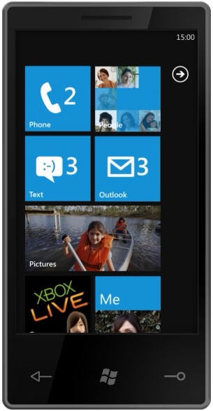
That home screen is the perfect mix of iPhone (structured, but with minimal ability to display info) and Android (stacked with widgets, but a mess layout-wise).
The UI in WP7 is incredibly person-centric- I look up their entry in the phone book, it shows me their updates on various social networks, as well as a "history" tab that aggregates all our chats, e-mails and text messages into one list. It's very slick.


