Live data from Hacker News

When old historic maps overlap with modern political maps

twitter.com

31–40 of 182 posts

Re: When old historic maps overlap with modern political maps

#31

Peeve: To cause to be annoyed or resentful. synonym: annoy. These are not pet peeves at all, they are the persons pet loves. All examples are a type of "look at this great example, designed not to annoy or cause resentment at all, just the opposite! Aren't they cool and amazing?"

I was very confused by that thread. I kept scrolling to find where he explained why it was a pet peeve of his.

Re: When old historic maps overlap with modern political maps

#32

I wonder if things are going to change significantly with all of the covid related movement.

Anecdotally, the movement I've seen largely results in consolidation of 'like-minds', rather than a culture-mixing diaspora that results in a greater balance of varied perspectives. I hope my limited experience isn't the norm, but I suspect it is.

Re: When old historic maps overlap with modern political maps

#33

Peeve: To cause to be annoyed or resentful. synonym: annoy. These are not pet peeves at all, they are the persons pet loves. All examples are a type of "look at this great example, designed not to annoy or cause resentment at all, just the opposite! Aren't they cool and amazing?"

Author admits his mistake:

François Valentin @Valen10Francois · 16h I realize that I've used that word completely incorrectly for ages!

https://twitter.com/Valen10Francois/status/15241607219023544...

Re: When old historic maps overlap with modern political maps

#34
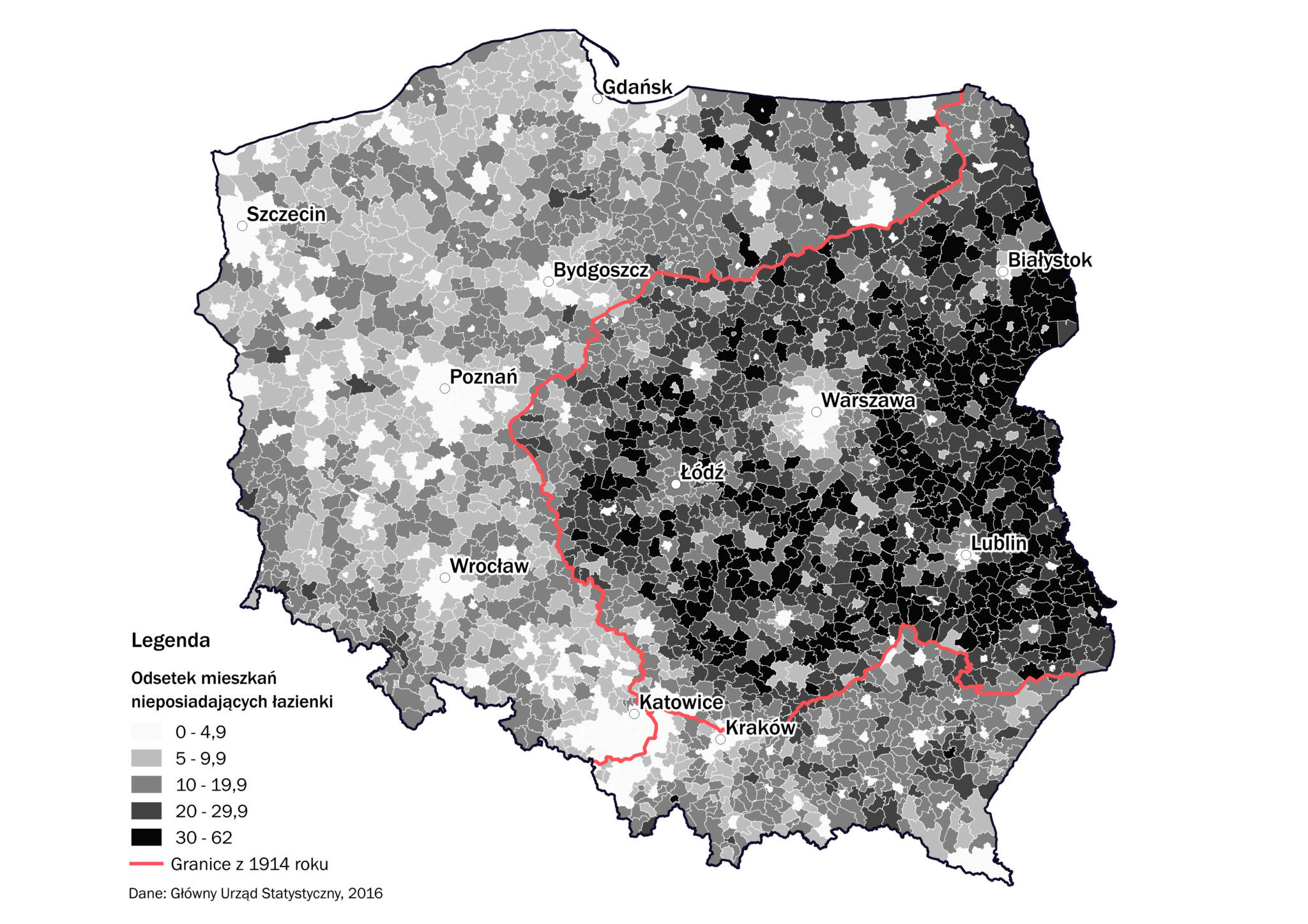
You can see the result of the 123-year partitioning of Poland on many maps, to the extent that it has become a meme:

1. the population of deer and boars: https://www.facebook.com/kartografiaekstremalna/photos/a.153...

2. the modern railway network: https://ziemianarozdrozu.pl/artykul/2861/mamy-%E2%80%9Enie-p...

3. the percentage of flats without a bathroom: https://www.miesiecznik.znak.com.pl/wp-content/uploads/2018/...

4. the percentage of companies in the real estate sector: https://www.facebook.com/kartografiaekstremalna/photos/a.153...

5. unmarried couples with children: https://www.facebook.com/kartografiaekstremalna/photos/a.153...

6. the area of asbestos roofing: https://wbdata.pl/mapa-azbestu-w-polsce/

7. families where kids get gifts for Easter: https://www.facebook.com/kartografiaekstremalna/photos/a.153...

8. the name for Santa Claus: https://www.facebook.com/kartografiaekstremalna/posts/123501...

9. town names starting with the letter A: https://www.facebook.com/kartografiaekstremalna/photos/a.153...

10. average farm size: https://biqdata.wyborcza.pl/biqdata/7,159116,22094987,polski...

Re: When old historic maps overlap with modern political maps

#35
post #30

Not sure I totally buy the Mexico one. The correspondence just isn't as strong as in some of the other ones, and in some places is confounded by modern state borders.

I don’t know that these are all cause and effect, but just interesting overlays. The Mexico one is clear to Americans - people who immigrate from Mexico choose to stay nearer to Mexico. Similar cultures, weather, etc. The areas previously being a part of Mexico is just coincidence.

Re: When old historic maps overlap with modern political maps

#36
post #34

You can see the result of the 123-year partitioning of Poland on many maps, to the extent that it has become a meme: 1. the population of deer and boars: https://www.facebook.com/kartografiaekstremalna/photos/a.153... 2. the modern railway network: https://ziemianarozdrozu.pl/artykul/2861/mamy-%E2%80%9Enie-p... 3. the percentage of flats without a bathroom: https://www.miesiecznik.znak.com.pl/wp-content/uploads/2018/…

The partitioning of Poland or its « migration » to the West ? Because as far as I'm aware, the split is due to the Western part being formerly German (including its population) rather than the Polish people itself having been split. Polish people are welcome to correct me, I'm not too familiar with history in this region aside from the broad stokes.

Re: When old historic maps overlap with modern political maps

#37

I’m sceptical, it’s too easy to cherry-pick data to make it look supportive of one’s political agenda. Not saying it’s the case here, I just wouldn’t trust too much "obvious" patterns and easy to understand maps from a twitter thread. More often than not, such threads are omitting data that doesn’t support the view of the author. Reality is rarely obvious and simple.

Pretty much this. Without deep historical analysis, this doesn't mean anything. It's like amateur etymology that is based on how similar certain words are, which typically gets things laughably wrong.

Re: When old historic maps overlap with modern political maps

#38

This seems to be complete BS to me: all I see in these maps is a lot of confirmation bias, the author really sees what he wants to see. Some maps do overlap very well but in that case it only looks interesting because we want to see a causation link where there is correlation. So sorry for the harsh words but I actually find this upsetting.

I completely understand your point. Misinterpreting correlation with causation is something that frequently bothers me in writings and discussions. In this case, however, I did find the correlations the author pointed out interesting. I did not interpret this as causal (the author may have made that claim, but I was more interested in the maps).

I still found it really cool to see how much an impact geography and path dependence has on our current state. I may be over generous, but when they show maps like the Alabama one where an ancient sediment deposit is correlated with farm size, racial makeup, and election results I think they are giving an example of how there can be common causes tied to geographies over long periods of time.

You're completely correct that simply overlaying the Austrian Empire's borders on a map of Romania's election results does not prove a causal link. It is much more likely that there is an underlying common cause (geographic feature, ethnic makeup, etc.). Pointing out these correlations is fun to me, as I'm able to speculate on the possible common causes.
Re: When old historic maps overlap with modern political maps

#39
Something similar that I find both fascinating and heart-breakingly tragic: The "Black Belt" in the U.S. Deep South. The Black Belt is both a geological term used to refer to the rich & dark soil [0] and a geopolitical term to refer to the high percentage of African Americans [1]. During the Cretaceous period, the shore-line at the time ran through the middle of Alabama and Mississippi, depositing rich organic deposits, which in turn allowed for plantations to thrive in those parts of the deep south. Even nearly 160 years after the Emancipation Proclamation, those counties still have some of the highest percentages of African American Populations. Overlaying the population demographic map on a a map of the cretaceous shoreline shows a correlation [2].

[0] https://en.wikipedia.org/wiki/Black_Belt_(geological_formati... [1] https://en.wikipedia.org/wiki/Black_Belt_in_the_American_Sou... [2] https://politicartoons.livejournal.com/4422659.html

Re: When old historic maps overlap with modern political maps

#40
post #34

You can see the result of the 123-year partitioning of Poland on many maps, to the extent that it has become a meme: 1. the population of deer and boars: https://www.facebook.com/kartografiaekstremalna/photos/a.153... 2. the modern railway network: https://ziemianarozdrozu.pl/artykul/2861/mamy-%E2%80%9Enie-p... 3. the percentage of flats without a bathroom: https://www.miesiecznik.znak.com.pl/wp-content/uploads/2018/…

That's pretty dank alright.
Post reply on HN