Earlier quoted context omitted.
Delays on keypresses.. in 2022. Are we going backwards?!
IntelliJ is really bad about this sometimes. I get that their software does an incredible amount of really tough stuff behind the scenes (which is why I won't be switching any time soon), but God I wish they prioritized input responsiveness over everything else.
The end of the nice GTK button
341–350 of 666 posts
Re: The end of the nice GTK button
#342I really miss a consistent user experience. A core idea that I as a user can rely on to predict how a new app will work. I was in awe when I discovered as a kid that user interface were a research area. Things like Fitt's Law and so on. It was not just opinion. Today I get the feeling it's mostly just opinion. Either the designer's opinion or the wish to copy the look of something. Whenever I see a hamburger menu I s…
> I feel confused and disrespected as a user every day I definitely agree with this, and I like your use of the word disrespect. I think the younger generation has encroached onto the sanctity of "the platform", if you will, and now us old timers are suffering. I time myself for my actions every day since I started noticing these despicable UI trends, and on average I waste about 2-3 hours a week trying to discover w…
Coming from that era, I strongly disagree. While I agree with the article, that some elements are harder to spot as interactable, I would still say that they are way more coherent than programs from W2K era and that one just got used to the broken design of the UIs of that era/platform.
While usually understanding the UI even in W2K, I don't think that the dumbing down of UI (and reducing palette/layers adds to that) for the dumb users is necessarily a bad thing. At the end of the day I am also a dumb user.
Actually using GTK3 for a while now and moving to GTK4 however might also trick me to not notice a downgrade in discoverability, so in that particular instance I might get tricked by getting used to a certain design language even if they simplify it to the point of actually decreasing UX for users that are unfamiliar with GTK compared to GTK3.
Re: The end of the nice GTK button
#343Yeah, the new GTK4 UI looks like a clone of Apple’s UIKit with a worse font. Shame that Gnome is following the trend of flat and boring UIs.
On macOS Desktop, checkboxes, buttons and everything else are still designed for mouse/kb
On gnome things are designed for vertical and touch screens, so you forced to endlessly scroll, windows is doing something similar, wich is an indication that they target mobile users, they are so out of touch
Only Apple knows what they are doing when it comes to UI/UX for desktop, and they make sure they don't mix desktop/mobile UX
Re: The end of the nice GTK button
#344Re: The end of the nice GTK button
#345This. This! You see people on Apple devices constantly scrolling up and down just a tiny bit while browsing the web. What a weird tic I thought, when I saw different people do that. Turns out scroll bars are always hidden on Safari for elements that have overflow with scroll behavior. So you never know if you're reading some important stuff that actually has another paragraph you don't see because it's otherwise not obvious you're looking at some with limited height. And it seems others are busy imitating this, I feel this happens with Firefox in Android now too.
Then these new navigation gestures on mobile. Gone are the three mighty buttons of Android. When the iPhone released, it was praised for cutting ties with anything that was established in the old computing world, all the implicit knowledge you had to have about how to use a classic desktop os. You could give the iPhone to any tech illiterate person and they could figure it out. Everything was discoverable, a fresh start with a clean and consistent UI language.
But today, not so much. Now phones went through the same iterations as the desktop os, and it's ok that you now need to learn a gesture to return to the home screen, or go back one step. There is no way someone who never used a phone before will somehow think "I might have to swipe into the screen from the left!" So now, just as the desktop os, we just assume you already know how to use a phone, and add "optimizations" on top of that that someone needs to tell you about.
Re: The end of the nice GTK button
#346I agree 100% with the author, the old GTK button was gorgeous, it will be missed. > I have had to explain to people tons of times that the random word in the UI somewhere in an application is actually a button they can press to invoke an action. This is one of my biggest complaints with the super flat modern designs. Many widgets lost their skeuomorphic depth, which encoded a lot if visual information (the clickabili…
Things like having pull handles on both sides of a door that has to be pushed from one side. Or having no push plate on either side of a glass door. Do I push? Is it a sliding door that's not working? Don't know!
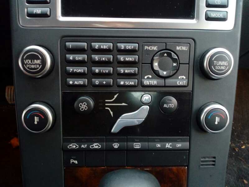
My car has the climate controls hidden behind a graphic of the current state on the stupid touch screen. It used to be buttons that had three zones for head, body and feet, a wheel for fan and a wheel for temp[1]. Volvo used to pride themselves on having controls you could use with gloves on, so all the buttons had 3D features and a positive press feel.
Now it's not even obvious the graphic is a button at all (it's also incredibly dangerous as you cannot do anything without a multi-click modal process with only visual feedback that you have to look at to use). Thankfully the window demister is still a physical button because that would be incredibly dangerous to hide behind a soft screen interface: when you need it you need it. However, it's lost its 3D profile and is now just a flat button.
My office has an amusing one: there's a door at each end of the building. The building is the same on both sides, neither side looks more "fronty" than the other, and the doors are the same. Only one of these is the main entrance. The door next to the car park (i.e. where anyone unfamiliar with the site will arrive) is not the main door. Therefore there are no call buttons. However, there's also no indication that there is another door on the other side. A whole building basically has no obvious start menu. Just...why do that?
[1] https://bparts-eu.s3-eu-west-1.amazonaws.com/ftp/azor_2/000/...
Re: The end of the nice GTK button
#347I really miss a consistent user experience. A core idea that I as a user can rely on to predict how a new app will work. I was in awe when I discovered as a kid that user interface were a research area. Things like Fitt's Law and so on. It was not just opinion. Today I get the feeling it's mostly just opinion. Either the designer's opinion or the wish to copy the look of something. Whenever I see a hamburger menu I s…
Re: The end of the nice GTK button
#348I really miss a consistent user experience. A core idea that I as a user can rely on to predict how a new app will work. I was in awe when I discovered as a kid that user interface were a research area. Things like Fitt's Law and so on. It was not just opinion. Today I get the feeling it's mostly just opinion. Either the designer's opinion or the wish to copy the look of something. Whenever I see a hamburger menu I s…
The worst offender is the login prompt. In Gnome, from the lock screen, I simply start typing my password. As soon as I type the first letter of the password, the password prompt appears, and when I'm done I hit enter and it unlocks.
On Windows, the first letter merely makes the prompt appear, but does not yet type into the prompt. In fact, it will only start feeding letters into the prompt once the little prompt-appearing-animation has finished. If I just start typing my password, it will eat the first three or four letters. So I hit enter, wait for the animation to finish, and only then start typing.
That's not the end of the world, honestly. But it is a learned gesture that the system taught me by failing to do what I'd asked it to do. It just goes to show the attention to detail that makes a UI feel fluid and frictionless.
Re: The end of the nice GTK button
#349A lot of comments in this thread are negative. As a developer using GTK4 and libadwaita, and as a user that uses gnome, I really like the changes. GTK4 brings some much needed changes, and the major bugs like listview scrolling being broken or bad text rendering on non-hidpi displays suck, but both have people working on fixing them. Libadwaita is a huge improvement, and makes it way easier to build good apps. As for…
That's the thing - you can say a particular design decision is incorrect. There's objective metrics around good user design.
Taking the position that all design is subjective, and therefore "just an opinion" is why the gnome team are widely derided.
It's not just an opinion - there's measurements you can make and metrics you can collect that serve as evidence for or against a particular design.
Re: The end of the nice GTK button
#350I'm going to take a risk here and say that I'm a designer who generally likes flat design. I see a lot of hate here against flat design, and it makes sense. A lot of designers abuse it, making their UIs ambiguous. It's probably true that if flat design was never conceived, UIs would be less confusing on average. But it's clearly possible to do flat design well. iOS is mostly flat, but it's quite beautiful and user fr…
I'd argue that the flat 2D look is cool these days because it is different from the skeuomorphic 3D look we had before. It will look old and faded in a few years, and in the search for a fresh look, we'll rediscover a more tactile 3D look.
Anyway, I actually like the flat 2D style as well. It might be that many current programs are not doing it well merely because they haven't had much experience with it. This will sort itself out in a few years. Much like the super-skeuomorphic apps from a few years ago that included things like stitching and torn-off paper in calendar apps and notepad apps, respectively.