Live data from Hacker News

The end of the nice GTK button

blog.brixit.nl

291–300 of 666 posts

Re: The end of the nice GTK button

#291

Earlier quoted context omitted.

Easy for someone who works at Apple to say "just throw money at the problem" while there is so much more to consider. Design as a workflow for Open Source design (as in UI/UX) hasn't even been worked on that much. Ideally, open source contributors work on projects because they care about it, and want to improve it. I'm not sure how many designers are using GTK applications day-to-day to care enough about it to start…

As I mentioned before, Canonical and Red Hat have money and could afford proper designers. Programmers are expensive as well, and they have plenty of those on staff. Someone is putting together standard HIGs for Gnome, writing these standard themes, designing the base apps, etc. So you can't just say it's all decentralized and so there's no hope -- there's a ton of collaboration and top-down work happening with Gnome…

> As I mentioned before, Canonical and Red Hat have money and could afford proper designers.

They do employ designers, including for GNOME. You might not like their designs. But to call them anything but proper is pretty mean spirited.

Re: The end of the nice GTK button

#292
post #272

Earlier quoted context omitted.

> Whenever I see a hamburger menu I silently think "Here someone has given up" Can you explain what you don’t like about hamburger menus?

Is a dumpster of features, you have no idea what you'll find in there. Has someone hidden the zoom buttons in there? How about print? Perhaps that's also where save is, or tab colour? Most things in the hamburger menu are completely unrelated but exist for the removal of context. Button outlines so you have no idea what you can and cannot click on as well, which is mentioned in the fine article, are all modern design…

So on desktop applications, I assume you prefer all your functions to be on toolbars, and you have similar disdain whenever you encounter a File menu? I guess if there's a lot of functions, you probably need some tabs on your toolbar- so the Office Ribbon interface is idyllic I assume?

Re: The end of the nice GTK button

#294

Earlier quoted context omitted.

Is a dumpster of features, you have no idea what you'll find in there. Has someone hidden the zoom buttons in there? How about print? Perhaps that's also where save is, or tab colour? Most things in the hamburger menu are completely unrelated but exist for the removal of context. Button outlines so you have no idea what you can and cannot click on as well, which is mentioned in the fine article, are all modern design…

So on desktop applications, I assume you prefer all your functions to be on toolbars, and you have similar disdain whenever you encounter a File menu? I guess if there's a lot of functions, you probably need some tabs on your toolbar- so the Office Ribbon interface is idyllic I assume?

The difference between a file menu and an hamburger icon is that the file menu hides file operations while the hamburger icon hides… anything. something. dead bodies.

Re: The end of the nice GTK button

#295
>Now one of the worst parts is that everywhere I only even hint at not completely loving the new libadwaita theme I instantly get shut down and disagreed with before I can even get the chance to give some feedback.

Gtk2 -> Gtk3 dejavu.

Re: The end of the nice GTK button

#296

I agree 100% with the author, the old GTK button was gorgeous, it will be missed. > I have had to explain to people tons of times that the random word in the UI somewhere in an application is actually a button they can press to invoke an action. This is one of my biggest complaints with the super flat modern designs. Many widgets lost their skeuomorphic depth, which encoded a lot if visual information (the clickabili…

Borderless buttons to have the right to exist, but you should be very careful with their use. For example, take this UI I made recently: https://mastodon.social/@grishka/107998100334356147 , 2nd screenshot. The button to decline invitation looks like a link (same color) and it's next to a real button. No one would ever get confused by this, it's pretty clear it's clickable. But a black word in a larger font among bla…

I disagree. I had to sit and think for a few minutes as it was extremely unintuitive - my first impressions were that I couldn't decline the invitation at all, and the button was disabled or missing for some reason (I've seen some bad CSS in my career so it no longer surprises me when it goes missing).

Re: The end of the nice GTK button

#297

I'm going to take a risk here and say that I'm a designer who generally likes flat design. I see a lot of hate here against flat design, and it makes sense. A lot of designers abuse it, making their UIs ambiguous. It's probably true that if flat design was never conceived, UIs would be less confusing on average. But it's clearly possible to do flat design well. iOS is mostly flat, but it's quite beautiful and user fr…

> If it's not obvious, it's probably not a critical feature, just a nicety for those who discover it.

That's a really bad way to go about usability. It's pretty frustrating you're looking for a feature to have to hunt for it like you're playing a point & click game. At that point I wouldn't even call it a feature, it's an Easter egg.

Re: The end of the nice GTK button

#298
> This has all the features I like from GTK 3. The only issue with it is that font rendering looks horrific, but that might just be my machine

I don't understand linux users' font tastes, apparently. To me the GTK4 screenshots are the only half-way decent font rendering in the lot. All the GTK3 shots have broken kerning in headings, not to mention the awful (lack of?) antialiasing.

Re: The end of the nice GTK button

#299

Earlier quoted context omitted.

So on desktop applications, I assume you prefer all your functions to be on toolbars, and you have similar disdain whenever you encounter a File menu? I guess if there's a lot of functions, you probably need some tabs on your toolbar- so the Office Ribbon interface is idyllic I assume?

The difference between a file menu and an hamburger icon is that the file menu hides file operations while the hamburger icon hides… anything. something. dead bodies.

Almost every desktop application has a File menu whether or not it deals with files. The File menu has an "Exit" item. Does it Exit the File? OBS has "Always on Top" as an option within "File".

Or we can look at it from the other side. "Where do I find the settings for this app?". Is it in File, Edit, View, Tools or Help. The answer depends on the app. Menus can be well organized or poorly organized but I don't think we should be banishing menus. The hamburger icon is just an iconic, space efficient way to say "menu"

Re: The end of the nice GTK button

#300
post #270

I really miss a consistent user experience. A core idea that I as a user can rely on to predict how a new app will work. I was in awe when I discovered as a kid that user interface were a research area. Things like Fitt's Law and so on. It was not just opinion. Today I get the feeling it's mostly just opinion. Either the designer's opinion or the wish to copy the look of something. Whenever I see a hamburger menu I s…

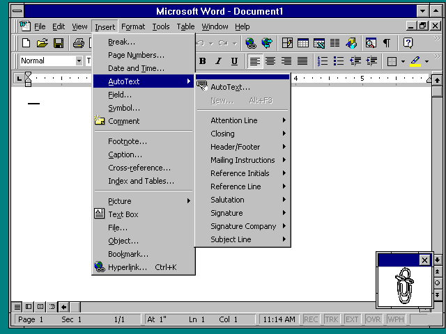
I feel the same way. It's like we're back to the MS-DOS era where every application had its own interface and you had to learn each application's way of performing tasks. macOS and to a lesser extent Windows prided themselves on consistency across applications. But this required developers to voluntarily conform to those platform's guidelines, and in the case of Windows, the goal of consistency was challenged by (1) Windows' backwards compatibility and (2) Microsoft's own disregard for consistency at times, such as Microsoft Office using its own UI toolkit instead of relying on the UI elements of the version of Windows Office is running on (for example, Office 97 introduced flat toolbars, a different style of menu bar, and the Tahoma font, which deviated from Windows 95/NT 4 and its button-style toolbars and its use of MS Sans Serif); this theme even carried over to Windows NT 3.51 where Office's UI was out of place; see http://toastytech.com/guis/nt351word.png for a screenshot). Contrast that with the Web, where there are no common UI/UX guidelines. Sadly this philosophy has spread to the desktop, where increasingly each application seems to have its own UI/UX without regard for the platform's guidelines.

There is one good thing I could think of about the loss of consistency across applications: the underlying operating system matters less when the application works the same across platforms. Ironically this may help with the adoption of desktop Linux; Chrome, Slack, Zoom, and VSCode generally work the same. To paraphrase, this fulfills Netscape's vision in the mid-1990's of reducing the operating system to a bunch of device drivers.

One would think that Microsoft and Apple don't want Windows and macOS to be reduced to a bunch of device drivers. Then again, perhaps Microsoft's and Apple's business models don't require the long-time maintenance of these desktop-oriented operating systems. Microsoft makes a lot of money from Office and Azure, and Apple makes a lot more money from the iOS platform than from the Mac.

Still, I personally lament the rise and triumph of the siloed app, and the decline of platforms that promoted UI/UX consistency through a set of standard human interface guidelines, and I feel personal computing is generally getting worse instead of better.
Post reply on HN