Live data from Hacker News

The end of the nice GTK button

blog.brixit.nl

111–120 of 666 posts

Re: The end of the nice GTK button

#111
Perhaps I'll be crucified for saying this, but I actually like flat design. Or at least, I think I do. I always thought flat design was as the name suggests; flat. As in, no gradient, no faux 3D, and I guess no borders. I'm not such a fan of rounded buttons, I think they often scale badly (pretty much anything round will unless its a vector I guess), but I didnt think that was a requirement of flat design.

That being said, I'm not sure what it is now, because that original button looks like flat design to me. The only "non-flat" element of it is the 1px border, but surely thats not the source of all this commotion?
Re: The end of the nice GTK button

#112
post #95

Earlier quoted context omitted.

“Scale-independent layout” (layout that ignores pixel aliasing) really requires PPI over ~200, that is, more than most desktop monitors provide. We’re still just not there.

You could do text hinting (snapping to the (sub-)pixel grid) after layout, based on some kind of auto-hinting heuristics. Arguably, this is needed anyway because text gets "laid out" all the time as part of advanced typesetting, including all sorts of complex microtypography that doesn't really play well with the old-fashioned "bitmap font" type of hinting.

I proposed and implemented snapping vertical positions to the pixel grid after layout: https://gitlab.gnome.org/GNOME/gtk/-/issues/3787#note_127656...

The maintainer responded that "[c]hanges to the rounding behavior of glyph positions really belong into pango, though". I understand, but I don't know whether he's suggesting fractional layout but integer-rounded rendering, or integer-rounded line heights and layout and rendering. And I don't know how to change Pango, and lost interest in digging further.

Re: The end of the nice GTK button

#113
post #110

So basically the new GTK is iOS but without the professional designers behind it. What I cannot understand is how Canonical, Red Hat, or some rich SV person hasn’t thrown money at the problem and hired a big wig design firm or person to overhaul it all. Johnny Ive is now even available (if he’d take the project). But even going thru a site like dribbble there are so many amazing designers out there. To me it would be…

> So basically the new GTK is iOS but without the professional designers behind it. Professional designers seem to be the ones creating these problems. Back when it was just programmers you could tell a button was a button, a tab was a tab and we didn't hide basic functionality behind a swipe gesture or long press that users were supposed to just know. Now everything is pretty but harder to use.

> Back when it was just programmers you could tell a button was a button, a tab was a tab and we didn't hide basic functionality behind a swipe gesture or long press that users were supposed to just know.

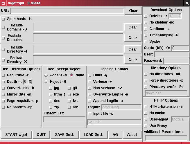
Keep in mind that programmers also gave us this: http://www.martin-achern.de/wgetgui/images/linux_wgetgui.jpg

People across all disciplines are capable of making poor design choices

Re: The end of the nice GTK button

#114

Earlier quoted context omitted.

This is why I have reverted to the CLI whenever possible. There's something deeply assuring knowing that I don't have to relearn my whole workflow every few months when the trends change. ls, grep, find, ps, htop will always be what they are. Even the Windows CLI is thankfully consistent. All I want is to get work done the way I want, and I've found the CLI is increasingly the path of least resistance.

I regret to inform you that the latest release of `find` has been renamed to [magnifying glass emoji]. For example, # Find directories the old way. find . -type d # The cool new way! [magnifying glass emoji] . -[keyboard] [folder emoji] Edit: HN appears to strip emojis, so my new edited comment doesn't pack the same punch.

You jest, but I'm not sure that is a bad idea. bash/zsh seem happy with emojis as function/alias names, and I can input emojis easy enough. In fact some emojis are easier to type in my chosen layout than the string necessary to disambiguate completion for some commands.

Thanks for the idea, and I'll redirect co-worker scorn at U+1F984 for `git push` towards you ;)

Edit to add: Using emoji for commands/arguments is actually quite workable with global aliases or custom zle widgets in zsh, and moderately workable by using $INPUTRC to specify text replacements for readline if you're a bash user.

Re: The end of the nice GTK button

#115

Earlier quoted context omitted.

The don't theme my app people were complaining about their bug trackers being full of theme-related issues. Instead of just setting up a filter rule in their tracker so they could ignore those issues, they decided to go super draconian and remove theming for the entire desktop. That disproportionate response to what comes down to an organizational shortcoming on their end made people upset, I'm not sure what they exp…

Note that they don't care about the themes their end users pick, though. You can theme your app just fine. They just want operating systems using their software (with their logos, trademarks and support links) to stop shipping their custom themes by default. They just don't want Canonical or Fedora to ship a theme that makes all applications that didn't come bundled look like shit. If you like the Windows 95 Hotdog S…

But end users use the same mechanism to theme their apps as vendors and that one is being removed.

Re: The end of the nice GTK button

#116
post #9

Earlier quoted context omitted.

I agree that the defaults are atrocious, but freetype can be configured and the options are limitless.

Linux font rendering has come a long way in the last couple years. With TrueType2 and Windows fonts taken from an installer ISO (and not the ancient corefonts package), you can actually get some overall mostly okay font rendering. Every now and again, the hinting bugs out and it looks unreadable, but its far better than the olden days.

What exactly has happened in the last couple of years? And how would installing those newer Microsoft fonts affect font rendering elsewhere than where they are used (not at all by the desktop environment by default, and as to web sites, it depends on what you use)?

IIRC the last big-ish change for me was around 15 years ago when some patent-encumbered patches were enabled by default by (some) Linux distributions. Which is okay for me because overall I think freetype font rendering is better than that in Windows with most fonts, the arguable exception being certain Microsoft fonts – however, freetype has the additional advantage that it rarely if ever produces pixelated ugliness with unhinted webfonts, unlike what I've seen happening with Windows.

Re: The end of the nice GTK button

#117

So basically the new GTK is iOS but without the professional designers behind it. What I cannot understand is how Canonical, Red Hat, or some rich SV person hasn’t thrown money at the problem and hired a big wig design firm or person to overhaul it all. Johnny Ive is now even available (if he’d take the project). But even going thru a site like dribbble there are so many amazing designers out there. To me it would be…

I think the problem Gnome, and Microsoft, have is they keep throwing money at designers. So designers keep making designs for the sake of designing. They should stop designing, stick to the design they already have and only do incremental updates when new widgets come out.

Re: The end of the nice GTK button

#118
post #47

I agree 100% with the author, the old GTK button was gorgeous, it will be missed. > I have had to explain to people tons of times that the random word in the UI somewhere in an application is actually a button they can press to invoke an action. This is one of my biggest complaints with the super flat modern designs. Many widgets lost their skeuomorphic depth, which encoded a lot if visual information (the clickabili…

UIs go through 3D and 2D in phases. Windows 2.0 - 3.1: 2D Windows 95 - 7: 3D Windows 8 - 10: 2D MacOS 6 - 7: 2D MacOS 8 - 10: 3D MacOS 11: 2D As a side point, I predict Sheriff and Sans-Sheriff fonts to also go into similar phases too though over a longer time scale. We're in a very long Sans-Sheriff phase now but I think Sheriff will be "in" in 20 years.

Is macOS 11 a lot different than macOS 12?

I'm using macOS 12 right now and there are a lot of 3D elements especially if you compare it to Windows 10 or Gnome in the screenshots of this post. It seems to be a mix of both approaches (similar to GTK 3).

Re: The end of the nice GTK button

#119
post #100

A lot of comments in this thread are negative. As a developer using GTK4 and libadwaita, and as a user that uses gnome, I really like the changes. GTK4 brings some much needed changes, and the major bugs like listview scrolling being broken or bad text rendering on non-hidpi displays suck, but both have people working on fixing them. Libadwaita is a huge improvement, and makes it way easier to build good apps. As for…

[deleted]

Re: The end of the nice GTK button

#120
It's the cycle of GNOME. Every few years they introduce something new that causes lots of regressions. Some of these regressions are then being worked at, some are defended as "design decisions" (no theming, Nautilus opening a new window for every folder, broken filechooser dialog, desktop indexer you can't turn off). Bugs are worked on and thing stabilize. People learn workarounds for their issues. Then another iOS-inspired thing comes and things break again.
Post reply on HN