GNOME core modules now only depend on introspection-based Python bindings (pygobject-3) and hence pygtk, gnome-python and gnome-python-desktop are not required any more. Interesting. I have been out of the loop for a while. Does this mean that existing pygtk applications have to be ported to pygobject-3 or is it a simple "import" change?
GNOME 3.2 Released
31–40 of 52 posts
Re: GNOME 3.2 Released
#32Earlier quoted context omitted.
You know, everything you see on most GUIs (Gnome is not Linux-only, you know) is themable. If you feel inclined to help the designers make a prettier interface, you can easily find information on how to actually help.
Nah, thank you. I think I will rather just continue buying my OS. I’m not really willing to invest more time than just trying it out from time to time nor do I understand why I should be.
The people who don't like margins don't want to help. Now you know.
Re: GNOME 3.2 Released
#33Anyone else move away from Gnome recently? I've switched to XFCE and find the workflow better adapted to what I'm used to, I gave gnome-shell a month or two before I couldn't take it anymore.
Re: GNOME 3.2 Released
#34Anyone else move away from Gnome recently? I've switched to XFCE and find the workflow better adapted to what I'm used to, I gave gnome-shell a month or two before I couldn't take it anymore.
Moved to Ubuntu 11.04 before giving up on Linux and even though I'm not the biggest Unity look-and-feel fan, it has most of the aspects of gnome-shell I like and worked smoothly on my ThinkPad T60 except for hardware volume buttons which was fixed with [1] and slow wireless due to an older kernel which was fixed with [2].
Overall this idea (inspired by Spotlight and I think perfected in Windows Vista by mapping it to a single key) of mapping the Windows key to an auto-focused, system wide search box is fantastic. I really wouldn't want to go back to a system without that keystroke. Gnome using that same structure and taking you to this nice overview/launch panel is a really slick refinement.
[1] http://forums.debian.net/viewtopic.php?f=6&t=60945#p3793... [2] http://ubuntuforums.org/showthread.php?t=1837729
Re: GNOME 3.2 Released
#35Earlier quoted context omitted.
Nah, thank you. I think I will rather just continue buying my OS. I’m not really willing to invest more time than just trying it out from time to time nor do I understand why I should be.
So, to answer your original question, "What's with Linux and margins?": The people who don't like margins don't want to help. Now you know.
Re: GNOME 3.2 Released
#36The "web application" trick is a great idea. I think we may see this idea stolen soon by all major OSes.
http://ihnatko.com/2011/07/22/making-desktop-webapps-in-lion...
Re: GNOME 3.2 Released
#37Anyone else move away from Gnome recently? I've switched to XFCE and find the workflow better adapted to what I'm used to, I gave gnome-shell a month or two before I couldn't take it anymore.
I stuck it out with Gnome 2.x on Ubuntu, until I "had" to convert that machine to Windows 7 (for running IAR). Windows 7 is somehow an improvement over Gnome 3.
Re: GNOME 3.2 Released
#38Anyone else move away from Gnome recently? I've switched to XFCE and find the workflow better adapted to what I'm used to, I gave gnome-shell a month or two before I couldn't take it anymore.
Funny, I can't get enough of it. It's rough around the edges probably because I'm running from the Gnome PPA on Ubuntu Natty, but the way it manages windows on multiple desktops is like nothing I've seen. It makes so much more sense. To each their own I suppose. Isn't there an option to go back to the traditional desktop?
Because you totally would look there and not Displays or Screen.
Re: GNOME 3.2 Released
#39Earlier quoted context omitted.
I stuck it out with Gnome 2.x on Ubuntu, until I "had" to convert that machine to Windows 7 (for running IAR). Windows 7 is somehow an improvement over Gnome 3.
What is IAR?
Re: GNOME 3.2 Released
#40So, what’s with Linux and margins? I thought they had solved that by now but nope, the margins are still all over the place, inconsistent and visually distracting. I feel this is even more apparent now that they dialed up the margins even more.
Please excuse my question, as I am quite design-inept, and often have no problem with whatever visuals are presented. I'm trying to figure out which margins are worthy of ire or inconsistent, for the sake of my own improvement on such visual matters. The only difference/inconsistency that leaps out at me is that between the content of a window and its border, in which case there seems to be a clear divide between pop…
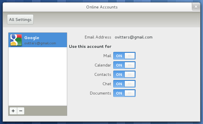
The very first screenshot on the page is a very awkward dialog: http://library.gnome.org/misc/release-notes/3.2/figures/gnom...
* "Use this account for" runs uncomfortably close to the account list. It looks bad. Couldn't they just put that whitespace on the right to use?
* The switch labels (Mail, Calendar...) are aligned with the Email Address label, but the switches themselves aren't aligned with the email value (ovitters@...). The implicit grid is broken.
* Someone was too lazy to style the email address in the selected state of the account list (dark gray on medium blue). There's not enough contrast to easily read it.
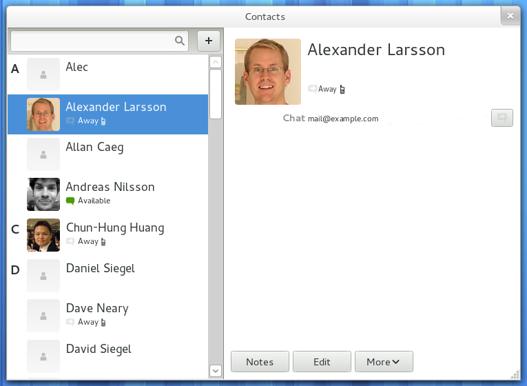
http://library.gnome.org/misc/release-notes/3.2/figures/gnom...
* This is the Contacts app whose sole purpose is to view a person's details. Why are their only details (Away, mail@example.com) the tiniest words on the screen?
* Letter placement in the contacts list (A, C, D) looks reckless and noisy. Horizontally, its margins are not equal. Vertically, it appears arbitrary. It would look better if they were horizontally centered and vertically on the baseline of the contact's name.
* The letters (A, C, D) also have too much contrast; they should be lighter. They're a visual hint, not an area of focus.
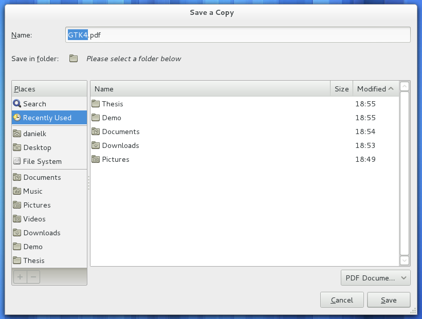
http://library.gnome.org/misc/release-notes/3.2/figures/file...
* Why is the filetype selector only wide enough to show "PDF Docume..."? There is a ton of space.
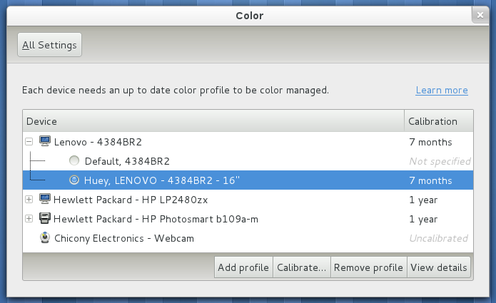
http://library.gnome.org/misc/release-notes/3.2/figures/colo...
* None of these buttons have enough padding around the label when compared to the buttons in other dialogs.
* Why are the lower buttons all squished together?
Most of these can't be fixed by theming, because they were caused by the dialog creators themselves. In short, there is a lack of attention to detail. :)