Wouldn't QVWM work better with some configuration?
Make Linux look like Windows 95
181–190 of 207 posts
Re: Make Linux look like Windows 95
#182https://archive.org/details/winfiles_cmfriend_202005 Ah, so that is what the semi-popular cyan-greyish colour theme is. Random encounter: http://hallofshame.gp.co.at/tabs.htm > I've been looking for the origin for twenty years.
I feel like that's just a slight variant (with the font, mainly) of the built-in Rainy Day theme.
Re: Make Linux look like Windows 95
#183This is what Red Hat 5 looked like out of the box. (More or less.)
Re: Make Linux look like Windows 95
#184Re: Make Linux look like Windows 95
#185For a more complete experience it should remove sound drivers and alsa from kernel and force you to find a binary copy on a floppy that you pray still works to make the speakers function .
Re: Make Linux look like Windows 95
#186Fun project, but I don't miss old Windows (I don't miss Windows at all really).
Re: Make Linux look like Windows 95
#187https://archive.org/details/winfiles_cmfriend_202005 Ah, so that is what the semi-popular cyan-greyish colour theme is. Random encounter: http://hallofshame.gp.co.at/tabs.htm > I've been looking for the origin for twenty years.
I like it, it's relaxing for the eyes, like the blue tints of Sun Solaris with CDE: http://toastytech.com/guis/sol.html
Note that CDE is open source since a few years ago. I personally compiled and run it on Debian 10. Getting it similar to screenshots you linked is not too much of a work.
Re: Make Linux look like Windows 95
#188> Make Linux look exactly like Windows 95... I mean *exactly*.
Good try, but if you're going to emphasize the exactness, I'm going to nitpick.
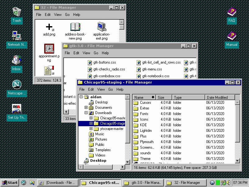
In the top picture ( https://cdn.substack.com/image/fetch/f_auto,q_auto:good,fl_p... ), the menu bar has too much vertical padding and lacks mnemonic (underlined) letters. The amount of padding on the desktop icon text also looks off. A good example is https://socket3.files.wordpress.com/2016/10/w95ptoys-1.png .

In the second picture ( https://cdn.substack.com/image/fetch/f_auto,q_auto:good,fl_p... ), Calculator just looks completely off. The Taskbar has too much space between the icon and window title. The tray icons should go in the same box as the clock, not outside. Good examples: https://i.pinimg.com/originals/27/fc/05/27fc05d3f826760c7fd0... ; https://www.cultofmac.com/ezoimgfmt/cdn.cultofmac.com/wp-con...
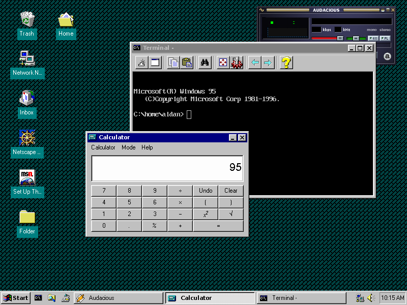


And this isn't even going as far as to nitpick the exact font-rendering algorithm down to the pixel.
Re: Make Linux look like Windows 95
#189This with WINE is what I think is the perfect combination of GUI and CLI... but as a long-time Windows user, several things stood out and made it look slightly off: the menu bar and padding around the icon labels is too tall the window borders are slightly too wide (compared to the default) scrollbar buttons shouldn't disable at end of travel sort direction indicator in header control (which first appeared in Win2k)…
It's the fonts in general, for me; though I also noticed that the menus and icons labels had too much padding.
Re: Make Linux look like Windows 95
#190This with WINE is what I think is the perfect combination of GUI and CLI... but as a long-time Windows user, several things stood out and made it look slightly off: the menu bar and padding around the icon labels is too tall the window borders are slightly too wide (compared to the default) scrollbar buttons shouldn't disable at end of travel sort direction indicator in header control (which first appeared in Win2k)…
Is "keming" a graphical pun on "kerning"?
I thought so when I saw it, as well. It's pretty funny - bad kerning == keming [0]. It's a keeper, I'd say.