Live data from Hacker News

Design evolution of the Windows control panel

versionmuseum.com

61–70 of 112 posts

Re: Design evolution of the Windows control panel

#61
post #51
post #49

Earlier quoted context omitted.

This is what happens when you have too many chefs in the same design kitchen. Microsoft really could use some product/UX zealot in the driver seat for a while. They should also work on reducing the latency of their products in general... Everything feels like laggy trash now. Someone should do a study on stress levels between windows XP and windows 11 user groups for basic daily office tasks and then throw it into th…

"Microsoft really could use some product/UX zealot in the driver seat for a while." I hate to say this, but I think it would just result yet another UX camp in the system. The weight of legacy is heavy. To clean up the UI mess, Microsoft would need to heavily deprecate supported APIs and conventions, and I don't think that's going to happen.

They were on the right track, but again the too many cooks part borked the whole execution, now we have lots of tiny kitchens each managed from one of those cooks trying to sell their special dish going forward.
Re: Design evolution of the Windows control panel

#62
post #49

The control panel was solved, so to speak, once they added a search interface. It doesn’t matter how complicated the hierarchy of modules is if what you want is only a search away. Only Microsoft could unsolve a solved problem by segregating the settings into two paradigms, neither of which is a superset of the other. Even the duplicated functionalities are not equivalent—the list of programs you can uninstall with t…

This is what happens when you have too many chefs in the same design kitchen. Microsoft really could use some product/UX zealot in the driver seat for a while. They should also work on reducing the latency of their products in general... Everything feels like laggy trash now. Someone should do a study on stress levels between windows XP and windows 11 user groups for basic daily office tasks and then throw it into th…

Hi, Windows Phone fanboy here. I've posted most of the below before. ;-) The sad truth is, that the new Metro UI introduced with Windows 8 specifically for Phones was pretty efficient and slick. A mid-tier WP phone was running circles around a mid-tier Android phone in 2014 when it comes to smoothness. Then we got another reboot of the whole mobile endeavor with UWP for Windows 10, which was more resource intensive, continuing the megalomaniac idea of having a unified mobile and desktop experience. And I don't think it's impossible to create this somehow. I just think developing a nice Phone UI and forcibly bolting it onto a 30 year old desktop OS that mostly evolved in gentle steps before was... stupid.

Anyways, the ironic thing today is that that whole UI mess Windows is in was caused by something that doesn't even exist anymore. These two disjoint worlds that lead to these jarring moments where you're thrown from that modern flat-clearly-coming-from-a-mobile-design-paradigm settings window into another dialog coming straight from the 90s. The new one wouldn't exist without Microsoft's botched attempt of re-entering the phone market! Without WP, we could have simply gotten more thought-out iterations and improvements to the plain old Windows GUI, with a desktop-centric approach, but more modern design philosophies. But now we have a mobile-first UI that is being spent lots of effort on to make it usable on a desktop OS.

And sure, I'm over-dramatizing a bit here. We got more touchscreens, convertibles, yada-yada that still benefit from these changes. But it was approached in a really twisted, stupid way, and I still don't know anyone who prefers UWP apps. Especially my old folks are rather confused by this and would prefer Windows still looked like XP or 7. Younger people might not care so much but spend all of their time in a browser anyways if they don't use their phones. Everyone else is a professional, and professional software doesn't exist as UWP apps.

Re: Design evolution of the Windows control panel

#63

Am I the only one who actually liked what M$ was doing with Windows 8?

No, I was a beliver on WinRT as merge for COM/.NET world, .NET Native as it should have always been and C++/CX as Microsoft finally getting the point of C++ Builder.

They just borked the whole execution and burned the bridges that many of us had, with the multiple rewrites since Windows 8 came to be, dropping support for devices and finally dropping even .NET Native and C++/CX.

The irony is that Windows 11 is so rushed out, that they needed to still make use of UWP for the new UI regardless of WinUI 3.0 marketing.

Re: Design evolution of the Windows control panel

#64
post #58
post #53

Earlier quoted context omitted.

I tried using bluetooth speakers with Windows. It was fucking atrocious because Windows makes zero effort to compensate for bluetooth lag. Watch a video file or a Youtube video on Android and it inserts a split second of delay into the stream so the video and audio sync up. Windows does nothing of the sort, and it feels like you're watching a dubbed foreign language film.

This does not match my experience using Airpods Pro on Windows. On the other hand it is seemingly impossible to use the microphone of these Airpods and listen to music at the same time. The quality is atrocious. Something that I assume is possible on a Mac. (Anybody knows of a solution? I read it's because of bluetooth profiles or whatever...)

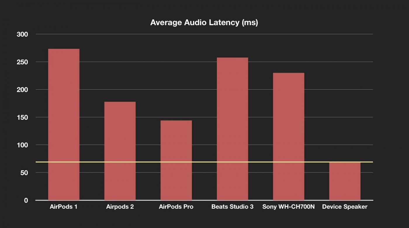
Airpod Pros have a fairly small latency. You may not have noticed it.

https://stephencoyle.net/images/latency-chart.jpg

Re: Design evolution of the Windows control panel

#65
post #52
post #4

My first PC had Windows 3.1 and I very vividly remember the buttons, the menus, and many of the icons. In a way, they still inspire me to this day. In fact, I themed a Shoelace button based on 3.1 a few months ago. https://codepen.io/claviska/details/zYwgyEO

A shoelace button?

It’s a web component library. https://shoelace.style/components/button

Re: Design evolution of the Windows control panel

#66
post #42
post #10

Left off Windows 11. The new one is the most logical one yet. Don't like that much about Windows 11, but the control panel is improved.

How many clicks does it take to find and change your DNS?

Three clicks to get from the root of the settings app to DNS assignment window

Re: Design evolution of the Windows control panel

#67
post #57

Windows 2000 control panel was perfect. I'd take pretty much any of the interfaces over the abominiation that is windows 10 control panel. It's form over function so hard it hurts, in a place where function is all I want. I'm not on a "journey" or having an "experience" or whatever they're aiming for. I just want to change a setting, so show me ALL the settings programs, RIGHT NOW. It's laughable how much you need to…

IMHO Windows XP classic view was the best from what Windows offered. To be fair, every design between Windows 95 and XP classic view was good. Icon view was Windows oldschool design that just worked. They could add categories, kind of like OSX did at some point and just leave at that.

Re: Design evolution of the Windows control panel

#68
I came to dislike the control panel interface on Windows because it is disjunct from management console snapins and does a bad job at reconiling administrative/power user access knobs with basic computer controls. The control panel does not adapt to the user level / user role (Administrator, plain user) well enough. You have to switch between control panel (including "modernized" network controls), advanced properties dialogs (interesting network settings, classic style), and msc snapins for diskmanagement, event viewing, task and device management in order to get things done. On top of that gpedit is not even included in the default compmgmt.msc. Oh and these days add powershell scripts on top. Oh and regedit.

One more issue is that they kept "evolving" the design (classic, settings view, etc) without retiring previous interfaces. Now you have access to everything and you keep wondering how the controls and components all interact. Almost as catastrophic as explorer.exe and "shell" integrations, resulting in the most laggy explorer.exe yet.

Re: Design evolution of the Windows control panel

#69
post #57

Windows 2000 control panel was perfect. I'd take pretty much any of the interfaces over the abominiation that is windows 10 control panel. It's form over function so hard it hurts, in a place where function is all I want. I'm not on a "journey" or having an "experience" or whatever they're aiming for. I just want to change a setting, so show me ALL the settings programs, RIGHT NOW. It's laughable how much you need to…

One of my most-used muscle memories is Win+R -> "control". Works even as far as Windows 11 and is still the most effective way to make changes happen on a Windows PC.

Re: Design evolution of the Windows control panel

#70

The old one that people praise isn't that good. It does all the things it needs to, but it uses eight layers of popup dialogs, it works poorly at DPI's over 150% and so on and so forth. Basically, a 2005 Windows UI is mostly a bad windows UI. The proper solution would have been to refresh the old one. Make a full-featured control panel that uses just slightly more modern UI paradigms and technologies. And with zero w…

> I don't know what parts of the control panel must remain for backwards compatibility (with what!?)

Because programs and drivers can and did ship their own control panels, it's fairly easy (https://www.codeproject.com/Articles/29264/Control-Panel-App...). Java comes to my mind, as did some virus scanners, and drivers for all kinds of hardware - and the latter is the key why MS keeps the architecture in place, they take backwards compatibility extremely serious, to the extent you can (generally) use Windows 95-era games and other software on a Windows 10 machine!

The other part is that there is an utterly absurd amount of things that can be configured in Windows, with a lot of ways to do so: text-based configuration files on the disk (e.g. /etc/hosts), registry settings, group policies that are mapped to registry settings, classic control panel applets, new control panel applets, the whole mess that is the bootloader config... all of this needs serious effort to re-organize, for something that 99% of end-users won't ever touch.

And that explains why there is such a split: the stuff that end users regularly need (display resolution, wallpapers, audio, ...) is in the new crap look, and the stuff that even nerds rarely touch (user-wide environment variables) is in the old school CPL applets.

Post reply on HN