Live data from Hacker News

New alternatives to HSL and HSV that better match color perception

bottosson.github.io

41–50 of 80 posts

Re: New alternatives to HSL and HSV that better match color perception

#41
post #6

Looking at the author's explanation for HSV and HSL, it sounds like they are designed for hypothetical programmable wavelength lights and paints. Hue would be wavelength, Saturation is either output filter bandwidth or conversion element efficiency, Value/Lightness is either output current or amount of ink. RGB is likewise for fixed wavelength three-color lights/filters, and CMYK is for prints. I think it's the same…

> Hue would be wavelength

This doesn't work, because "https://en.wikipedia.org/wiki/Magenta is an extra-spectral color, meaning that it is not a hue associated with monochromatic visible light."

Re: New alternatives to HSL and HSV that better match color perception

#43
I’ve used HSLuv a fair bit, and while it’s great for e.g. programmatically ensuring good contrast… it produces some unpleasant colors especially in the yellowish range. I’m going to try out Okhsl as a replacement because it sure looks nicer to my eyes, at least on my phone.

Re: New alternatives to HSL and HSV that better match color perception

#45
post #40

My personal complaint with color pickers is that they make it hard to find many normal environmental colors. Where is brown? I've learned to find it around red, a little toward orange, and a dark saturation. It's not intuitive, and I don't feel like I just pick _some_ brown because I can't easily explore the space of browns through beige and tan. Flesh tones are similarly difficult. I'm not sure what the solution is.…

Brown is weird [1]. It's basically dark orange. Flesh tones fall into that same category - people are orange-hued [2]. Oranges/reds are mostly produced by various unsaturated molecules, such as carotenes, lignins, phenols, and tars, and browns are just dark collections of many kinds red-orange pigments. It does not map well to any of the common color spaces because its inherently heterogeneous. The solution would pro…

I don’t understand that video. Can’t all colours be described differentially to another colour? And don’t we have lots of names for different shades? Why does this make brown unusual?

Re: New alternatives to HSL and HSV that better match color perception

#46

Earlier quoted context omitted.

My biggest complaint about perceptual colour spaces has been that they make working with colours near gamut boundaries really hard. I agree, this can be awkward. I like using perceptual spaces because they are self-evidently a “neater” starting point for colour work than something artificially distorted like HSL or (horror!) RGB, but it’s important to recognise that they offer an incremental improvement and don’t mag…

I played around with a perceptual color space and made an interactive doodle that you can see here: https://hexpansion.io/ → click on "Colors". The blobs attempt to spread out in a perceptual color space. You can add more blobs with + and remove them by clicking on their pie slices or on a blob directly. Code is based on an older perceptual color space: https://github.com/neolefty/hexerals/tree/master/src/color

FYI the + button doesn't work for me on Android Fennec (Firefox) 91.2.0 (Build #912020), though the rest seems to

Re: New alternatives to HSL and HSV that better match color perception

#47

Earlier quoted context omitted.

My biggest complaint about perceptual colour spaces has been that they make working with colours near gamut boundaries really hard. I agree, this can be awkward. I like using perceptual spaces because they are self-evidently a “neater” starting point for colour work than something artificially distorted like HSL or (horror!) RGB, but it’s important to recognise that they offer an incremental improvement and don’t mag…

I played around with a perceptual color space and made an interactive doodle that you can see here: https://hexpansion.io/ → click on "Colors". The blobs attempt to spread out in a perceptual color space. You can add more blobs with + and remove them by clicking on their pie slices or on a blob directly. Code is based on an older perceptual color space: https://github.com/neolefty/hexerals/tree/master/src/color

Very interesting, but I had a question about the background color on the page. but first some ... background. A long time ago, I worked at a digital printer manufacturer and I was building a equal perceptual gradient target for a backlit transparency material, Ilfochrome, at a customer site. One thing I found interesting was how much the perception of how 'linear' the gradient looked depended on how bright the background was.

A 'target' was a set of densities we would calibrate the machine to reach for a particular RGB value. 0,0,0 = 3.4D and 255,255,255 = .04D (for transparent material).

One group in the company insisted on a simple cube root density drop off, based on a reading of the L* formula. However, when the customer printed a large gradient with it, they rejected it. It looked like the 'linear' gradient on your site. However, when we put the test pattern (a small 4x8") pattern on the light board, it looked perfect.

So we tried an experiment, we printed 3 gradients on a full sized sheet, (50 inchesx50 inches), one with a 'clear' background, one with a 50% grey and one with a black background.

I was in the field, so I found a gradient that looked good, but did a bunch of study when I got back, I felt that some of the newer CIE models at the time did take into account background.

Tldr; I was curious is your page and those models included into its gradient calculation what the surround is? Also, it would be interesting to display these with an adjustable background. (dark, light, grey), or with colors.
Re: New alternatives to HSL and HSV that better match color perception

#48
post #14

My phone and laptop, and browsers support DCI-P3. Is there a color picker for wider gamuts? Because the article keeps talking about sRGB and picking in that color space, but I feel like is limiting the capabilities of current technology.

I had the same question looking into HSLuv recently. Came across this https://github.com/hsluv/hsluv/issues/73 but it didn't really gain much traction. Maybe it'll be more popular once Chrome finishes CSS Color Module Level 4 color space support.

Re: New alternatives to HSL and HSV that better match color perception

#49

These days I would want a color picker that considers the lighting and surrounding colors. I have an office which has huge windows facing (mostly) away from the sun so I have bright light from either clouds or blue sky. Reproductions of renaissance paintings and photographs on ‘bright white’ paper look great, but at home the color temps are in the high 2000s usually and I need coated papers for the images to be compe…

“Technically correct” way would be to control the surroundings than adapt representations. High CRI lightbulbs, display hoods, wallpapers, etc.

Re: New alternatives to HSL and HSV that better match color perception

#50
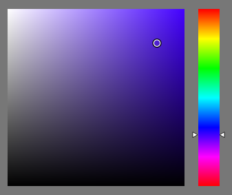
What I don't like in standard HSV color picker [1] is that the colors are distributed non-uniformly. For example, there is a wide area of same looking green color, but just a thin line of yellow and orange. I didn't understand if new models solve this issue.

[1] https://bottosson.github.io/img/colorpicker/hsv-picker.png

Post reply on HN