Live data from Hacker News

Webdesigners: please make text readable

contrastrebellion.com

81–90 of 109 posts

Re: Webdesigners: please make text readable

#81
post #4

I've gotten into the habit of modifying the CSS of web sites I frequent to improve the readability and usability in general. I do this using a plugin for the web browser. For instance, this is how the HN home page looks like: http://i.imgur.com/WaTQq.jpg This is the most perfect design because it's tailored to my needs. Here's how YouTube looks like: http://i.imgur.com/eZAsx.jpg Reddit: http://i.imgur.com/rnaxb.jpg

I'm a big fan of userContent.css myself.

One of the big disappointments I've had with Chrome so far is that there's no way to set default font sizes (within the browser UI itself). I suspect there may be configuration settings .... hrm .... no "about:config", damn.

I'll try the userContent.css trick next. I've long forced all sites to use both my preferred fonts and sizes. Most comply reasonably well, though some (overly specified) designs break.

And that's for a guy who's been surfing in his 20s-40s, with good vision, though I'm just starting to feel the need for reading glasses. My parents are in their late 70s, Dad's got glaucoma. I've had to push up the contrast and zoom settings in his Mac account, for which he's grateful (the Web is one of his primary outlets / connections to the world now).

Sites designed on large, high-contrast Mac monitors, viewed on smaller, lower contrast devices, suffer the most. HN definitely could use a contrast improvement (I'm viewing zoomed up a couple of clicks right now, couldn't say just how much).

The real key isn't just sizing fonts (and setting contrast) appropriately, but to design pages which resize and rescale gracefully. I can live with the first if the second also occurs. Far too often it doesn't.
Re: Webdesigners: please make text readable

#82

The author's focus on just 2 things, contrast and font, are not only overly simplistic, but are not even universally true for all people. For my eyes, reading high contrast black on white all day causes eye fatigue, while HN level of contrast (and the contrast on my site) causes less fatigue. I have no idea what percentage of people feel that way, but clearly some do. I am a huge proponent of designing web sites for…

The black-on-grey is hard to read for me, especially at default zoom. I'm bumped up 4 steps (just checked) which gives a bolder text.

Garrett Hardin (the Lifeboat Ethics / Tragedy of the Commons guy) actually had several of his books published with a deep brown ink on cream-colored paper, for maximum readability (c.f. _Stalking the Wild Taboo_ referenced here: http://books.google.com/books?id=jT-pl1LQTIIC&lpg=PA101&... ) Note that that particular reviewer didn't care for the effect.

HN _does_ have a simple layout that's highly amenable to resizing, to its credit.

Re: Webdesigners: please make text readable

#83

The author's focus on just 2 things, contrast and font, are not only overly simplistic, but are not even universally true for all people. For my eyes, reading high contrast black on white all day causes eye fatigue, while HN level of contrast (and the contrast on my site) causes less fatigue. I have no idea what percentage of people feel that way, but clearly some do. I am a huge proponent of designing web sites for…

The black-on-grey is hard to read for me, especially at default zoom. I'm bumped up 4 steps (just checked) which gives a bolder text. Garrett Hardin (the Lifeboat Ethics / Tragedy of the Commons guy) actually had several of his books published with a deep brown ink on cream-colored paper, for maximum readability (c.f. _Stalking the Wild Taboo_ referenced here: http://books.google.com/books?id=jT-pl1LQTIIC&lpg=PA101&.…

You mention black-on-grey. Are you referring to HN or my site, www.filterjoe.com? My site is close to the color of a faded paperback novel, a yellow/beige. HN looks halfway between beige and grey on my monitor - so I'm guessing you're referring to HN. I've noticed that the higher the resolution is on a monitor, the easier it is to read lower contrast text.

I've noticed large color variance on different monitors. When I first started my site I went for very low contrast link color with no underlines (trying to reduce links as a source of distraction) but some people on some monitors couldn't see the links at all. So I put back in the underlines.

Re: Webdesigners: please make text readable

#87

Earlier quoted context omitted.

Core fonts don't necessarily equal good web typography. Arial, for instance, is pretty mediocre for the web . You could say the same about Helvetica (it is still better designed than Arial). As for web fonts, Adobe and other foundries have large collections of gorgeous fonts specifically designed for the web.

Helvetica on Windows is terrible, see https://github.com/paulirish/html5-boilerplate/issues/42 . This is because Helvetica comes from Linotype instead of Microsoft, and they care more about print than screens. Arial might not be a good typeface , but as a font it's pretty damn well hinted for screens. Except for Minion Web and Myriad, I haven't seen a really legible web font from Adobe that is usable at 11-15px. Heck…

Because Helvetica looks so bad on Windows, a good compromise for a CSS font stack is something like:

  font-family: "Helvetica Neue",Arial,sans-serif;
Helvetica Neue (a minor reworking of Helvetica from 1983) is a Mac system font, but few Windows PCs have it. So Mac users get nice fonts and everyone else gets Arial.

Many CSS font stacks list Helvetica after Arial, but that is silly because nearly all computers (like 98%) have Arial, so Helvetica will never be selected. :(

Re: Webdesigners: please make text readable

#88

There's a second problem that's popping up lately: font-face on the body text. System fonts have been painstakingly hinted to make them more readable on-screen. Most web-embeddable fonts don't have appropriate hinting or are just plain bad choices for body text. Hoefler & Frere Jones (one of the most respected foundries around) haven't released embeddable fonts because they've been working on it for years . The resul…

> There's a second problem that's popping up lately: font-face on the body text.

Plus, browsers will flash the body text in the alternate system font (or a blank page) while the font-face file is downloaded from the web server.

Re: Webdesigners: please make text readable

#89

>designers need to think of elderly users with bad vision There are plenty of us young folks with terrible low-contrast vision, too :) I've personally got HN turned up to 175% zoom, and even that's a bit on the low side if I want to read the text of self-posts. IMO, this is an important distinction -- I once heard a friend indicate that, because their app was targeted at people aged ~20-30, accessibility wasn't an im…

A short sighted decision, indeed! :)

Re: Webdesigners: please make text readable

#90
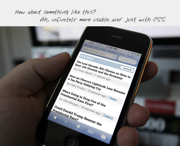
http://andyrutledge.com/images09/newsSite/images/iphone_nyt_... -- in here lower-contrast is used properly, I think. Low-contrast allowed to hide the low-priority details allowing the brain to quickly navigate through important, high-contrast titles. Not all text is important.
Post reply on HN