Live data from Hacker News

The worst volume control UI in the world (2017)

uxdesign.cc

341–350 of 490 posts

Re: The worst volume control UI in the world (2017)

#341
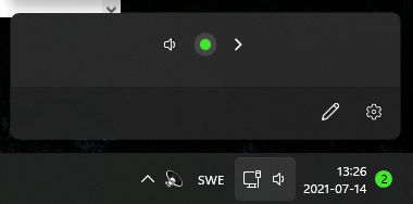
This is the new volume control in windows 11 (some insider version they've randomly thrown at me): https://imagizer.imageshack.com/img922/786/aIfxKh.png

It's atrocious. No slider, clicking on it "blips" the speakers so you can hear how loud it is. You have to hover pointer on top of it which enlarges the green circle by about 10% to show "Hey, you're hovering me, in case you missed it!" and then scroll so the the tiny tiny dot gets slightly more enlarged (which clearly indicates new volume, duh). Then it shrinks to a smaller size back when stopping the hover.

Oh, the arrow to the right? Does that open the customary volume slider? No that's the sound device picker. Speaker to the left is the mute. To make matters worse it's in the same "group" as the network symbol is (although there's no network settings when clicking), and sometimes clicking the thing doesn't work at all, depends on how much explorer.exe decides to hang at the moment.

But surely I just got some broken alpha/beta version.

Re: The worst volume control UI in the world (2017)

#342
post #6

Nearly all volume controls suck because by and large the software world is ignorant of the fact that loudness scales logarithmically. 99.9% of volume controls scale the output linearly.

This is in the same category of error as most programmers thinking that sRGB uses a linear light model. They try to do arithmetic like blending or blurring on the raw image data this inevitably does the wrong thing. Similarly, most non-AAA game engines ignore the sRGB tone curve and treat all inputs and outputs as if they were linear, which results in unexpected brightness shifts in textures. Up until very recently,…

I think more people are aware of gamma correction now.

The best way to do that, if you are using shaders, is to have "fragColor.xyz = pow(col,vec3(1./2.2))"* on your last line. If it looks bad, look elsewhere, you are not allowed to touch that last line. The opposite should be done just after reading textures, if they aren't already linear.

*: sRGB actually has a weird transfer function, but it is closely approximated by a gamma of 2.2

Re: The worst volume control UI in the world (2017)

#343

This is the new volume control in windows 11 (some insider version they've randomly thrown at me): https://imagizer.imageshack.com/img922/786/aIfxKh.png It's atrocious. No slider, clicking on it "blips" the speakers so you can hear how loud it is. You have to hover pointer on top of it which enlarges the green circle by about 10% to show "Hey, you're hovering me, in case you missed it!" and then scroll so the the tin…

So you have signed up for insider builds? Then claiming that they have "randomly thrown" it at you is just odd. You explicitly told them you wanted early builds.

Re: The worst volume control UI in the world (2017)

#344

Earlier quoted context omitted.

My the most favorite one is when someone pastes link in a chat to MS Office document on Sharepoint/Onedrive. It is opened in Teams and when you close the document you might naively assume you will be back in the chat you came from but no, you end up on the main screen and you need to search for the chat window again.

Which is impossible because it throws meetings with chats all in the same list so you have 3000 things going on. Not to mention that meetings that ended 3 weeks ago still have active chats. Or if you were invited once now you’re forever attached to the chat of all the meetings that come after, even if you’re not invited. Teams started ok, but it has become worse than Skype, which is something I didn’t think was possi…

Ahh, but MSN messenger was not the best of all chat clients in its day either. I remember advertisement aplenty, spam, terrible "candy bar" UIs and a password reset system that basically let others steal your account easily. I think I used the official client maybe twice at an upper limit.

Honestly, the best UI Microsoft ever invented were always those inside their video games. I still think AoE2 is hard to beat.

Re: The worst volume control UI in the world (2017)

#345
post #55

Earlier quoted context omitted.

We had network issues the other day and a few minutes into the meeting we realised my audio stream was delayed by a whole minute. There was no indication on the Teams UI this was happening. I'd hear a question about a window I'd already closed on screen share, type a response, and they got it a minute after asking. As someone who uses Discord at home, Teams is pain.

LOL. I wonder where that data was physically sitting for a whole minute.

At Rest.....

Re: The worst volume control UI in the world (2017)

#346

This started out entertaining, then I realized that there is no attribution for the designs, and even though there are several links that say things like "the original thread," they are all just links to search results for "volume" on the ProgrammerHumor subreddit.

Would attributing the posts to random Reddit names provide much value? If I knew the 3rd one was from /u/potato_up_my_rectum, it's not like I would go seek out his other art or work.

The point of attribution is to give credit to the creators. It's an intrinsically valuable act. You might not go look at their other posts, but I might. And if I were one of the creators whose work was taken to add value to someone's blog post, I'd appreciate the courtesy.

Re: The worst volume control UI in the world (2017)

#348
post #85

The volume controls in Tuxguitar are legitimately worse than some posted here. To adjust the volume of a track, you choose "View > Show Instruments" and then the unlabeled first circle in each row is the volume "knob". It's a "knob" because it is basically a circle with a dot with the 6-o'clock position indicating 0 and the 3 o'clock position indicating maximum. To adjust it, you click and hold (with no visual feedba…

Moving a round volume control in a circle would be even worse.

Re: The worst volume control UI in the world (2017)

#349

I used to work with a "GUI Expert" who designed everything like the 100-radio-button example, except that he didn't line anything up. I'd look at something he'd done with controls snaking left and right as you scanned down the dialog, and I'd (sigh to myself internally, and) say "OK, go ahead and clean it up and check it in", and he'd look confused and ask "clean what up?" He was actually UI blind in the same way som…

Tbh, I saw that example in the post and thought "that's ugly but extremely usable; I don't think that belongs here".

Sure, it would be a little easier to use with some extra UI tweaks - e.g. aligned correctly (10x10 instead of 11x10), digits padded & maybe larger click areas - but the general idea of being able to click once and get the desired volume is pretty powerful: you can technically do that on a scale, but accuracy is tricky and the annotation isn't as detailed.

I'm not saying it's better than a scale (a certain compromise on granularity provides the optimum solution), but it's hardly a candidate for "worst".

Re: The worst volume control UI in the world (2017)

#350
post #85

The volume controls in Tuxguitar are legitimately worse than some posted here. To adjust the volume of a track, you choose "View > Show Instruments" and then the unlabeled first circle in each row is the volume "knob". It's a "knob" because it is basically a circle with a dot with the 6-o'clock position indicating 0 and the 3 o'clock position indicating maximum. To adjust it, you click and hold (with no visual feedba…

Circular knobs in audio contexts that don't support circular mouse movement need to not exist. If you want to have the user drag their mouse up and down, just use a vertical slider .

Back in the kde 3 days, there was this applet called "knob" for volume control. For me personally, its circular knob UI is actually the best.

Firstly, you can place the applet at a corner of the panel, e.g. at the bottom right, such that you now have an infinitely large target [1] to hit.

Then, once you have the mouse pointer hovering above it, you can:

- scroll up/down to increase/decrease the volume

- middle click to toggle on/off the sound

For those who possess precise control of the mouse pointer, of course they can still click on an arbitrary spot on the knob to set the volume.

For bonus point, because it is a knob, you always know what is the current volume level. All that for maybe 40x40 pixels of screen real estate only.

[1] https://blog.codinghorror.com/fitts-law-and-infinite-width/

Post reply on HN