Earlier quoted context omitted.
Um, what's so bad about that?
Some people see `px` and assume it's physical pixels and because they know some devices have different pixel densities, they go complaining about how coding in terms of pixels instead of `em` doesn't account for density, unaware that `px` refers logical pixels[0] [0] https://blogs.perficient.com/2014/12/24/css-pixel-ratio-or-h...
Perfect Motherfucking Website
121–130 of 249 posts
Re: Perfect Motherfucking Website
#122From " http://bettermotherfuckingwebsite.com/ " which is one up the chain: > A little less contrast WHY. WHY DO PEOPLE DO THIS. To give this person credit they have at least chosen some sensible values, rather than gone with something that was just about enough on an expensive graphic designer high-contrast monitor and then not tested it on anything else. Leaving the rest of us squinting to try and read text or manua…
> Yes I know the art theory stuff about never using black because it doesn't appear naturally. I think the underlying reasons for that are underappreciated. When you pick #000000 for your text color, people won't see it as pure black anyway. Imperfections in your screen's backlighting aside, your screen reflects the ambient lighting, or, if you're outdoors and pointed the wrong direction on a sunny day, your screen r…
Re: Perfect Motherfucking Website
#123I built an antithesis to this: https://lxe.github.io/everywebsite/
Re: Perfect Motherfucking Website
#124Re: Perfect Motherfucking Website
#125Re: Perfect Motherfucking Website
#126Re: Perfect Motherfucking Website
#127Earlier quoted context omitted.
This one has a dark theme though.
And a license.
Does it add something to the satire, or does it make it funnier? Clearly the original page's lack of a license didn't make it impossible for anyone else to iterate on it.
And again, I can't stress this enough, the point of the original page was not that every single addition you could make to a website was bad. It was not that you shouldn't have a dark mode. It used radical minimalism to show that by default websites work, even if you have no clue what you're doing.
The lack of niceties is the point. Nobody was unable to read the original page or iterate on it. Could the page have been nicer? Sure. But the point was that even if you did nothing at all, the web still worked.
Re: Perfect Motherfucking Website
#128I want to hecking scream. The point of the original website in this chain was not that you couldn't do media queries, or that all of your designs had to be unstyled. It was a gosh-darned satire that showed that even if you did literally nothing , your website would still be responsive and readable and load fast. The fact that it did nothing, that it was just a completely unstyled HTML page was the reason that the jok…
This one has a dark theme though.
Like ad blockers, sometimes you have to adjust it, but it usually Just Works. The main innovation from this is that my display has much improved contrast, because I can set the brightness for text on a black background, instead of setting the brightness for an entire screen of white. It is amazing how good a screen looks when it's not running at 1% brightness. (Just don't open a non dark mode app at night, or you won't be sleeping for a week.)
Re: Perfect Motherfucking Website
#129Earlier quoted context omitted.
> WHY. WHY DO PEOPLE DO THIS. Do you like 400 nits of #ffffff right into your eyeballs? No? Me neither. The alternative is absolute darkness with extremely bright text, which in turn makes it unreadable (if you have astigmatism as I do) and literally causes pain due to the high contrast. Nothing in nature has such an extreme contrast. The only reason anyone would ever use full contrast is if they have a shitty 6-bit…
> Nothing in nature has such an extreme contrast. What about black text on white pages in an actual hardback book? But since you referred to nature, what about zebras?
Re: Perfect Motherfucking Website
#130Earlier quoted context omitted.
> WHY. WHY DO PEOPLE DO THIS. Do you like 400 nits of #ffffff right into your eyeballs? No? Me neither. The alternative is absolute darkness with extremely bright text, which in turn makes it unreadable (if you have astigmatism as I do) and literally causes pain due to the high contrast. Nothing in nature has such an extreme contrast. The only reason anyone would ever use full contrast is if they have a shitty 6-bit…
> Nothing in nature has such an extreme contrast. What about black text on white pages in an actual hardback book? But since you referred to nature, what about zebras?
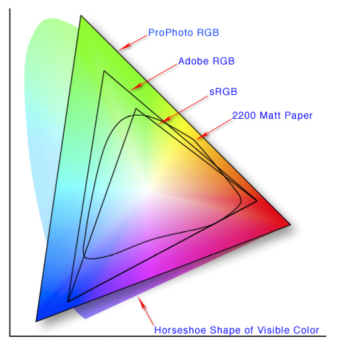
The not-triangular shape labeled "2200 matte paper" are all colors representable by reflective materials.
Colors outside of that range can only ever be produced by emissive materials, such as fire, stars, or your monitor.
All the colors your website uses should be from the range of reflective colors, as those are the ones seen in nature, and the ones your eyes are adapted to see.
The same applies also to black/white contrasts. Even vantablack next to a white sheet of paper (which would already be massively higher than any contrast in nature) still has a much lower contrast ratio than your monitor has.