Live data from Hacker News

KDE vs. Gnome Design Philosophies (2017)

ocsmag.com

61–70 of 85 posts

Re: KDE vs. Gnome Design Philosophies (2017)

#61

Earlier quoted context omitted.

I disagree. Gnome3 for me is perfect. I think tastes are tastes but gnome 3 gives me the function as well aesthetics. The zoom out functionality to show all windows open is essential given i have a lot of windows open at the same time. Alt-tab icons are a huge cognitive load.

We had all this with Gnome 2, although you had to apt-get install it.

A lot of the compiz stuff still blows things away today. But truthfully, while I liked it, I didn't need it.

Re: KDE vs. Gnome Design Philosophies (2017)

#62

Anyone think that ubuntu around 2011, final days of Gnome 2, really had perfected the desktop UI experience, before all the forays into wanton novelty for noveltys sake made it the confusing mess it became later? To think that a linux distro had the almost ideal desktop UI realised and then squandered it all away, seems puzzling now.

Yes, at that point it was approaching Windows 2000 with a much better terminal experience. A "workstation" experience. We all know how things went after tablet mania took over.

I still use Ubuntu Mate today, closest I've found to the earlier peak and still supported.

Re: KDE vs. Gnome Design Philosophies (2017)

#63
post #44
post #37

Earlier quoted context omitted.

PulseAudio was the last straw that pushed me to get a Mac. When I switched to Ubuntu, wifi worked, sleep (and more to the point, wake) on my T42 worked, and audio worked. Each release after that something would break, and but you couldn't really work around PulseAudio very well.

PipeWire (from the guy behind Gstreamer) is coming. Seems like it won't be anything like PulseAudio. The future seems exciting. https://en.wikipedia.org/wiki/PipeWire

There was an LWN article about PipeWire [1] a while back. Among the interesting parts of the article was an explanation for the PulseAudio debacle, and why PipeWire likely doesn't have the same problem. Basically, PulseAudio exercised several kernel APIs that had existed in ALSA for a long time, but had not been used widely. Hence it uncovered a ton of bugs in device drivers that were not tested against applications using these function calls before. By now, all those bugs are fixed because PulseAudio is widely used. PipeWire is using mostly the same APIs as PulseAudio and Jack, so it's not going to have the same troubles as PulseAudio.

[1] https://news.ycombinator.com/item?id=26327779

Re: KDE vs. Gnome Design Philosophies (2017)

#64

I'm curious is anyone else feels like I do about these things. I've used linux off and on over the years, various distros, various GUIs, sometimes KDE based, sometimes Gnome, sometimes others. I've never noticed any differences that seem substantive. It just seems like a random walk around the usual gui design space. Which I think makes sense as there isn't really a whole lot to do there. Is it just me? Do other peop…

Terminal. Check

Web browser. Check

They're the same

Re: KDE vs. Gnome Design Philosophies (2017)

#65
post #44
post #37

Earlier quoted context omitted.

PulseAudio was the last straw that pushed me to get a Mac. When I switched to Ubuntu, wifi worked, sleep (and more to the point, wake) on my T42 worked, and audio worked. Each release after that something would break, and but you couldn't really work around PulseAudio very well.

PipeWire (from the guy behind Gstreamer) is coming. Seems like it won't be anything like PulseAudio. The future seems exciting. https://en.wikipedia.org/wiki/PipeWire

Eh. PulseAudio is nothing like PulseAudio. People hated PA when it was forced into distros before it was ready, and still had many bugs. That PA doesn't exist any more and most of the issues have been ironed out for years. PulseAudio can do a lot more things than ALSA ever could.

(Yes, obviously at least one person reading this will still have intractable issues with PulseAudio, but there are exceptions to every rule. By and large it just works and has been a great solution for Linux for close to a decade now.)

Re: KDE vs. Gnome Design Philosophies (2017)

#66

Anyone think that ubuntu around 2011, final days of Gnome 2, really had perfected the desktop UI experience, before all the forays into wanton novelty for noveltys sake made it the confusing mess it became later? To think that a linux distro had the almost ideal desktop UI realised and then squandered it all away, seems puzzling now.

If I recall correctly it didn't have a dock. Everyone seems to have settled on the dock being the best paradigm for managing open apps, and launching favorites, for most users. You might disagree, but the ux people at Apple, Microsoft, Google, Gnome, and KDE seem to think it's the best approach for the vast majority of users.

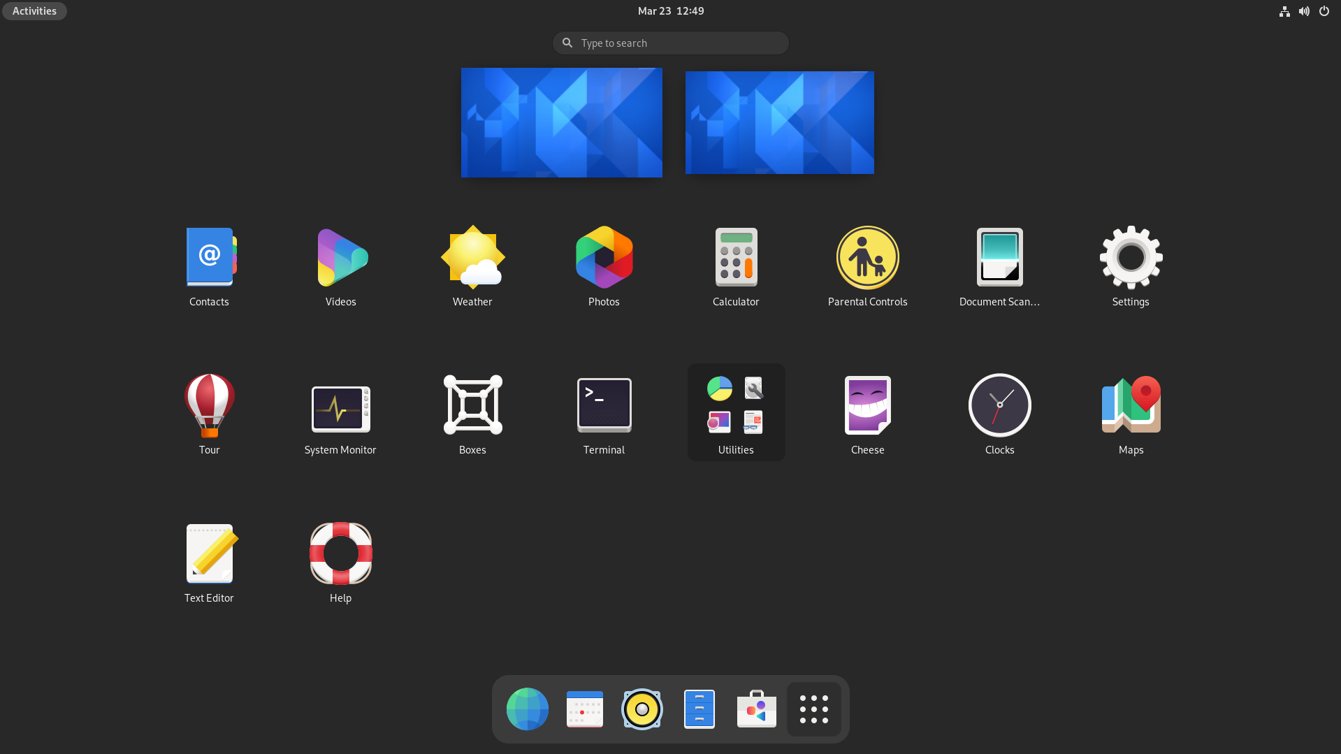
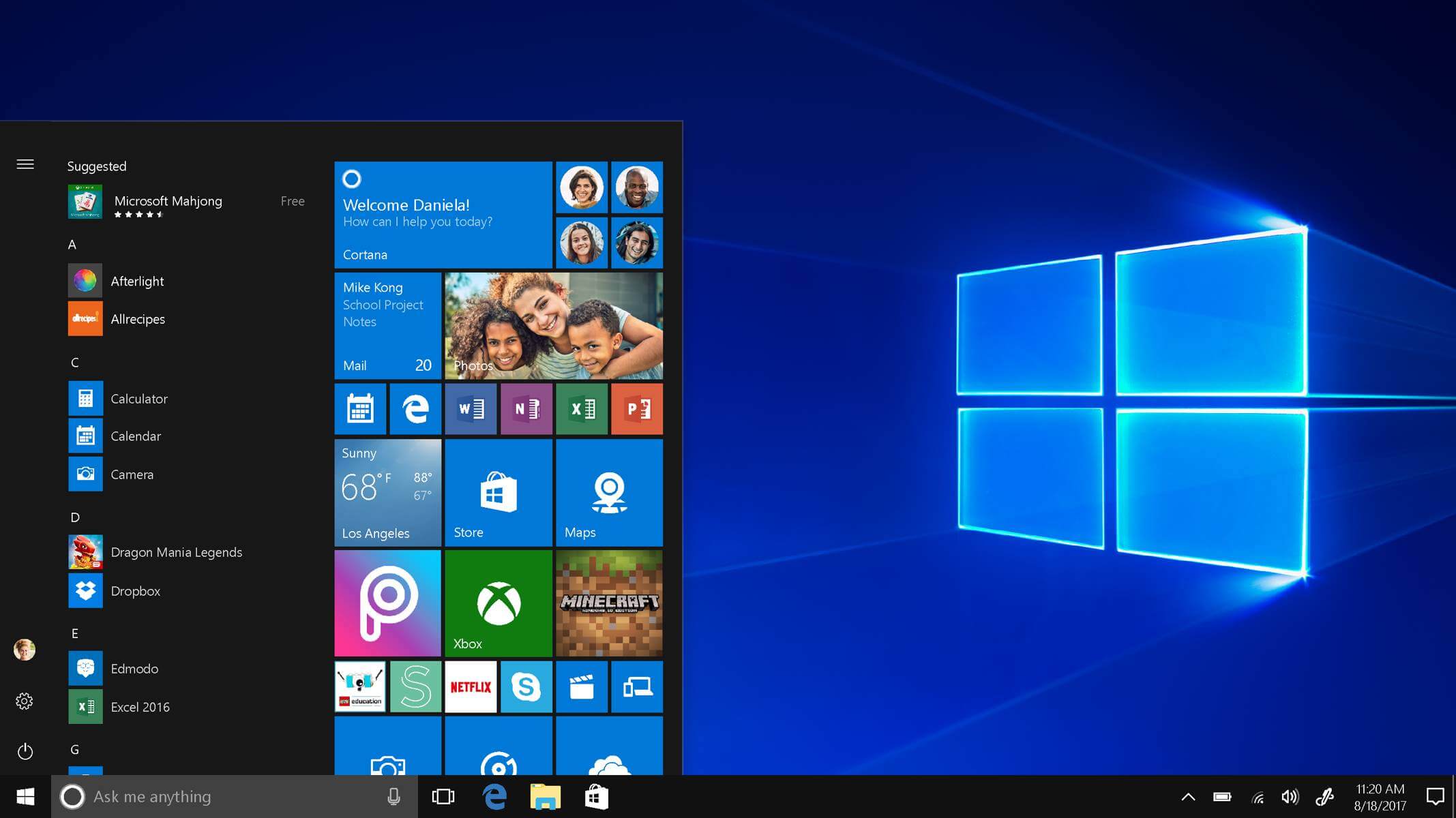
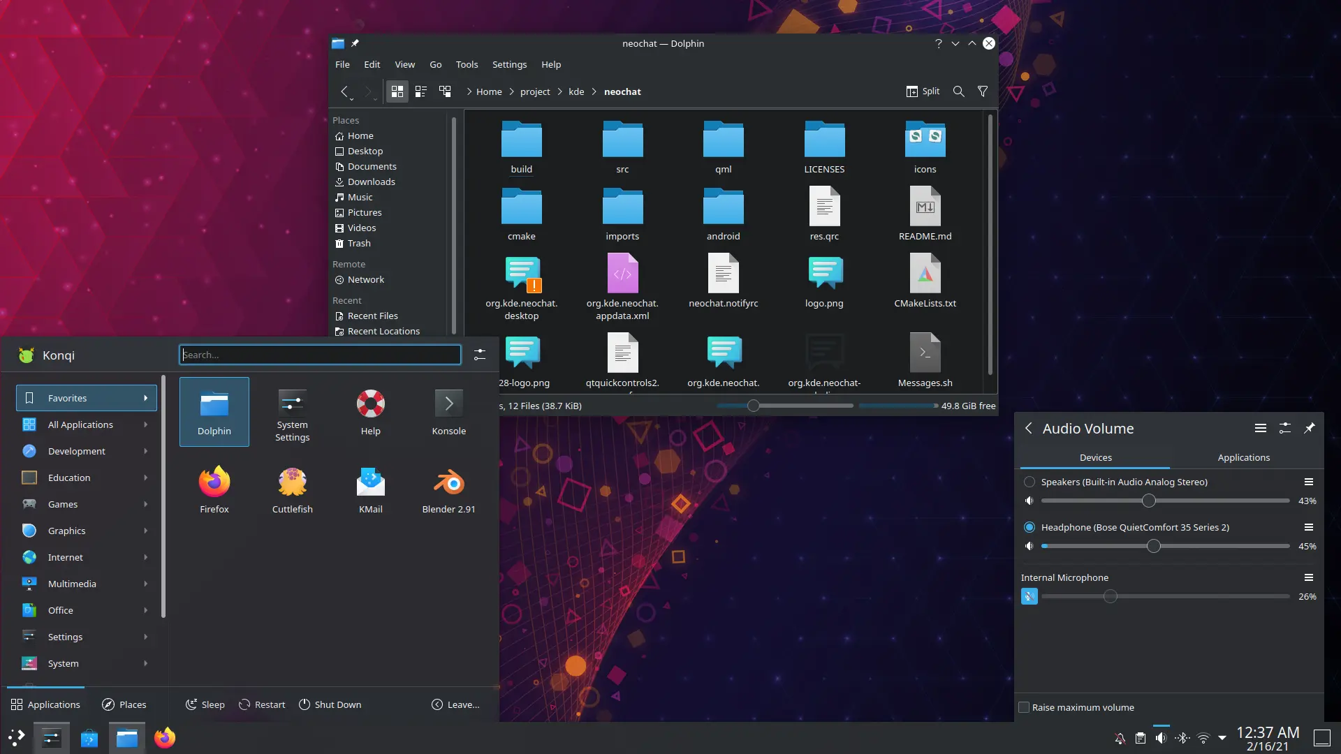
Not Microsoft[1], not KDE[2], and not Google [3]. Gnome's "dock" is only visible when you go into the "expose" mode at the top left corner [4], making its behavior very different from an Apple style dock. To be honest I have no idea what you're talking about. The only org that has "settled" on a dock being the best paradigm is Apple, and that's simply what they've done for decades. It's hard to imagine them reconsidering their ways.

Perhaps by "dock" you are referring to using an icon-based taskbar rather than one that also contains the window title? That's not what most people mean by a dock.

[1] https://cdn.windowsreport.com/wp-content/uploads/2018/11/win...

[2] https://kde.org/announcements/plasma/5/5.21.0/plasma-dark.we...

[3] I don't think it would be fair at all to call ChromeOS's taskbar a dock. The icons are centered like a dock, but they're in a full-width bar that also contains many other buttons and indicators. https://upload.wikimedia.org/wikipedia/en/c/c9/A_screenshot_...

[4] https://www.gnome.org/wp-content/uploads/2021/03/overview.pn...

Re: KDE vs. Gnome Design Philosophies (2017)

#67

Anyone think that ubuntu around 2011, final days of Gnome 2, really had perfected the desktop UI experience, before all the forays into wanton novelty for noveltys sake made it the confusing mess it became later? To think that a linux distro had the almost ideal desktop UI realised and then squandered it all away, seems puzzling now.

One of the things I really like about modern KDE is that I'm able to recreate exactly that experience in an updated desktop environment with an excellent compositor. Only two differences in my case:

1. I've forgone the bottom bar entirely in favor of merging everything into an icon-only taskbar at the top. But it's still got all the same features as the traditional Gnome 2 desktop (including the iconic 4-panel workspace indicator).

2. I have an "expose" feature at the top left of the screen which imitates the one really nice to have feature from modern Gnome. By hitting the hot corner with my cursor, I can show all the windows on my desktop, allowing easy switching. KDE can do this out of the box.

Re: KDE vs. Gnome Design Philosophies (2017)

#68
post #66

Earlier quoted context omitted.

If I recall correctly it didn't have a dock. Everyone seems to have settled on the dock being the best paradigm for managing open apps, and launching favorites, for most users. You might disagree, but the ux people at Apple, Microsoft, Google, Gnome, and KDE seem to think it's the best approach for the vast majority of users.

Not Microsoft[1], not KDE[2], and not Google [3]. Gnome's "dock" is only visible when you go into the "expose" mode at the top left corner [4], making its behavior very different from an Apple style dock. To be honest I have no idea what you're talking about. The only org that has "settled" on a dock being the best paradigm is Apple, and that's simply what they've done for decades. It's hard to imagine them reconside…

Read my other comment in this thread. The Windows taskbar he almost the exact same behavior as the Mac OS dock.

Re: KDE vs. Gnome Design Philosophies (2017)

#69
post #66

Earlier quoted context omitted.

Not Microsoft[1], not KDE[2], and not Google [3]. Gnome's "dock" is only visible when you go into the "expose" mode at the top left corner [4], making its behavior very different from an Apple style dock. To be honest I have no idea what you're talking about. The only org that has "settled" on a dock being the best paradigm is Apple, and that's simply what they've done for decades. It's hard to imagine them reconside…

Read my other comment in this thread. The Windows taskbar he almost the exact same behavior as the Mac OS dock.

Windows invented the taskbar, so far as I know, and their initial implementation only showed the icons: https://upload.wikimedia.org/wikipedia/en/8/88/Windows_1_Bar...

The macOS dock distinguishes itself aesthetically precisely by not being a taskbar with other functions and features. Every other taskbar implementation, even the ones that use icons (an approach that predates the Apple dock), sees it as important to not waste space and provide indicators and useful widgets on the same bar.

The "dock" approach is distinct in that it contains only large friendly application buttons, and doesn't use the full width of the screen. The thin taskbars common to other operating systems which also frequently use icons to switch applications shouldn't be considered docks, if for no other reason than that they predate Apple's approach. As you pointed out in your other comment, clicking on one of the icons doesn't even do the same thing in Windows as on macOS, and the task switcher part of the taskbar is the most comparable thing between taskbars and Apple's dock.
Re: KDE vs. Gnome Design Philosophies (2017)

#70
post #69

Earlier quoted context omitted.

Read my other comment in this thread. The Windows taskbar he almost the exact same behavior as the Mac OS dock.

Windows invented the taskbar, so far as I know, and their initial implementation only showed the icons: https://upload.wikimedia.org/wikipedia/en/8/88/Windows_1_Bar... The macOS dock distinguishes itself aesthetically precisely by not being a taskbar with other functions and features. Every other taskbar implementation, even the ones that use icons (an approach that predates the Apple dock), sees it as important to n…

> Windows invented the taskbar

Maybe, though it was probably inspired by a merger of the dock, which was not introduced by Apple but by NeXT in NeXTstep 1.0 (well, before 1.0, really), and the graphical shell menu/status bar in MacOS which MacOS had long before it had a dock, which it didn't get until OSX; the Windows task bar approximately merges those functions (but doesn't also serve as an application menu bar the way the MacOS one does.)

Post reply on HN