The Case For Better Watch Typography
hodinkee.com
The Case For Better Watch Typography
1–10 of 43 posts
Re: The Case For Better Watch Typography
#2I’ve found a similar issue with wall clocks... it’s frustratingly hard to find an option with good type. The double digit numbers tend to throw off the face balance .
Re: The Case For Better Watch Typography
#3All of the carefully crafted typefaces featured in the article emphasized recognizable style. None of them emphasized readability.
Personally, I prefer the typeface found on my Timex. It's nothing fancy, but it is very easy to read at a glance.
Re: The Case For Better Watch Typography
#4The "8" was very poorly thought-out in my opinion. It has no angles or sharp edges, setting it apart from the other numerals. It'd be better as a full circle on the bottom and a cut 3/4 or 4/5 circle on top.
Re: The Case For Better Watch Typography
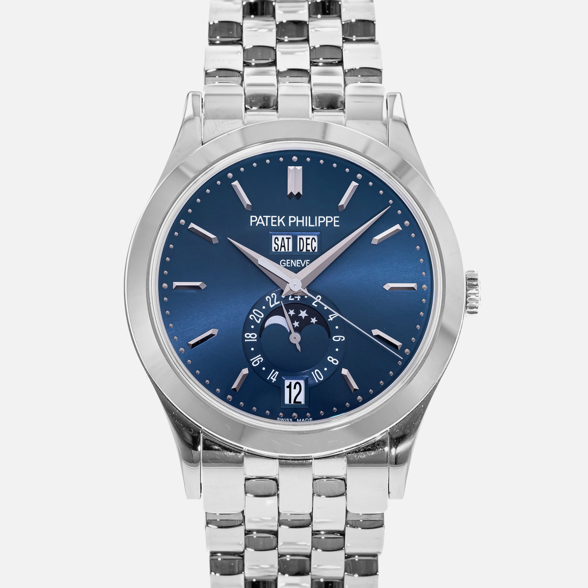
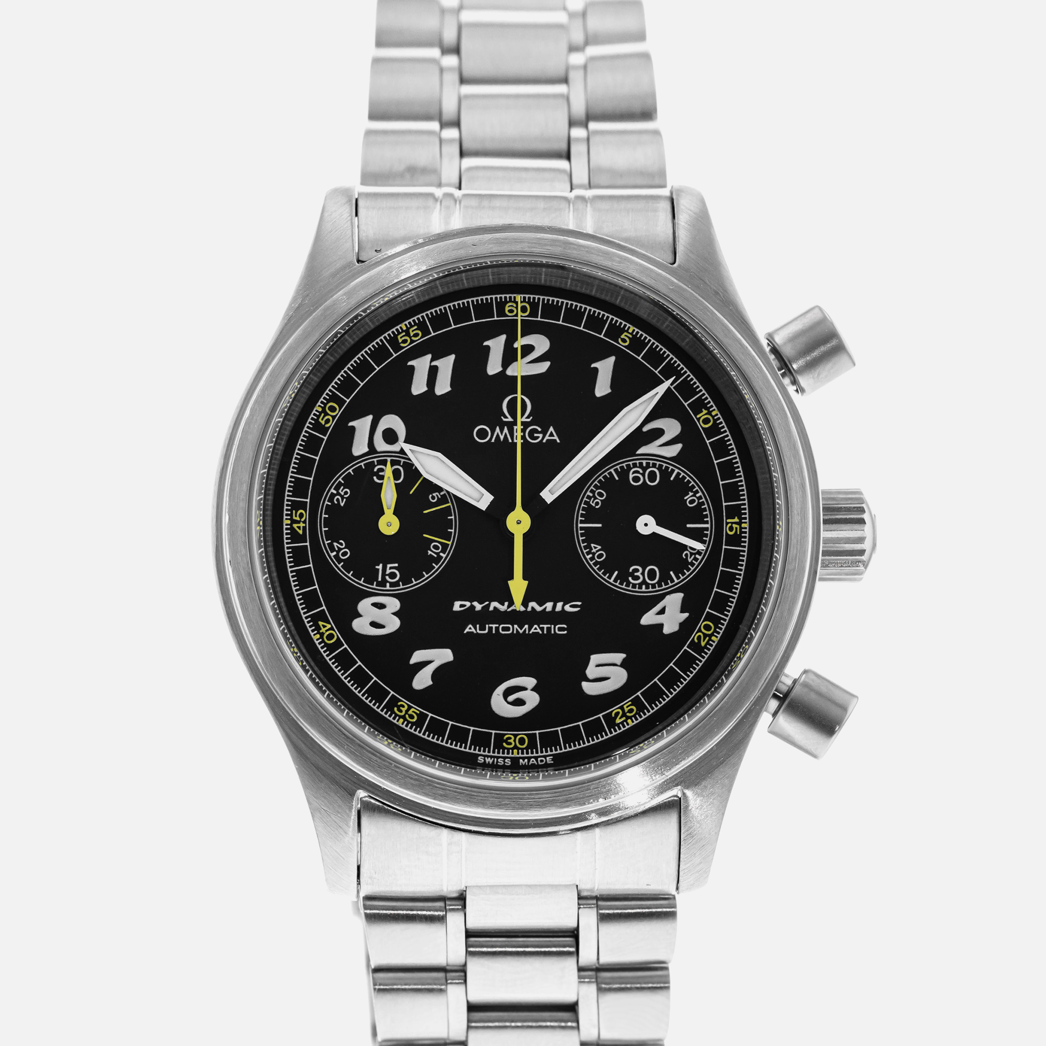
#5The article diplomatically doesn't show any examples of the terrible typography foisted on other watches, but it doesn't take much browsing around Hodinkee to find examples.
Like the stretched SAT DEC on this Patek Philippe: https://hodinkee.imgix.net/uploads/images/cf044e7b-7239-44a7...
Or this 'Word Art meets Mickey Mouse' Omega: https://hodinkee.imgix.net/shop/images/bf1f83ff-b964-4a98-a9...
(edit:) Here's another good piece on the same subject:
https://watchesbysjx.com/2015/08/editorial-why-fonts-and-typ...
Lots of lovely typography at the top, but search the page for "questionable" to find a real horror.
Re: The Case For Better Watch Typography
#6I find it easier to quickly read watches that have minutes printed instead of hours.
Re: The Case For Better Watch Typography
#7All of the carefully crafted typefaces featured in the article emphasized recognizable style. None of them emphasized readability. Personally, I prefer the typeface found on my Timex. It's nothing fancy, but it is very easy to read at a glance.
I think that is fine, most people aren't wearing watches out of practicality reasons. More as a style thing. I guess smartwatches could be considered more practical less stylish.
Re: The Case For Better Watch Typography
#8The article diplomatically doesn't show any examples of the terrible typography foisted on other watches, but it doesn't take much browsing around Hodinkee to find examples. Like the stretched SAT DEC on this Patek Philippe: https://hodinkee.imgix.net/uploads/images/cf044e7b-7239-44a7... Or this 'Word Art meets Mickey Mouse' Omega: https://hodinkee.imgix.net/shop/images/bf1f83ff-b964-4a98-a9... (edit:) Here's another…
Very few watchmakers, even at the top of the range, seem to get typography right when it comes to day/date/month windows. They just print whatever gets the information across and call it a day. At best, they might match the color and add a border around the window. It's almost as if they only care about designing the top layer of the dial.
The only well-known brand that consistently seems to get it right is A. Lange & Sohne, which totally makes sense because prominent numerical displays are one of the distinguishing features of their style.
Japanese brands are even worse. Take any complicated Citizen watch and you'll instantly recognize the "Eco-Drive" label in italic Arial/Helvetica with awkward kerning. Every element is printed in a random font that looks suspiciously similar to one of the Windows default fonts. The margins are all over the place, too. Seiko is somewhat better, but only because they usually don't print as many letters and numbers on the dial.
Re: The Case For Better Watch Typography
#9All of the carefully crafted typefaces featured in the article emphasized recognizable style. None of them emphasized readability. Personally, I prefer the typeface found on my Timex. It's nothing fancy, but it is very easy to read at a glance.
I think that is fine, most people aren't wearing watches out of practicality reasons. More as a style thing. I guess smartwatches could be considered more practical less stylish.
You’re not paying $65k+ for a watch because it’s utilitarian.
Re: The Case For Better Watch Typography
#10I think that Hermes watch that the article thinks so highly of has an awful typeface. It's cool that they went to the trouble of designing something to work within their design language, but it's totally unreadable. It would have worked better to simply leave the hour marks totally unadorned.