Luculent, my favorite:
Dev Fonts
181–190 of 342 posts
Re: Dev Fonts
#182I have recently discovered OCR font, and I LOVE it! I am, unfortunately, using it everywhere; however, I really do enjoy it in my terminal.
Re: Dev Fonts
#183I switched to coding in a proportional font, Verdana, a couple of years ago and never looked back. That's the font you are reading this comment in, in fact. Code is mostly words and words are much easier to read in a proportional font. Symbols are plenty clear enough in Verdana, all letters are distinguishable, and I don't use mid-line alignment so I don't see the point in a monospace font outside of the terminal.
What language are you using such that inter-line relative column spacing doesn't affect your code comprehension?
> I don't see the point in a monospace font outside of the terminal
Why not use Verdana in the terminal?
Re: Dev Fonts
#184More and more often, I see ligatures being used on such fonts. E.g. === or != are combined in a visually single character. Personally, I don't like that at all as I think it makes code less readable. It is probably something that you can get used to. But what exactly is the appeal of it anyway?
I consider editor not showing or changing what you exactly type as rude (I can accept autocompletion because it at least prompts).
It also introduce a ton of (unnecessary) complexity on top of the text formatting system, which in most cases are already a mess.
Re: Dev Fonts
#185I'm a big fan of Ubuntu Mono, I haven't encountered a better looking font for programming
Re: Dev Fonts
#186My favourite monospaced font is Triplicate https://practicaltypography.com/triplicate.html >: the only true serif monospace that I know of (though I have a vague feeling I found one other at some point). Every other serif monospace I know of is a slab serif. Triplicate’s variable stroke thickness is also exceedingly rare in monospaced fonts; almost everyone goes for uniform stroke thickness, as is customary with sans…
There's a free monospace serif-looking font called Go (made for Go, the programming language), designed by Bigelow & Holmes: https://blog.golang.org/go-fonts
[deleted]
Re: Dev Fonts
#187Earlier quoted context omitted.
Personally, however, I like to see exactly what it is I am typing, exactly which symbols are being used. Ligatures distort that. I feel the same way. I do think I would enjoy programming in a language that used a slightly more extended set of real characters, as long as we had solid editor and font support so typing and viewing them wasn’t going to be an issue for anyone. For example, I’d like to finally have ≠, ≤ an…
I feel the same way. Ligatures in coding fonts are a poor workaround for bad keyboard layouts. If you want to see ≠ then type ≠. Julia is the only ‘major’ language I know that supports most such characters.
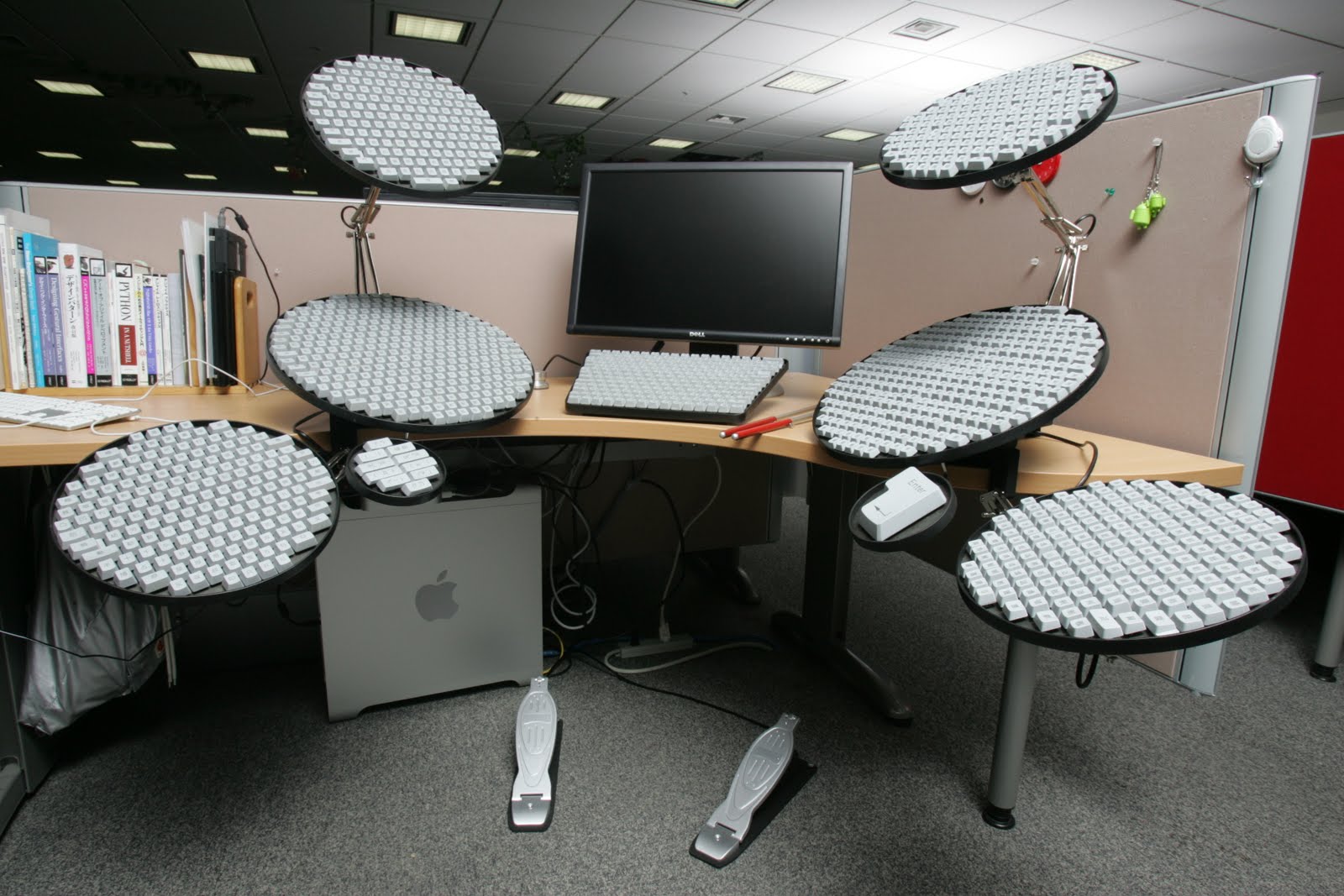
Haskell has a language extension that does the same thing [1]. Now all you need is a keyboard with good unicode coverage [2].
[1] https://wiki.haskell.org/Unicode-symbols [2] https://4.bp.blogspot.com/_EKfCI8QuAaM/S7L-baZ-ZVI/AAAAAAAAD...
Re: Dev Fonts
#188Earlier quoted context omitted.
How much did you pay for it? I love typography but this looks quite pricey
I paid the full price for it (€199), and I've found it to be a worthwhile purchase. It's pay-once-use-forever and since I spend a lot of time staring at code, the price per day of use is very low. Of course, there are free fonts that do the same and look good, I used Iosevka and Fira Code before I found PragmataPro. Honestly, I just adore how the font looks, and that was the primary reason I bought it, the others bei…
The thing that made the difference for me is the hinting, it's an absolute game changer on lower resolution screens.
Re: Dev Fonts
#189Earlier quoted context omitted.
I certainly don't blame you for not noticing the `#fbf3f3` background color on hover. However, it seems that every link is either small caps or has that trailing ° character. It looks like the former is used for internal links, and the latter for external. I agree that they're certainly not screaming, but considering that the author considers this a book , that is probably by design.
then again, the signature is indistinguishable from small cap and isn't a link
[deleted]
Re: Dev Fonts
#190Earlier quoted context omitted.
Personally, my eyes and brain just can't scan ligatures in code efficiently, I have to double read the code, especially "is that =, ==, or ===? Oh, and that's !==" (edit) I'll additionally qualify my comment, from a mathematics background I can casually scan a handwritten "!=" which is the same as the ligature, but I just cannot retrain my adult brain to accept the ligature version which is the same as the handwritte…
I find some ligatures help a lot. I can often miss != but won't miss ≠ or ≢ I think the whole idea of pre-pending ! to negate is a poor idea in general, it's too hard to spot especially in long convoluted lines where it's just thrown in before a complex bracketed expression.
I sometimes use a triple negation !!! for that reason. I don‘t know if there are any drawbacks, especially if there are other people working on the code, but it worked pretty well for me so far.