Live data from Hacker News

Which colour scheme is better?

stitcher.io

41–50 of 81 posts

Re: Which colour scheme is better?

#41
post #39

Some people may remember: first there were video terminals with light-on-dark to conserve fluorescent layer of CRTs, IBM PC continued the tradition and then Apple Macintosh came out with white background. Apple's argument was that people's eyes were trained for black-on-white print and it was one of the distinctive features of the platform then. There must be a reason why the print developed as black-on-white, maybe…

Print developed as black-on-white because ink/dye is expensive, and a light paper with dark ink is much easier to achieve in general than the opposite.

Re: Which colour scheme is better?

#42
> I wanna do the same with you: try it for one week, and let me know whether you're switching back to a dark theme or not.

So, I tried light themes predominantly from about 1995-2015, after using dark themes predominantly from 1985-1995, and before using dark themes predominantly from 2015-present.

But, sure, a week will make a difference.

Re: Which colour scheme is better?

#43
post #36

So, I have used both routinely, and don't really care too much one way or the other. I use dark more often, but if for whatever reason I'm in an editor that is light-themed (which happens not uncommonly), it's not worth any of my time to switch. So I don't have strong emotions on this. However, I do notice that "because science says so" is becoming a more and more common "you are not allowed to argue with my conclusi…

> However, I do notice that "because science says so" is becoming a more and more common "you are not allowed to argue with my conclusions" kind of add-on to any assertion. It is an oddly religious, faith-like use of the word "science". Conclusions are based on science? So, in a sense, they are the best result available based on evidence, best accepted theories, reasoning? Isn't it logical to say then that one approa…

What is faith-like is taking conclusions which the science justifies, at best, as being true on average and treating them as invariably true for each individual. It's the fallacy of division elevated to dogma.

Re: Which colour scheme is better?

#44

I use only dark schemes for programming and is way more relaxing for my eyes. One of the reasons is that the minimum brightness of my screens are just too bright compared to ambient light at night, and I love my ambient light at night, that is quite bright but illuminates all the room, so I can work on the room, and use things like blackboards or notepads, not just the computer screen. It hurts my eyes to have white…

If it's true that the minimum brightness is still too bright, that's an easy fix. If you're on a Mac, there are several freeware utilities to do exactly that, Shady was at one point the most popular. I assume there are similar utilities for Windows and Linux. They work by lowering the RGB intensities of all the pixels on your screen, instead of lowering the backlight further. It has exactly the same effect in the end…

It doesn’t have exactly the same effect: you get lower contrast. When you reduce the brightness of the backlight, blacks and whites alike become less bright. When you reduce the RGB intensities, the whites become less bright but the blacks stay just as bright. How big a deal this is depends on the technique. On OLED panels there’s approximately no difference, but it’s a huge deal in low-light scenarios with most LCD panels.

Re: Which colour scheme is better?

#45
White text on black background is hard to read, at least for me as I get a halo effect around text edges due to my astigmatism. However, that is an extreme colour scheme. A more balanced colour scheme like monokai is much better and gives better contrast than a light colour scheme for syntax highlighting, and reduces my eye strain as the monitor isn’t emitting as much white light. I also suffer from floaters, as others here seem too as well, and the main way to make them less distracting / hide them is to use dark colour schemes.

My work office, back when I had to go into the office, used overhead LED ‘energy efficient’ lights that were far too bright and had a colour temperature that was too white. They then painted the office walls white, I thought I was entering limbo every morning.

I think the key takeaway is that it all comes down to personal taste, and there is no universal colour scheme or brightness level that everyone is comfortable with.

Re: Which colour scheme is better?

#46
post #28

Earlier quoted context omitted.

> However, using a light scheme with mostly text, you have a huge rectangle of LED (most of the time) white light blaring at you, which itself causes eyestrain. I'll basically repeat my comment from below, but ergonomically set up displays meet ambient brightness, but don't exceed it (much). If you're sitting in front of a display set to 80 % brightness (~300+ cd/m²) in the evening, you're simply holding it wrong and…

Over-bright displays relative to the ambient light are definitely an issue. I've found myself feeling much less strongly about light vs dark since I installed some LED strips on the back of my monitors as bias lighting. (I didn't want to dim my monitors much more because you do lose contrast when the backlight is low)

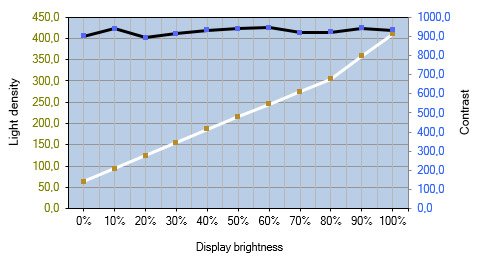
Contrast ratio is largely independent of backlight brightness. Intuitively this makes sense, because the panel is essentially just an adjustable light filter, which you'd expect to behave linearly.

Example: https://www.prad.de/wp-content/uploads/2020/07/lg-34gn850-ko...

Re: Which colour scheme is better?

#47
Related: high- versus low-contrast. Most colour schemes are low-contrast, and I haven’t the foggiest idea why, because I’ve always hated that, and find it makes no sense whatsoever (zero) as a decision.

I used to use molokai (dark, fairly high contrast); a few years ago I decided to build a new minimal, light, high contrast one from scratch, which I called “bland”, inspired by the printed code of yesteryear. Paired with Triplicate, the only true serif monospace font that I can think of (I have a vague feeling I found one other once, but can’t think what it was). Black text, white background, keywords bold, comments italic, that was it. I tried that for a few days and decided I liked it, but did want strings and comments distinguished, so I made strings red, comments green, numbers blue. Over time then I’ve added a small number of other cases for specific languages and constructs, but it’s stayed very minimal compared with what almost everyone’s doing.

Well, I deliberately tried it for a couple of weeks, then went back to molokai for a week before I broke and went back to bland because I found it just so much better.

It’s what I use in code blocks on my website, though with light grey backgrounds rather than white. See https://chrismorgan.info/blog/rust-fizzbuzz/ for an example.

It was a couple of years before I even bothered to make a dark variant of the theme, for the occasional low-light situation where dark actually works better, and because I wanted to have a dark mode on my website. I almost never use bland-dark.
Re: Which colour scheme is better?

#48

Related: high- versus low-contrast. Most colour schemes are low-contrast, and I haven’t the foggiest idea why, because I’ve always hated that, and find it makes no sense whatsoever (zero) as a decision. I used to use molokai (dark, fairly high contrast); a few years ago I decided to build a new minimal, light, high contrast one from scratch, which I called “bland”, inspired by the printed code of yesteryear. Paired w…

I highly recommend the various tempus color schemes[0], they are designed to be high contrast.

Tempus is a collection of themes for Vim, text editors, and terminal emulators that are compliant at the very least with the WCAG AA accessibility standard for colour contrast (which stands for a minimum contrast ratio of 4.50:1—while some items have a 7.00:1 rating, or else WCAG AAA).

I use one of the AAA schemes. It's not perfect though, certain color pairs are low contrast (typically the "dark" and "light" variant of the same color).

[0] https://gitlab.com/protesilaos/tempus-themes

Re: Which colour scheme is better?

#49
I call bullshit on that part about the Pulfrich effect. The brain has no problem compensating for timing issues in visual input - if not, blinking would be a real pain.

And maybe the delay is a good thing actually, smoothing out the screen flickering for a better experience.

Re: Which colour scheme is better?

#50

I do use two different color schemes depending on ambiant light. Dark background during the night, and light background during the day, in most cases. As simple as that. I wish my text editor would switch automatically and I might write a script to do that at some point, but this is a minor annoyance.

I know VS Code has a way to do it depending on window color scheme. Not sure if it is supported in Linux, but it is in Windows and MacOS. If your overall OS theme auto-changes based on time of day (or if you manually switch between light and dark mode whenever), VS Code will adjust as well. In the settings turn on `window.autoDetectColorScheme: true` then select a theme for each: `workbench.preferredLightColorTheme`…

No, it's not supported on Linux due to this Chromium bug [1]. For example, GNOME automatically switches themes via an extension [2], and most apps like Firefox honor that setting. But not for Electron apps, at least not yet.

It would be great, since my personal preference is also light theme during the day, dark at night.

[1] https://bugs.chromium.org/p/chromium/issues/detail?id=998903

[2] https://extensions.gnome.org/extension/2236/night-theme-swit...

Post reply on HN