Significant release. Missing Dark Mode was making me to switch to other clients, now I am back to thunderbird
What’s New in Thunderbird 78
11–20 of 230 posts
Re: What’s New in Thunderbird 78
#12Many of these UI changes seem like backward steps.
https://blog.thunderbird.net/files/2020/07/compose-compariso...
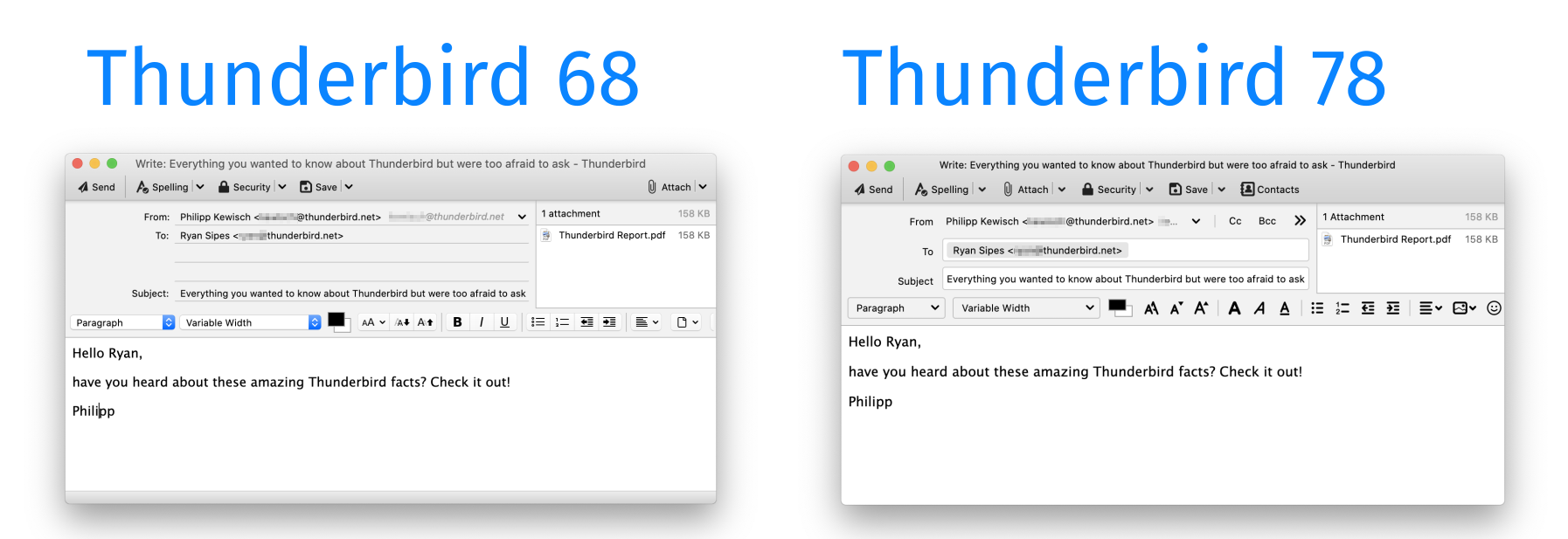
Old: Clear that you can enter multiple "To" addresses. Obvious that the formatting buttons are buttons.
New: Single-line "to" implies you can only enter one address. "Flat" buttons don't look like buttons.
https://blog.thunderbird.net/files/2020/07/account-setup.png
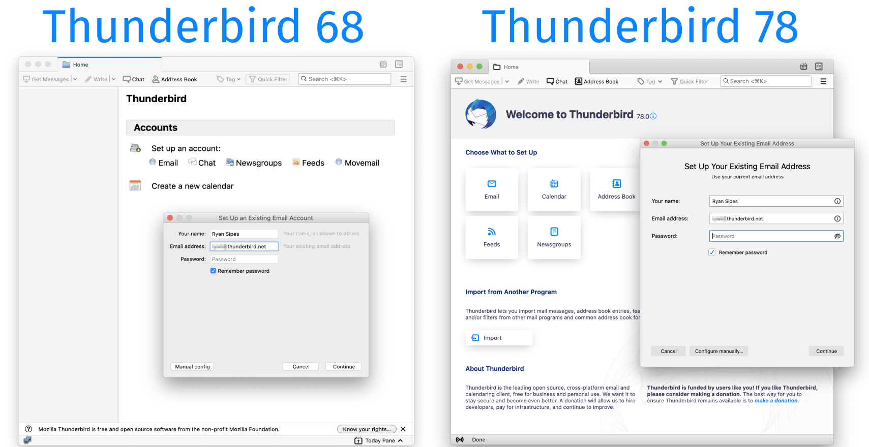
Extra white space makes the window nearly twice the size for no apparent reason. I wouldn't say the new one is any clearer. Maybe even less clear, since the grey textual tips next to the fields have gone.
Re: What’s New in Thunderbird 78
#13Finally dark mode! Some Windows only add-ons could do it. But now Mac and Linux can too
On windows 10, I have dark mode enabled system wide, but I struggle with most third party dark modes, the contrasts between components is not thought out enough - or in the case of email, styled html emails sometimes don't work on a dark background Is it possible to turn off the dark mode in thunderbird when the os system wide dark mode is enabled
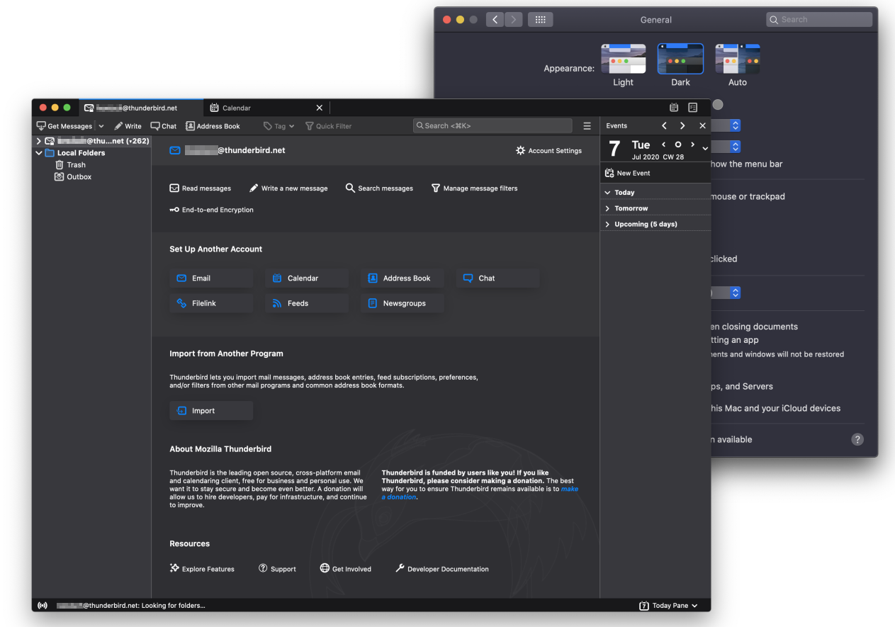
Yes, in the background window in this screenshot https://blog.thunderbird.net/files/2020/07/Dark-Mode-1.png you can see manual Light and Dark options as well as Auto.
Re: What’s New in Thunderbird 78
#14Many of these UI changes seem like backward steps. https://blog.thunderbird.net/files/2020/07/compose-compariso... Old: Clear that you can enter multiple "To" addresses. Obvious that the formatting buttons are buttons. New: Single-line "to" implies you can only enter one address. "Flat" buttons don't look like buttons. https://blog.thunderbird.net/files/2020/07/account-setup.png Extra white space makes the window nea…
Agreed about the flat buttons sadly following the OS-cohesiveness-hindering flatness fad instead of adhering to standard OS styling which can be recognized across apps by users.
Disagreed about the To/Cc redesign, the new design is much more efficient when you have multiple recipients, making good use of horizontal space. The old design did lead to:
1. Tons of wasted horizontal space (as each line is a recipient, on each line you only use the few characters describing each recipient, leaving space on the right blank). And also, one-line-per-recipient leads to tedious vertical scrolling inside a vertically-constrained space (3 lines by default, and you don't want more, you want to preserve vertical space for the email body, not the header).
2. Impossibility to easily copy/paste all recipients. With the new design, it's now easy: select all, copy (and repeat once if you have a Cc field, okay).
There's a reason this To/Cc design is what most (all?) desktop/mobile clients do.
Re: What’s New in Thunderbird 78
#15Earlier quoted context omitted.
On windows 10, I have dark mode enabled system wide, but I struggle with most third party dark modes, the contrasts between components is not thought out enough - or in the case of email, styled html emails sometimes don't work on a dark background Is it possible to turn off the dark mode in thunderbird when the os system wide dark mode is enabled
Yes, in the background window in this screenshot https://blog.thunderbird.net/files/2020/07/Dark-Mode-1.png you can see manual Light and Dark options as well as Auto.
Have it installed, such an option isn't available to me, in Win10
Re: What’s New in Thunderbird 78
#16Many of these UI changes seem like backward steps. https://blog.thunderbird.net/files/2020/07/compose-compariso... Old: Clear that you can enter multiple "To" addresses. Obvious that the formatting buttons are buttons. New: Single-line "to" implies you can only enter one address. "Flat" buttons don't look like buttons. https://blog.thunderbird.net/files/2020/07/account-setup.png Extra white space makes the window nea…
Not a fan of the flat buttons but I strongly disagree about the single/multi line TO situation.
I doubt there will be a single person for whom Thunderbird is their first email/messaging type app. Most would have used something on their iOS or Android devices first at least.
All of them will be comfortable with multiple users in a single To line, while having multiple lines for multiple users will actually appear alien to them.
Re: What’s New in Thunderbird 78
#17I switched to Outlook and found out my calendars and tasks from my Fastmail account were not supported (only Exchange accounts are now supported). If Thunderbird has now improved their calendar and task support, I will switch back.
It also looks like they added minimize to system tray, something else I found was impossible in Outlook.
Re: What’s New in Thunderbird 78
#18Many of these UI changes seem like backward steps. https://blog.thunderbird.net/files/2020/07/compose-compariso... Old: Clear that you can enter multiple "To" addresses. Obvious that the formatting buttons are buttons. New: Single-line "to" implies you can only enter one address. "Flat" buttons don't look like buttons. https://blog.thunderbird.net/files/2020/07/account-setup.png Extra white space makes the window nea…
The old To/Cc design was really bad. If you have more than three addresses, then these three lines scroll. The only indication that there are more than three addresses is a tiny scrollbar all the way to the right. I recently sent an e-mail to more people than intended when editing an old message as new, because it had more To-addresses that weren't visible and I didn't notice the scrollbar.
I'm very happy that it's being updated.
Re: What’s New in Thunderbird 78
#19Significant release. Missing Dark Mode was making me to switch to other clients, now I am back to thunderbird
I've been using a dark theme with TB since, I can't even remember how long. Let's say 2000, though I started with Netscape Mail. :-D
Re: What’s New in Thunderbird 78
#20Many of these UI changes seem like backward steps. https://blog.thunderbird.net/files/2020/07/compose-compariso... Old: Clear that you can enter multiple "To" addresses. Obvious that the formatting buttons are buttons. New: Single-line "to" implies you can only enter one address. "Flat" buttons don't look like buttons. https://blog.thunderbird.net/files/2020/07/account-setup.png Extra white space makes the window nea…
> "Flat" buttons don't look like buttons
Glad at least they've kept the (albeit small) separators between the buttons.
I immensely dislike the UI trend where everything is flat so there's no discernible separation between elements.