Live data from Hacker News

LibreOffice: The Next Five Years

lwn.net

111–120 of 433 posts

Re: LibreOffice: The Next Five Years

#111
post #38

Earlier quoted context omitted.

The ribbon interface was adopted in 2007. That's 13 years ago. What is the jank? It's a tabbed interface of buttons instead of menus and sub menus. The most common operations are descriptive buttons. Give someone word 2003 or word 2020 who has never used a word processor before. Which one would be more intuitive? It's bad UI if people just learn where to click. They should be able to think in terms of "I want to do X…

> The ribbon interface was adopted in 2007. That's 13 years ago. Came here for this. The first version of Office for windows (which is what most people are familiar with in terms of UI) is from 1998, so the non-ribbon interface has been around for 9 years, vs 13 for the ribbon interface.

Office 95 doesn't look that functionally different from Office 2003:

Office 95: https://i0.wp.com/isoriver.com/wp-content/uploads/2020/01/06...

Office 2003: https://imag.malavida.com/mvimgbig/download-fs/office-2003-s...
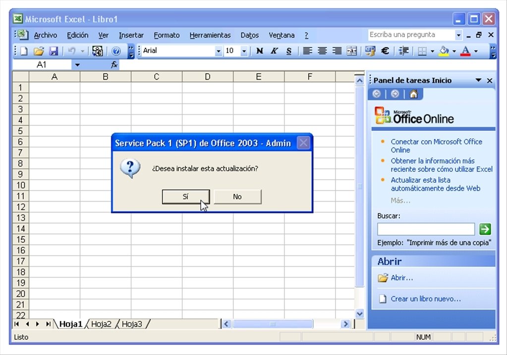
Honestly even Excel 3.0 (1990) doesn't look that disimilar (https://goughlui.com/wp-content/uploads/2014/05/about-excel....)

So that's 17 years for toolbars vs 13 for ribbon

Re: LibreOffice: The Next Five Years

#112
post #38

It's weird to me that people complain over "old and ugly" interfaces. Consistency is worth so much more than fad-chasing. Learning something is more worthwhile if you are able to trust that it won't change underneath you. Take MS Office for example, I was made to learn how to use it in elementary school, we had an exam where we got a printed out page and had to reproduce it in an hour. This was supposed to be fundame…

The ribbon interface was adopted in 2007. That's 13 years ago. What is the jank? It's a tabbed interface of buttons instead of menus and sub menus. The most common operations are descriptive buttons. Give someone word 2003 or word 2020 who has never used a word processor before. Which one would be more intuitive? It's bad UI if people just learn where to click. They should be able to think in terms of "I want to do X…

I've used office daily for 20 years but rarely have to use the ribbon menu at all and, if I do, it's rarely off whatever is up there by default. But every time it is, it's way more painful to explore compared to a plain text menu and after I find what I'm looking for, it's hard to get back to the default.

Re: LibreOffice: The Next Five Years

#113

It's weird to me that people complain over "old and ugly" interfaces. Consistency is worth so much more than fad-chasing. Learning something is more worthwhile if you are able to trust that it won't change underneath you. Take MS Office for example, I was made to learn how to use it in elementary school, we had an exam where we got a printed out page and had to reproduce it in an hour. This was supposed to be fundame…

With teaching UI you breed the class of people who will shout the loudest when something changes. Teaching your parents that "the internet" is the blue icon in the taskbar will teach them to call you when microsoft decides to install chromium-edge on their machine because "the internet is gone". Don't teach anyone how to use a specific UI, teach the concepts that made the UI look the way it does. And with that anyone…

Sometimes the views you see here are extremely biased. It's normal, we use computers all day, we are experts. We learn and adapt.

For some people, a computer is just another tool they've been recently forced to use in order to live in society (in many countries, you cannot longer reallistically do your taxes without a computer for instance).

As programmers, and especially those who work in UI/UX design, we owe some respect to those people, because those who take the extra effort to learn a radically new technology at an elderly age, are completely, utterly confused when companies decide to move stuff around just for the sake of it (or as a result of A/B testing?).

And yes, sometimes the only way I've been able to teach people how to operate a computer is by literally describing the UI and the icons. In my experience, finding a good way to teach via fundamentals to someome who doesn't care is extremely difficult. And believe me that I've tried it many times.

OTOH, note that none of my points apply to early education (school). In that case, I completely agree we need to teach the fundamentals, not UI.

Re: LibreOffice: The Next Five Years

#114
post #105
post #85

Earlier quoted context omitted.

As an ex trader, I can confirm that the new ribbon interface, when it first came out, caused me and my colleagues a world of pain. We knew all the shortcuts keys in the old version. The ribbon UI meant that a big chunk of the previous shortcuts didn't work anymore. Killed our productivity for a good few months.

Your experience reminds me of https://xkcd.com/1172/

But, the new ribbon interface was much more inconvenient.

If I recall correctly, pasting data while removing duplicates in the ribbon interface was Alt+AQORT, but only Alt+XY in the old Excel (I don't remember what X and Y were, but I know it was a 2 key combo!)

Re: LibreOffice: The Next Five Years

#115
post #103
post #85

Earlier quoted context omitted.

As an ex trader, I can confirm that the new ribbon interface, when it first came out, caused me and my colleagues a world of pain. We knew all the shortcuts keys in the old version. The ribbon UI meant that a big chunk of the previous shortcuts didn't work anymore. Killed our productivity for a good few months.

Had the ribbon interface been the original UI and the traditional menu-based interface the new UI, it sounds like you and your colleagues would have still faced the same frustrations. To me, it sounds like your issue is with change rather than the effectiveness of either type of UI.

No, not really. Some 1 or 2 key shortcuts became 5 key shortcuts with the new ribbon UI.

It was a real nightmare! Especially when the old shortcuts were also remapped to a completely different function, and your moving s so fast you don't realise where your data has gone!

Re: LibreOffice: The Next Five Years

#116

It's weird to me that people complain over "old and ugly" interfaces. Consistency is worth so much more than fad-chasing. Learning something is more worthwhile if you are able to trust that it won't change underneath you. Take MS Office for example, I was made to learn how to use it in elementary school, we had an exam where we got a printed out page and had to reproduce it in an hour. This was supposed to be fundame…

The ribbon interface is one of the best things to happen to office.

It was horrible to use before that.

For an app as complex and feature rich as word or excel, the ribbon interface is a great way to organise commands.

Not to mention context specific menu tabs.

Especially in Powerpoint, my productivity has increased tremendously. I just create a table and automatically go to the last tab to format it.

Re: LibreOffice: The Next Five Years

#117
I am looking forward to future development of LibreOffice. For me it has become better and better. I've never had a new installation, or update of LO which made me think "If only I had stuck to the old version!"

More and more I am using plain text formats these days, which I then convert into other things, but from time to time it is nice to have LO at the ready, knowing, that it is free software and as such will always be available, in our collective resources.

A friend of mine recently complained about pictures disappearing and floating over text area margins in their document and having to put them back in in a 200 page document. I've never had such a problem. However, there seem to be some rough edges left to improve.

I cannot complain about the user interface actually. To me it is quite intuitive and I find everything I usually need rather quickly.

Re: LibreOffice: The Next Five Years

#118
post #85
post #38

Earlier quoted context omitted.

The ribbon interface was adopted in 2007. That's 13 years ago. What is the jank? It's a tabbed interface of buttons instead of menus and sub menus. The most common operations are descriptive buttons. Give someone word 2003 or word 2020 who has never used a word processor before. Which one would be more intuitive? It's bad UI if people just learn where to click. They should be able to think in terms of "I want to do X…

As an ex trader, I can confirm that the new ribbon interface, when it first came out, caused me and my colleagues a world of pain. We knew all the shortcuts keys in the old version. The ribbon UI meant that a big chunk of the previous shortcuts didn't work anymore. Killed our productivity for a good few months.

Good old Microsoft changing the shortscuts every major release, because. Because? Because fucking why? Why do they do this.

Re: LibreOffice: The Next Five Years

#119
post #6

Is there a hosted service for LibreOffice online ? I wish I could find a better replacement for Google Drive.

I recommend checking out ONLYOFFICE. They have a personal tier with a small online storage for free. And everything is AGPLv3. https://personal.onlyoffice.com/

OnlyOffice have shot themselves in the foot when made it use MSO file format to store data. Should have build on ODT

Re: LibreOffice: The Next Five Years

#120

It's weird to me that people complain over "old and ugly" interfaces. Consistency is worth so much more than fad-chasing. Learning something is more worthwhile if you are able to trust that it won't change underneath you. Take MS Office for example, I was made to learn how to use it in elementary school, we had an exam where we got a printed out page and had to reproduce it in an hour. This was supposed to be fundame…

> Consistency is worth so much more than fad-chasing. Learning something is more worthwhile if you are able to trust that it won't change underneath you.

Almost anything could be described as a fad. Interactive computers were seen as a fad once. Punched cards were good enough! The command line was good enough!

For complex applications (roughly defined as, lots of nested menus), the ribbon UI is an improvement as it surfaces more features. In itself it's an evolution of the customized toolbar approach - there's plenty of UX research that showed that most people only had the standard toolbars. (Office still does offer a context sensitive "toolbar").

> we had an exam where we got a printed out page and had to reproduce it in an hour. This was supposed to be fundamental computer knowledge like learning to type.

I'm hoping this didn't mandate a particular program, but even assuming it did -- Microsoft Word's basic shortcuts all still work exactly like in 1995. The common toolbar buttons (bold, italic, lists, etc) are in the same place. Even the original keyboard shortcuts for deeply nested menus (e.g. Alt D F F, in Excel, for showing the filter UI, i.e., the old 'autofilter' command) still work.

So where is the problem exactly?

Post reply on HN